A gamified learning and support app for caregivers
CareCup is a gamified learning and support app designed to help caregivers navigate the transition from hospital to home with confidence. It brings together bite-sized education, expert guidance, and peer support in one compassionate digital space—using a reward-based system to motivate progress and reinforce confidence during complex caregiving journeys.
The project began with a simple question: what if caregivers had a companion as caring as they are?
Hospital discharge is a critical but fragmented point in care
Patients are often sent home with dense instruction packets, limited follow-up, and little consideration for the people responsible for carrying out recovery at home. Research shows high readmission rates tied to medication confusion, missed warning signs, and lack of coordinated support.
In this gap, caregivers become the de facto care managers—often without training, tools, or emotional support. While hospitals optimize for efficiency, caregivers are left navigating uncertainty, stress, and isolation.
The core challenge: how might a digital product support caregivers where the healthcare system falls short?
Listening to the people behind the care
I conducted five 30-minute, one-on-one interviews with caregivers aged 25–55 who had managed a hospital-to-home transition within the past year. Three were professional caregivers and two were unpaid family caregivers.
Feeling isolated and stretched thin
"Sometimes you feel like you are isolated from a lot of things. You find that you are not giving yourself enough time."
Discharge instructions aren't enough
"They just gave me a pack of instructions. Told me you just have to follow this and this, but you can't just read something. I end up googling things."
Professional support is stretched too
"We did have a social worker but she also seemed like she was stretched thin. We're asking all these questions and we're like waiting on replies."
Wanting real-time human guidance
"I wish I could talk to someone if I had something unusual. I could just talk to them, and they could talk you through challenging stuff."
I synthesized findings through affinity mapping and empathy mapping, identifying nine recurring themes including caregiving education gaps, environmental transition challenges, emotional burnout, lack of peer support, and limited access to responsive professional guidance.
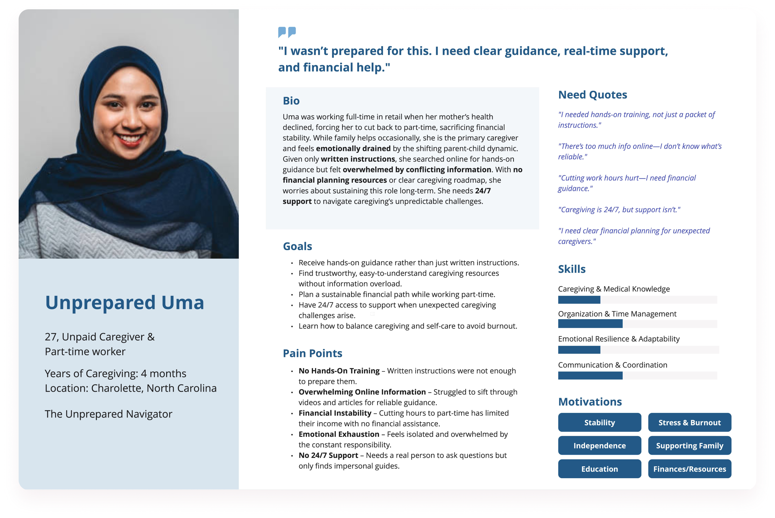
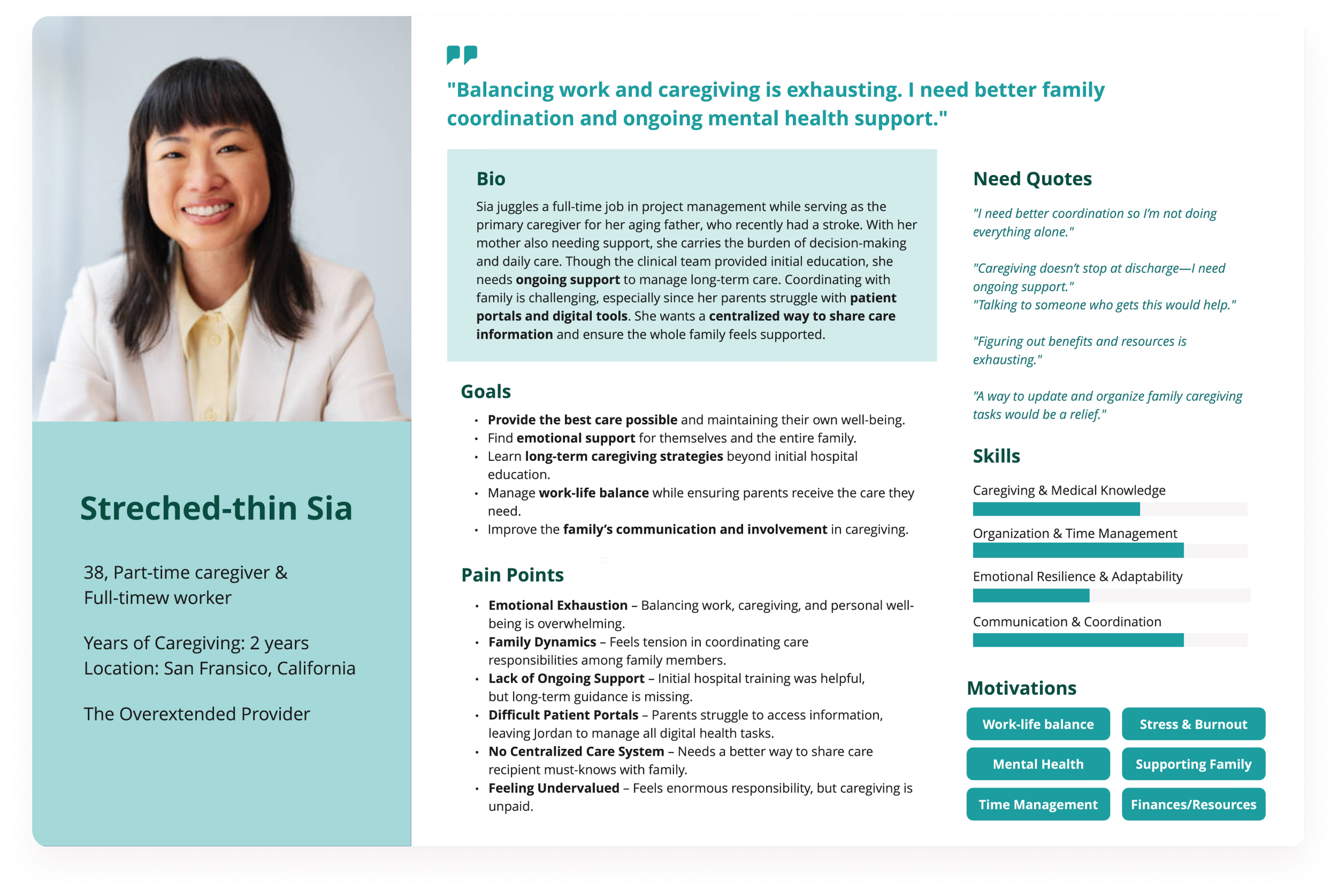
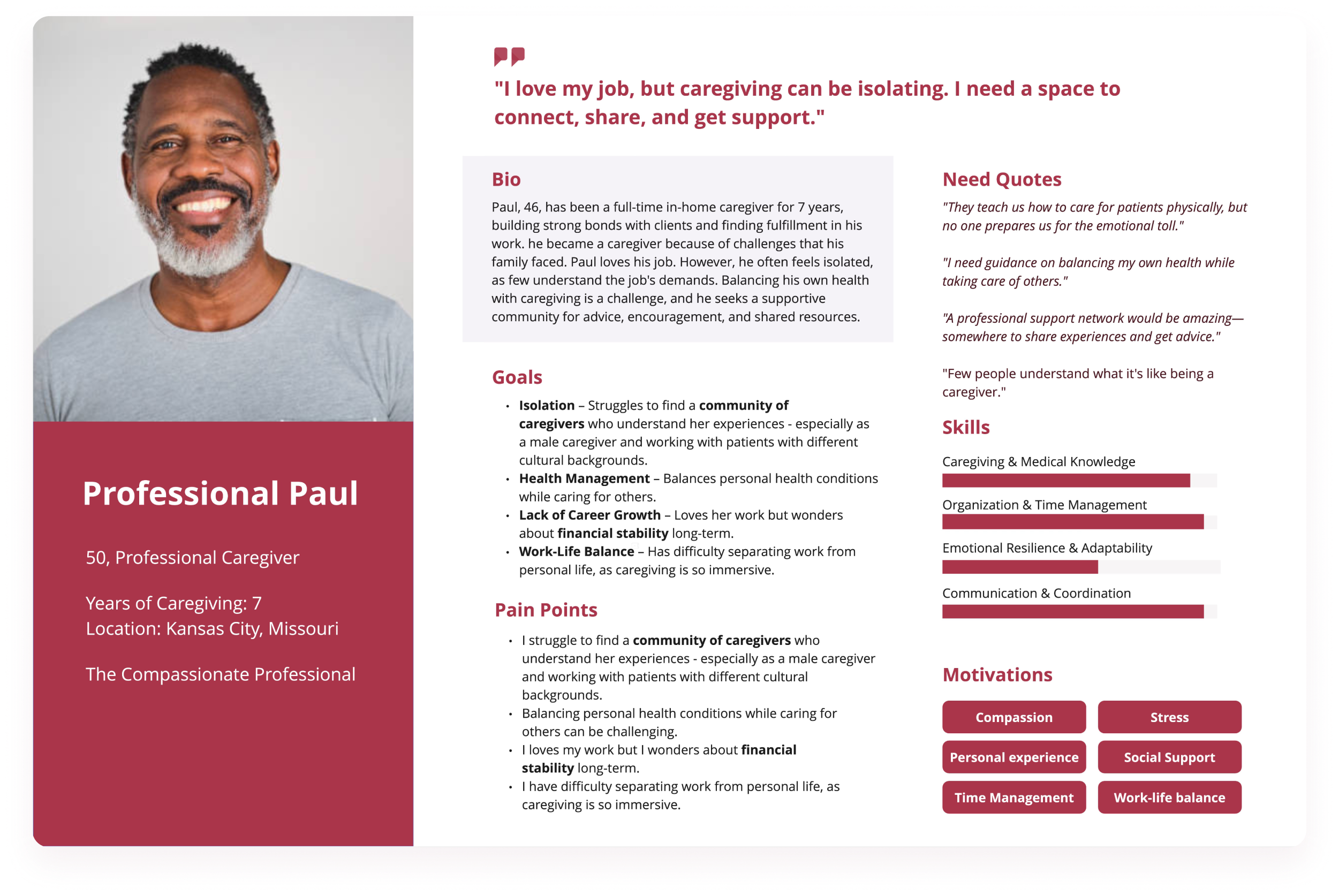
Three personas grounded the research
Professional Paul
Experienced full-time caregiver seeking credibility and peer validation.
Stretched Sia
Working daughter balancing employment, family dynamics, and emotional strain.
Unprepared Uma
Part-time worker suddenly thrust into caregiving without adequate guidance.
Common thread
All wanted clarity, reassurance, and a sense they weren't navigating recovery alone.
Caregivers need guidance, not just information
Caregivers were not struggling because they lacked effort or motivation—they were struggling because the healthcare system handed them responsibility without guidance. After synthesizing research, I reframed the challenge toward the caregiver's lived experience.
Caregivers needed reassurance, structure, and a clear sense of what to do next—especially during the first days at home. This led me to define the core problem as a lack of accessible, emotionally supportive, step-by-step guidance during care transitions.
How Might We...
I translated insights into "How might we" questions focused on improving confidence through education, reducing stress during transitions, supporting emotional wellbeing, and creating spaces for connection.
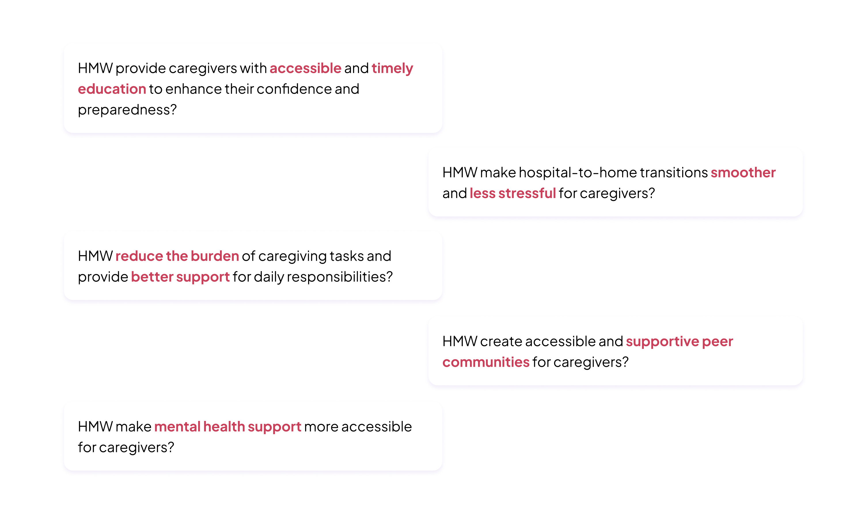
The Goal
A digital experience that guides, connects, and empowers caregivers to manage the transition from hospital to home confidently.
From sketches to concepts across three pillars
With the problem defined, I moved into ideation by sketching and clustering concepts around three emerging pillars: guided learning, expert support, and community connection. Each idea was evaluated against a simple lens: does this reduce cognitive load, offer reassurance, and feel usable on a hard day?
1. Onboarding Sketches
Designed to build trust, reduce overwhelm, and personalize the caregiver experience through gentle illustrations and short statements.
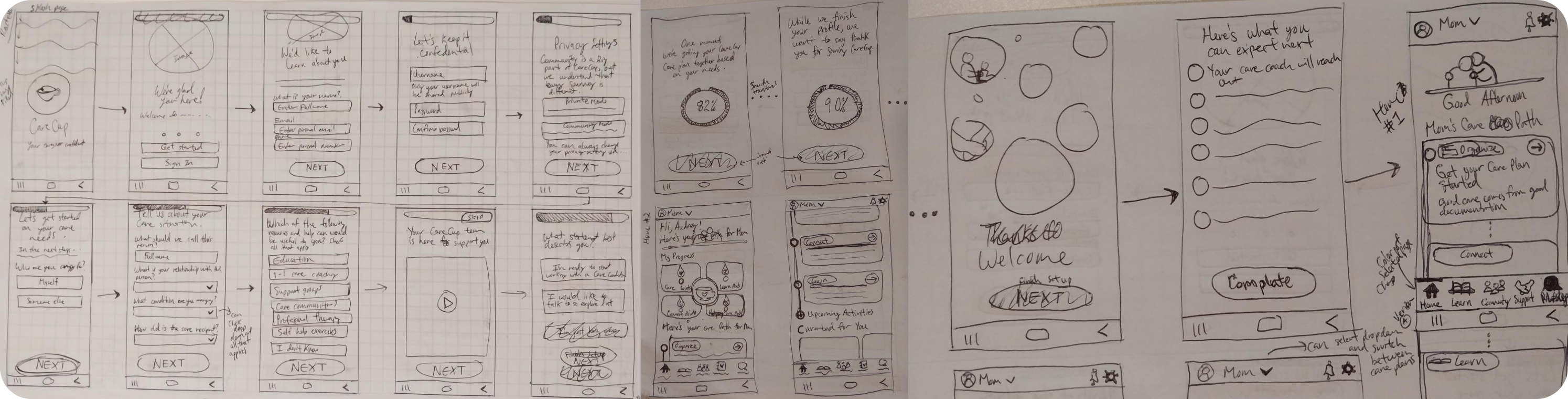
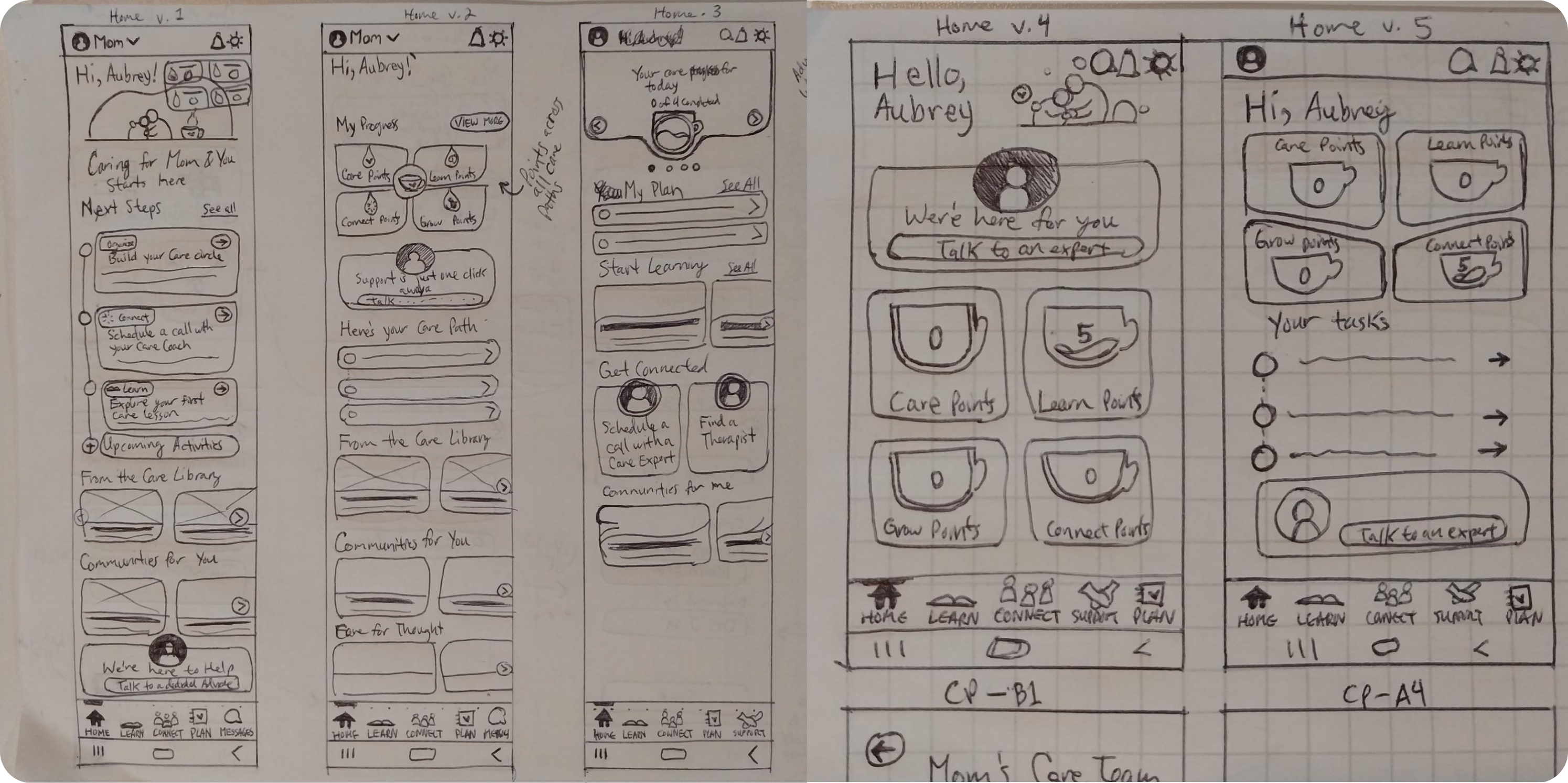
2. Home Screen Sketches
I iterated on several versions to test how caregivers might engage with content, resources, and progress tracking. The final direction streamlined the design into actionable steps.
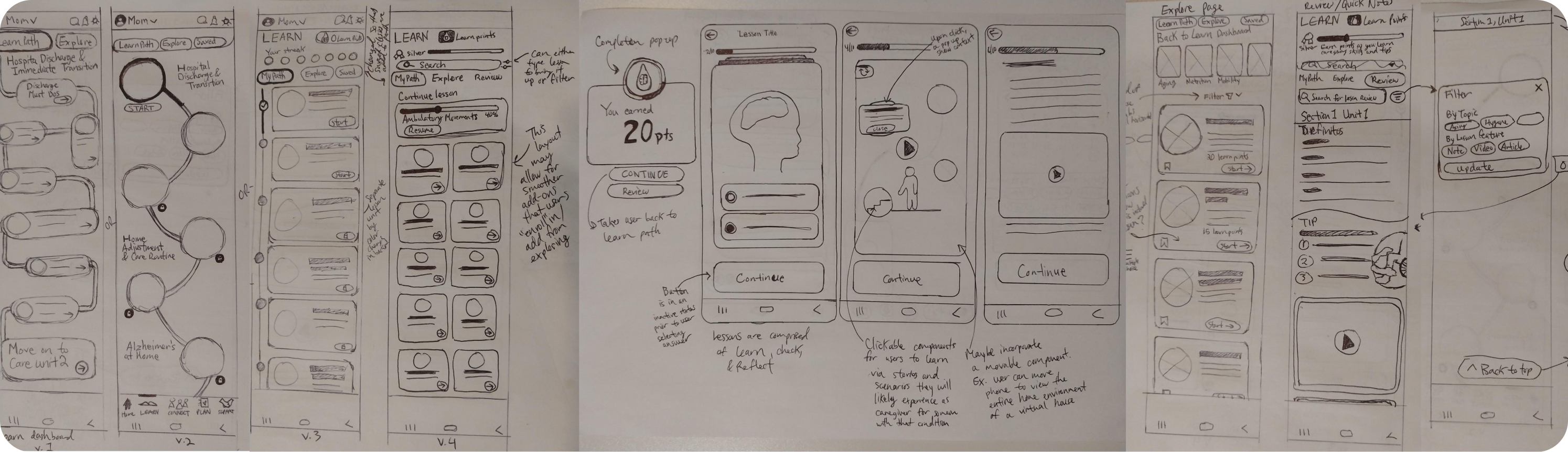
3. Learn Path Sketches
Comparing linear versus flexible learning structures highlighted the importance of balancing guidance with user autonomy.
4. Expert Flow Sketches
Integrating options for live chat, scheduled calls, and expert profiles with ratings to build trust and empower caregivers.

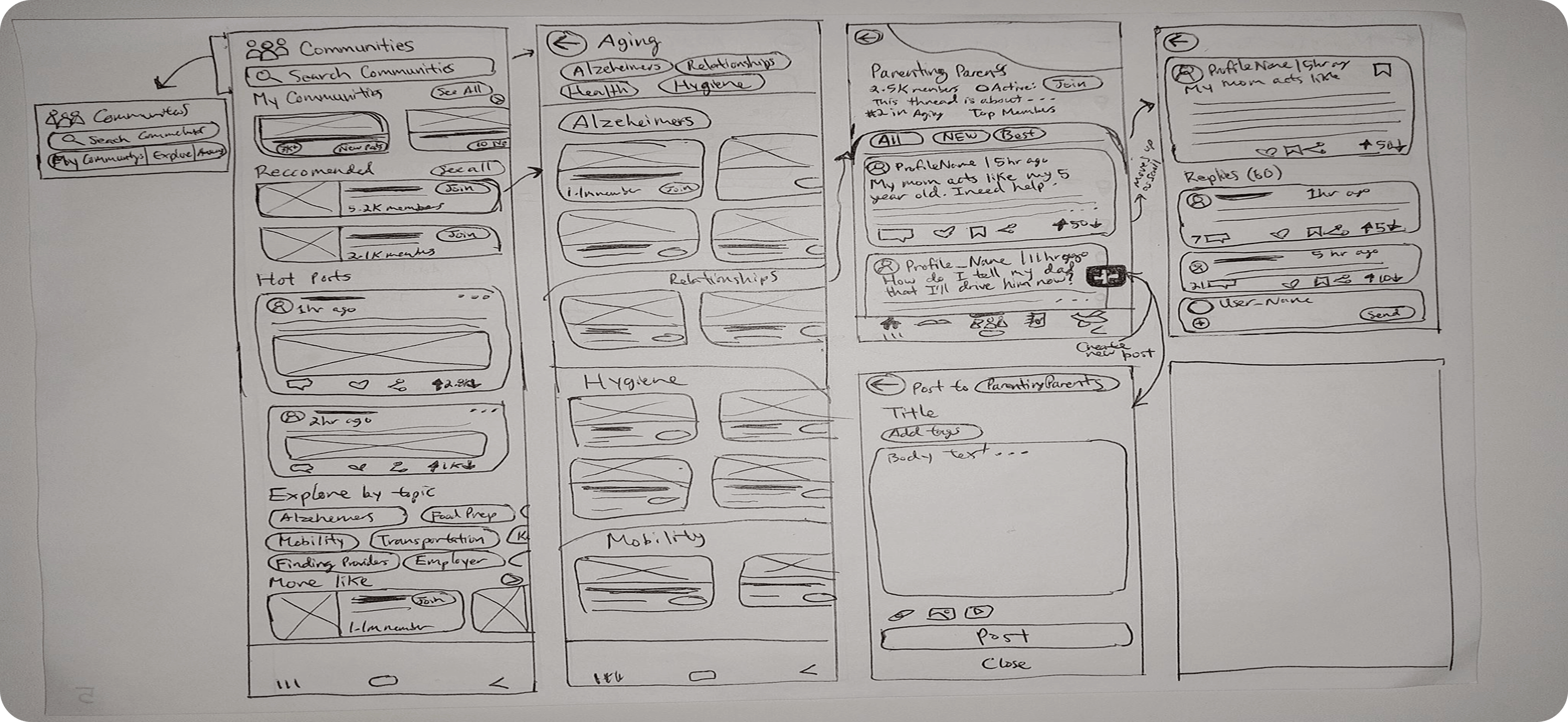
5. Community Flow Sketches
Threaded post views and quick reply options make conversations feel natural, supporting different caregiver needs.
From wireframes to guided flows
I translated concepts into early experience flows, mapping how a caregiver would onboard, start a care path, complete a lesson, and seek help. Low-fidelity wireframes focused on clarity rather than aesthetics.
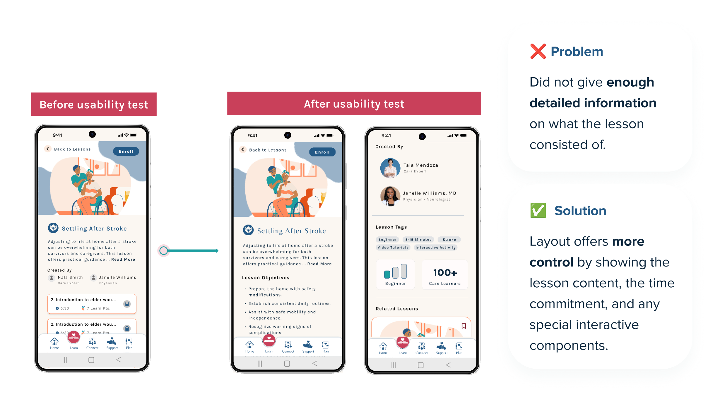
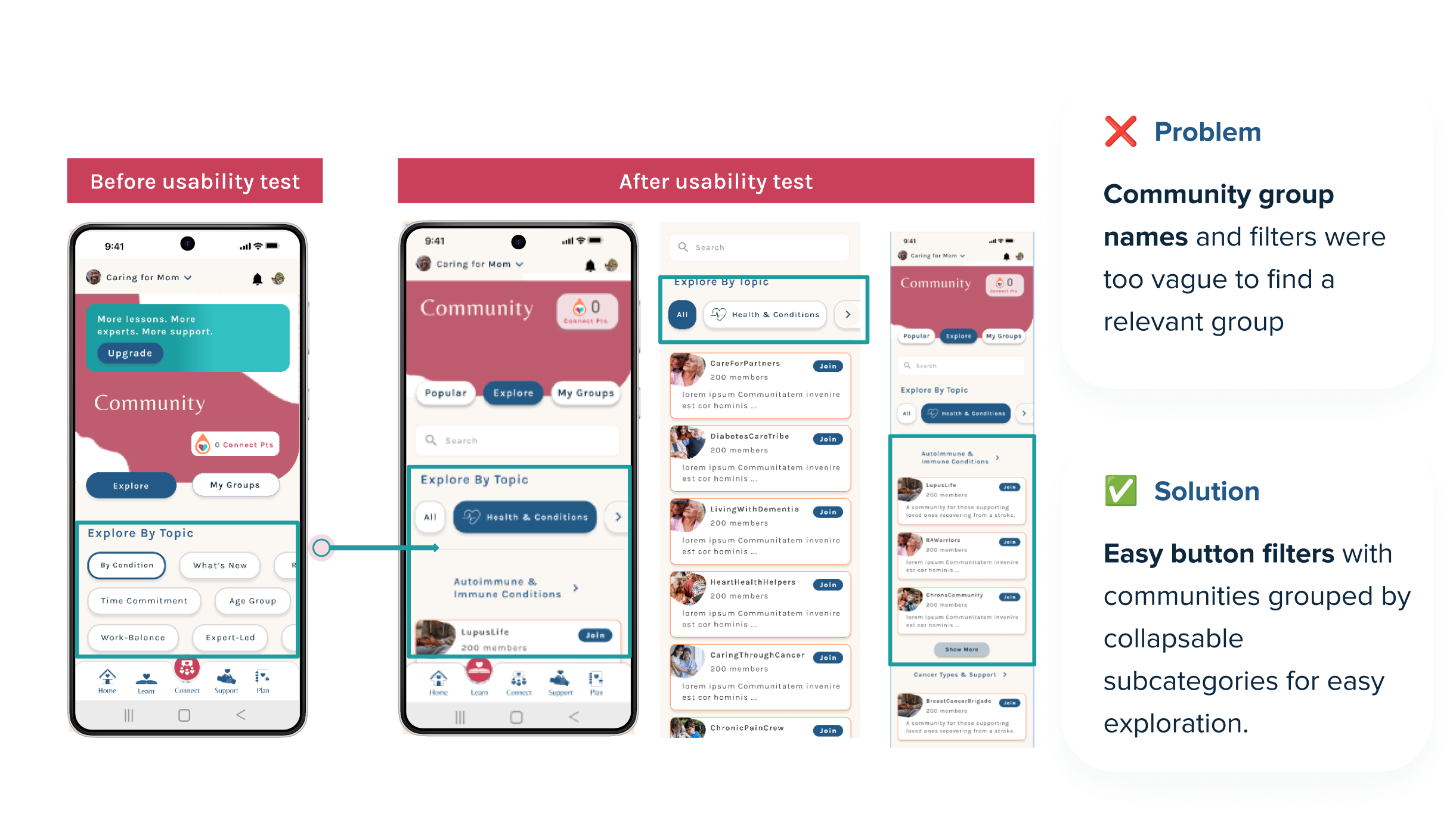
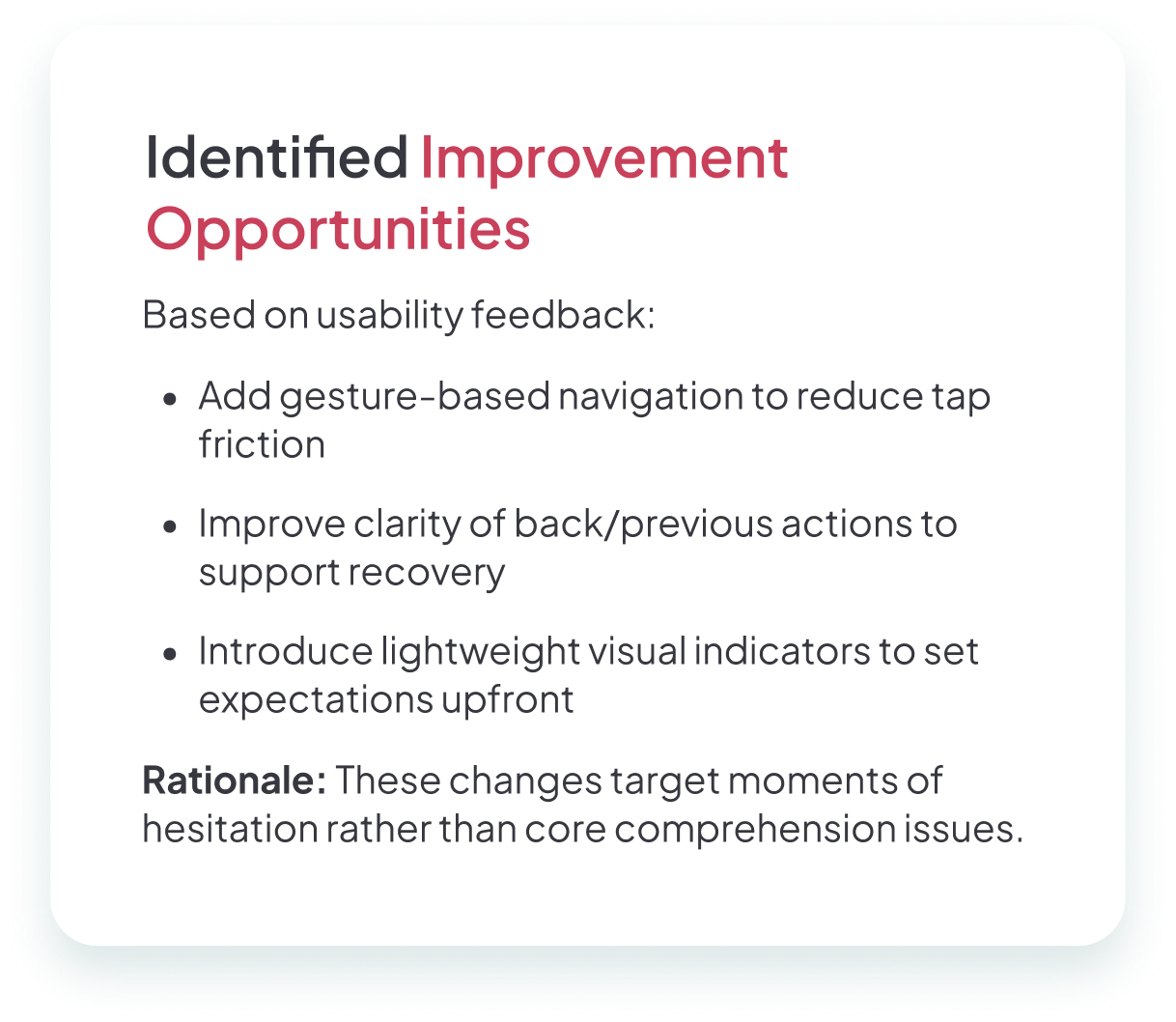
Testing revealed that while caregivers appreciated the simplicity, several areas lacked guidance: lesson overviews didn't provide enough context, support options felt vague, and community groups were difficult to navigate.
Onboarding
Gentle illustrations and short statements to gradually welcome users.
Home Screen
Active care paths, daily progress, and clear entry points for help.
Lesson Modules
Progress indicators and uplifting microcopy like "You're doing great."
Gamified Elements
Progress rings, streaks, and light animations for a sense of growth.
Warm, reassuring, and empowering
After building foundational wireframes, I moved into high-fidelity design to shape CareCup's visual identity, emotional tone, and interactive feel—directly addressing the stress, isolation, and uncertainty caregivers described.
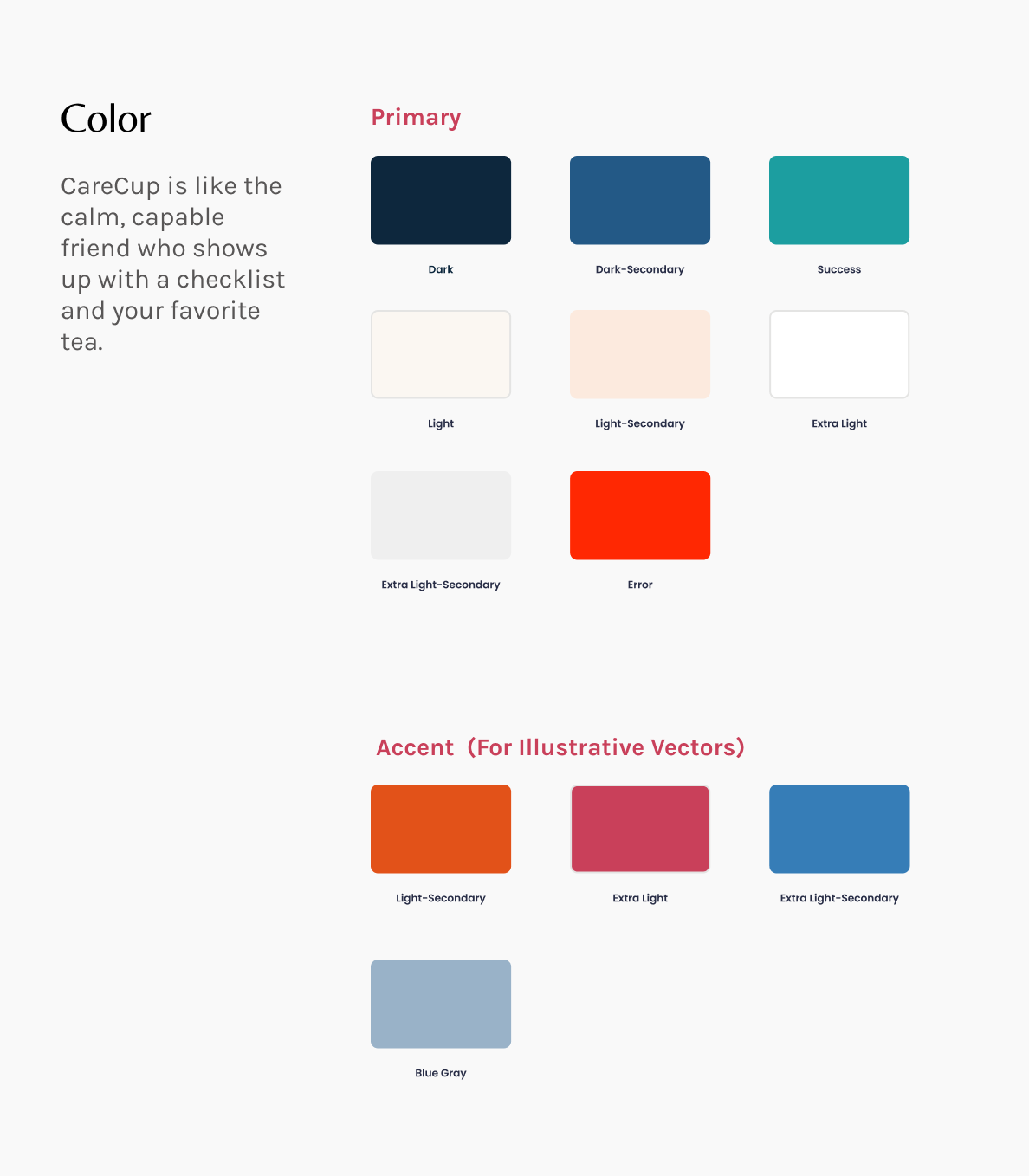
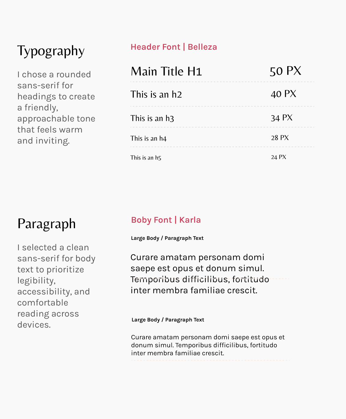
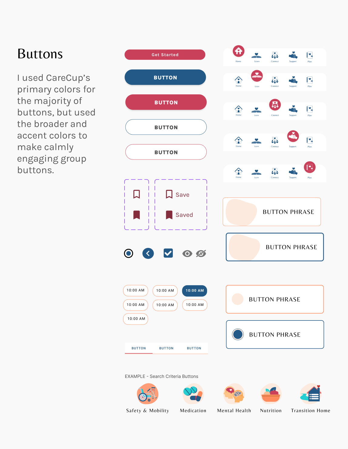
Color & Typography
A soft, welcoming palette rooted in calming blues and energizing corals, supported by neutral backgrounds for readability. The typography paired a friendly sans-serif for headers with a clean, accessible body font.
Micro Interactions
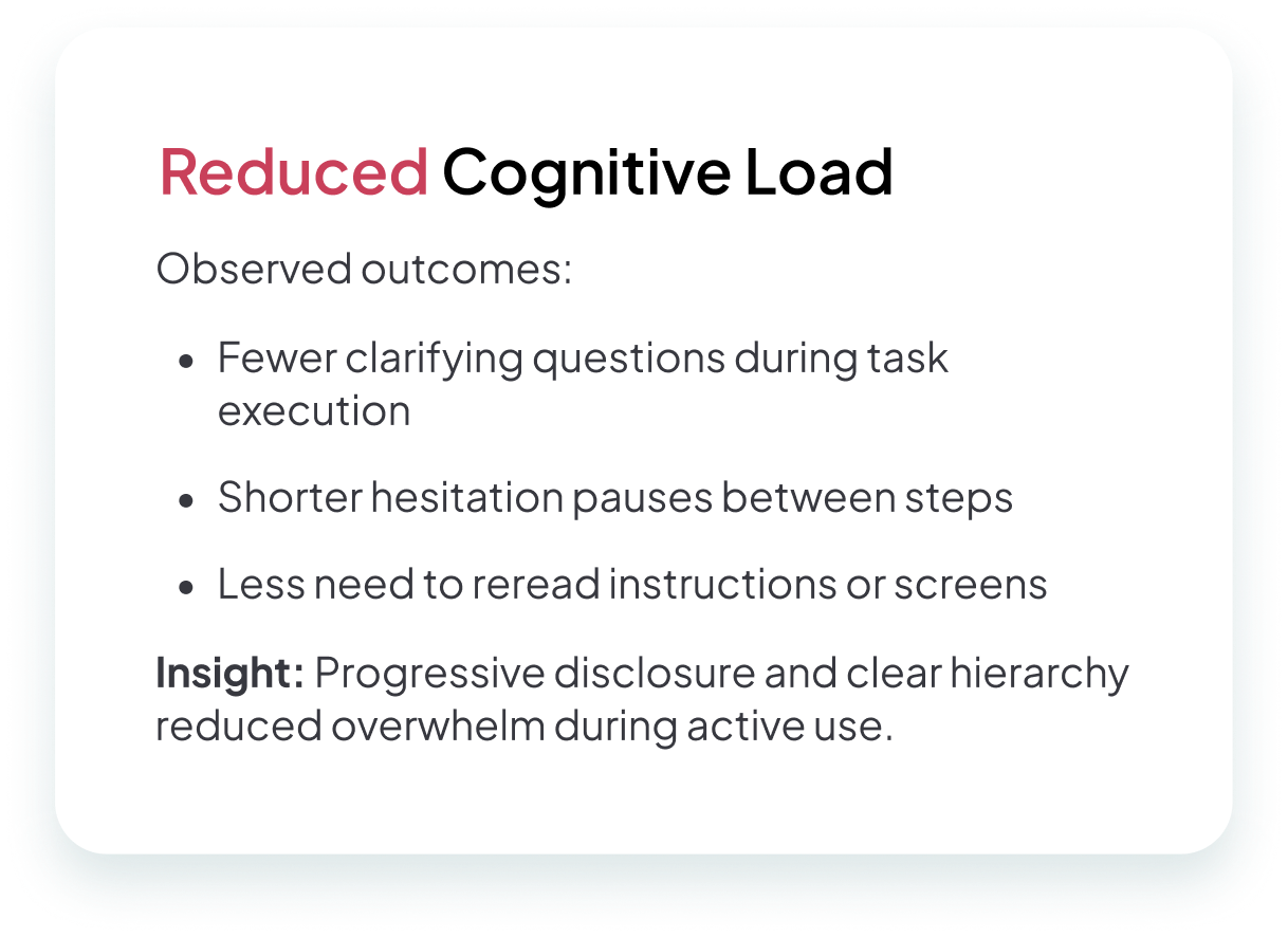
Every visual decision was made to reduce cognitive load while strengthening emotional connection. Rounded shapes, generous spacing, and intuitive hierarchy helped the interface feel like an ally. Micro-interactions—such as gentle confetti after completing a lesson—encouraged progress through celebration rather than pressure.
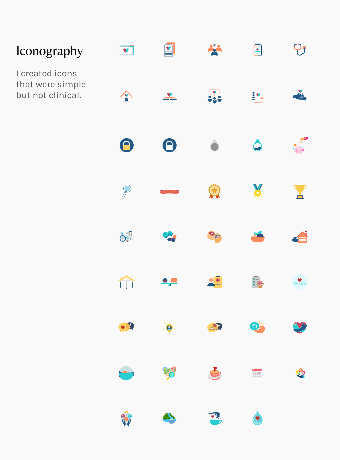
Humanizing the experience with custom illustration
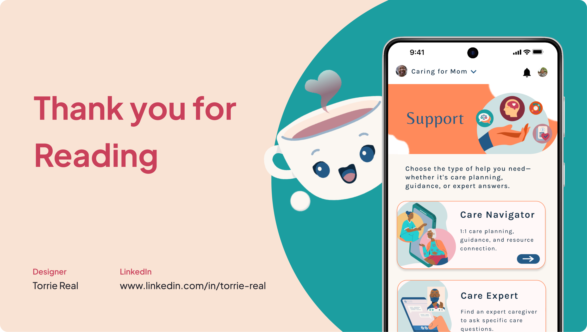
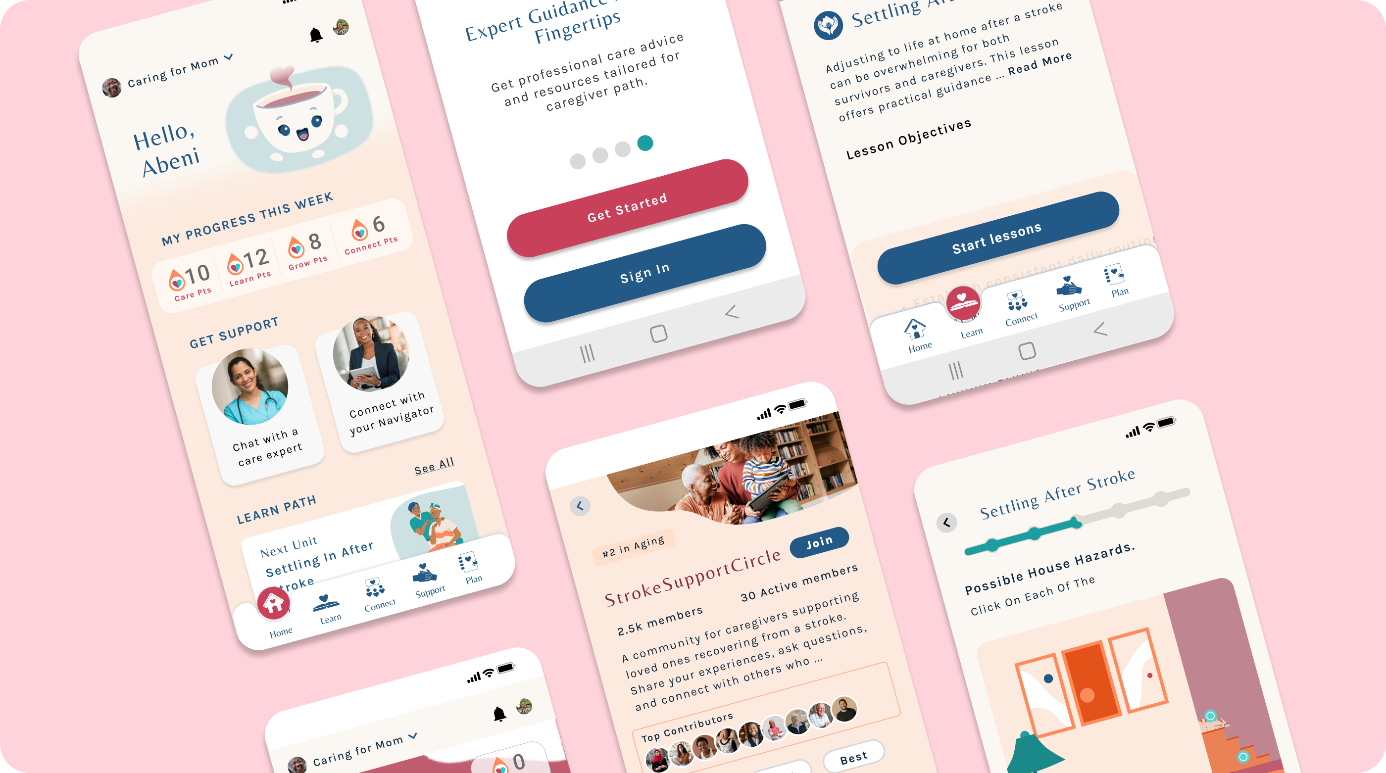
I introduced Cuppy, a smiling cup-shaped mascot who appears at key moments to offer encouragement and acknowledge effort. Cuppy's consistent tone, movement, and personality created a sense of companionship, softening clinical content and making the app feel more supportive.
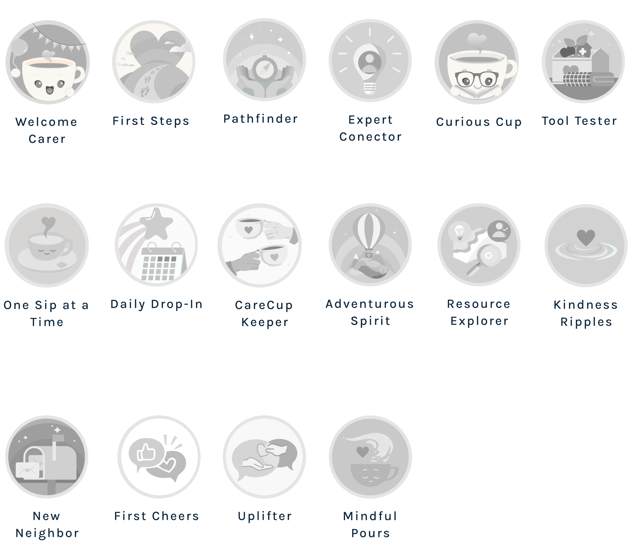
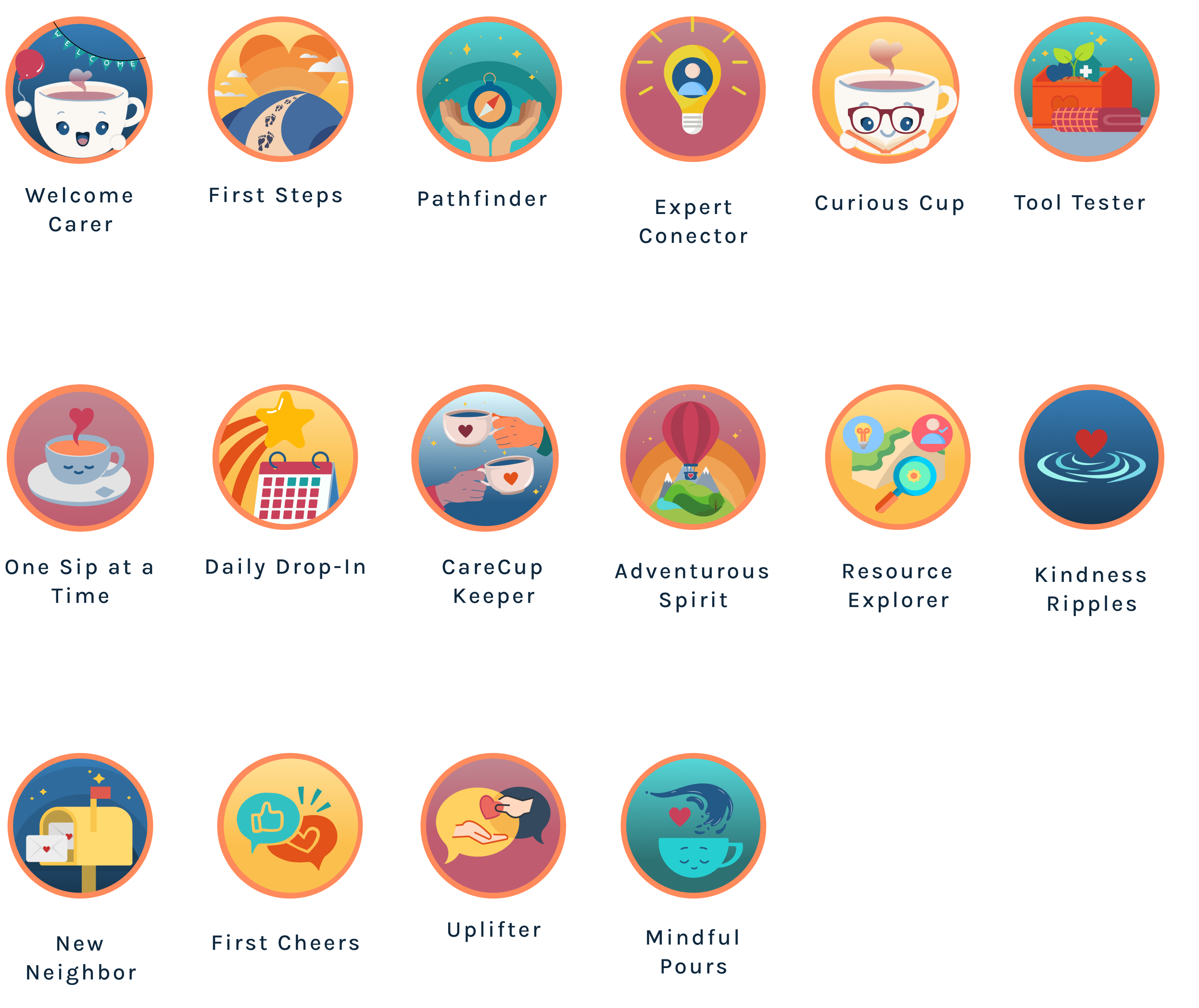
Custom vectors and badges extended this emotional layer, recognizing caregiving as meaningful work worthy of affirmation.

Two rounds of progressive refinement
- Caregivers struggled to understand lesson scope
- Skipped unclear features
- Felt unsure about where to ask for help
- Simplified labels and clarified support roles
- Restructured community categories
- Reflected real caregiver needs in navigation
- Long lessons caused scrolling fatigue
- Points system felt disconnected
- Community spaces lacked direction
- Users wanted expert credential transparency
- Broke lessons into shorter sections
- Connected rewards to meaningful milestones
- Added guided prompts in community spaces
- Surfaced expert credentials and response times

The complete CareCup experience
The final prototype demonstrates that caregiving tools can be both functional and compassionate—reducing overwhelm while building confidence.
Onboarding + Home Screens
Care Learn Module Screens
Expert Connect Screens
Community Screens
Functional and compassionate
User Experience Feedback
"I wish we'd had CareCup when my dad came home after his stroke—it would have made those first weeks so much less overwhelming."
"This would've saved me countless hours searching for foot care during my aunt's transition home."
"I'd love to have a real expert to talk to who understands me."
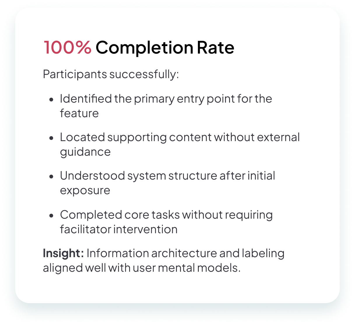
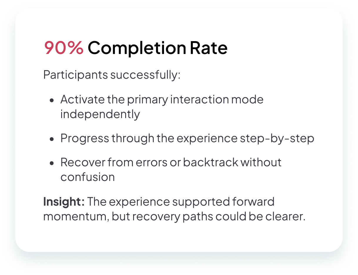
Users could complete core tasks without assistance, understood where to find help, and felt emotionally supported by the tone of the product.
Designing for caregivers means designing for humanity
CareCup taught me to pay attention not just to clicks, but to emotions. A moment of relief or recognition often revealed more than any task metric. I also learned that simplicity can still be powerful—the most meaningful improvements removed friction while honoring caregivers' time, energy, and dignity.
Designing for both professional and family caregivers deepened my understanding of inclusive design. Each group had different responsibilities, but both needed reassurance and clarity.
CareCup changed how I approach every project. Empathy is now the starting point, not an add-on. The best digital experiences don't just help people complete tasks—they help people feel capable, supported, and seen.