Designing a scalable pregnancy education experience for employer partners
I led the design of BenefitBump's pregnancy education course to address a growing gap between the support expecting employees needed and how pregnancy benefits were actually experienced in practice. Working closely with care navigators, operations, and leadership, I was intentional about how the course fit within BenefitBump's broader service model and employer partnerships.
The result was a structured, supportive education experience that builds confidence early, reduces fragmentation, and scales alongside the company's evolving family benefits strategy.
A scalable education experience for expecting parents
As someone with a background in maternal health and healthcare accessibility, I've long believed that pregnancy education should feel both practical and comforting. At BenefitBump, I had the opportunity to design a new set of self-paced pregnancy classes—a project born out of two urgent needs.
First, care navigators were consistently reporting that expecting parents lacked a trusted, centralized source of education, and call logs revealed a recurring pattern of questions. Second, the broader market was shifting: while insurers were scaling back direct pregnancy support, consumer demand for virtual classes was rising.
This created a clear gap—and an opportunity for us to fill it.
A gap between what expecting employees needed and what they received

The goal was to design a scalable pregnancy education experience that enables BenefitBump and its employer partners to deliver trusted, consistent guidance to expecting employees quickly and confidently.
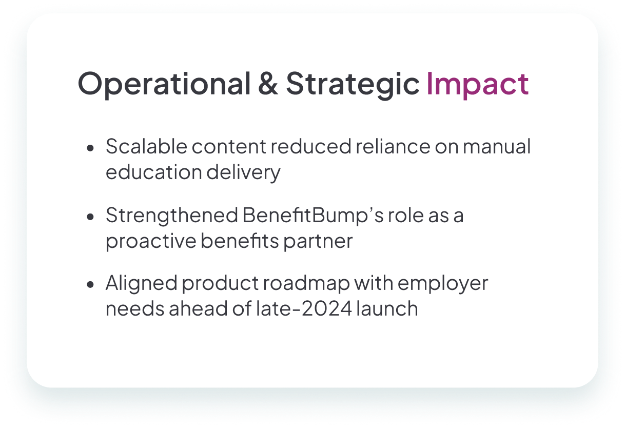
Reduce reliance on 1:1
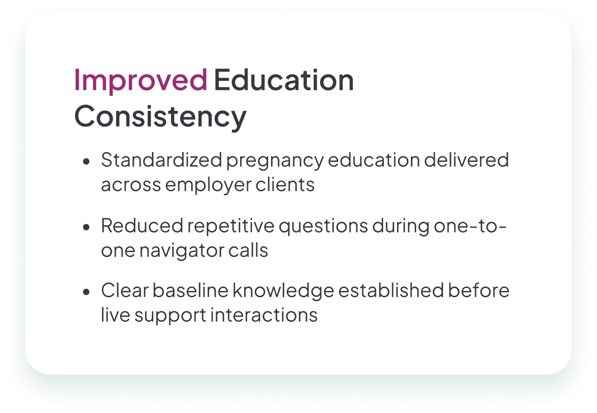
Standardize education for common questions so navigators can focus on complex needs.
Consistent across workforces
Deliver the same trusted guidance regardless of employer size or industry.
Reinforce benefits strategy
Connect education directly to employer benefits positioning.
Minimize overwhelm
Support employees during a high-stress life stage without adding complexity.
Partnering with those who knew participants best
Instead of direct user interviews, I partnered closely with those who knew our participants best: care navigators and their managers.
What experience should participants walk away with?
Navigators described wanting parents to feel informed and reassured—not overwhelmed by clinical language or benefit complexity.
What content is essential, and how should it be embedded?
Call log analysis revealed recurring question patterns around trimester milestones, benefits navigation, and postpartum transitions.
How do we design for conversion back to care navigators?
The course needed to complement—not replace—the navigator relationship, driving users back to expert human support.
Industry research and client vendor data also pointed to a trend: major insurers were moving toward virtual classes, but not always with a supportive, user-centered lens. That gap reinforced our mission—to create not just content, but a guided, empathetic experience.
Three guiding principles shaped the pregnancy classes
Once the scope was clear, I built a detailed project plan including timeline, deliverables, and cross-functional ownership. To set us up for repeatable success, I also created a template digital course preparation document, which later became the foundation for future product builds.
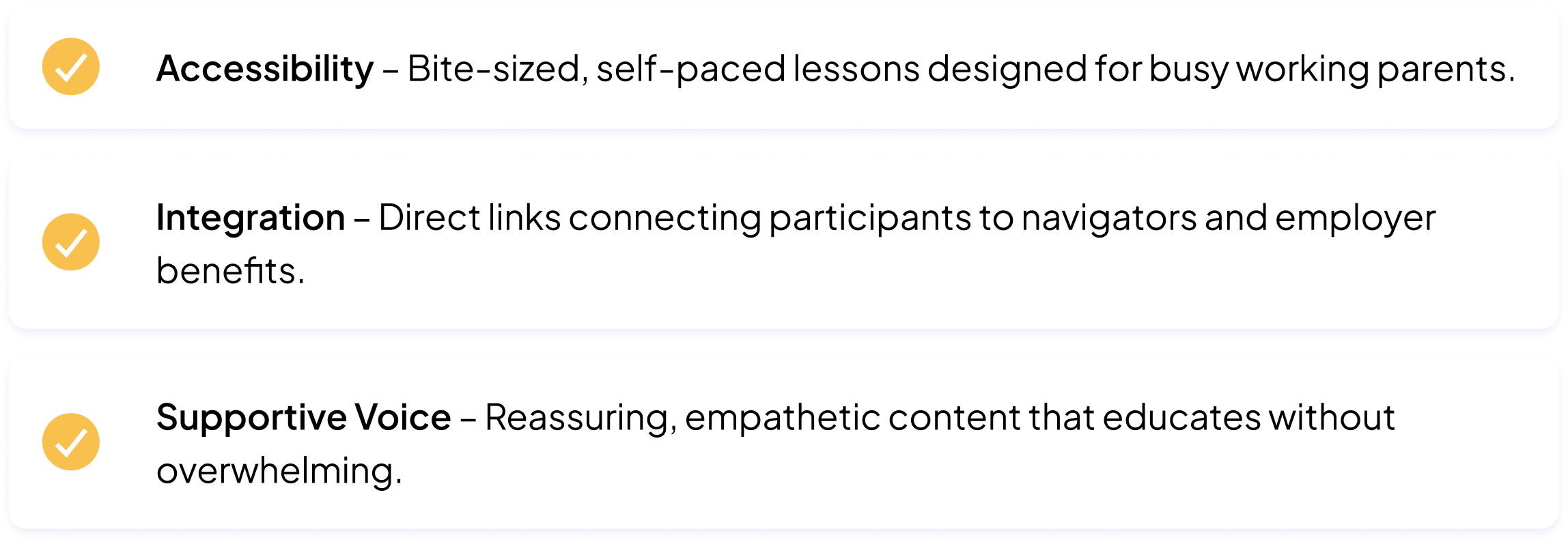
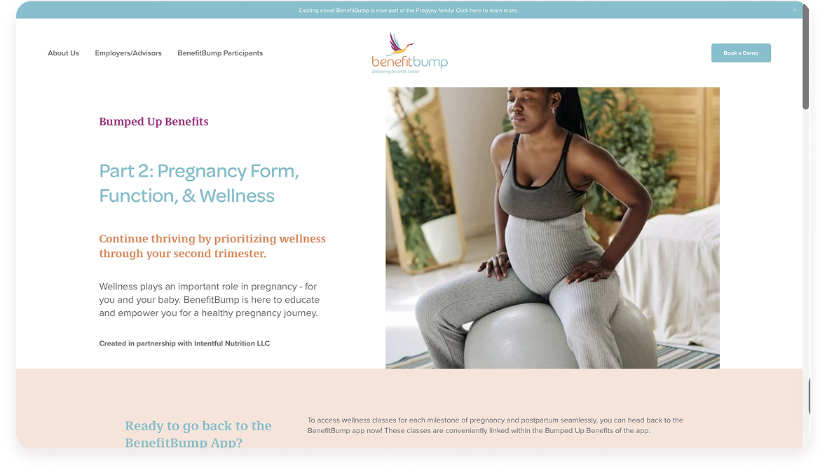
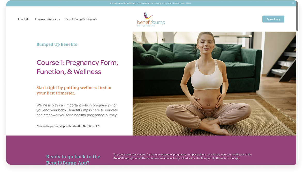
Warm, structured, and easy to navigate
Using the brand guide as a foundation, I leaned into soft, calming colors and modern, legible typography. Subtle accents reflected themes of family and growth.
I designed a card-based layout with generous spacing, allowing parents to focus on one idea at a time. Each section flowed naturally, mirroring the rhythm of pregnancy.
Lessons were broken into scannable sections with consistent buttons and interactive elements. High contrast ensured readability on all devices.
From the first screen, the course avoided a clinical tone. Instead, it welcomed parents into a space that felt professional yet personal.
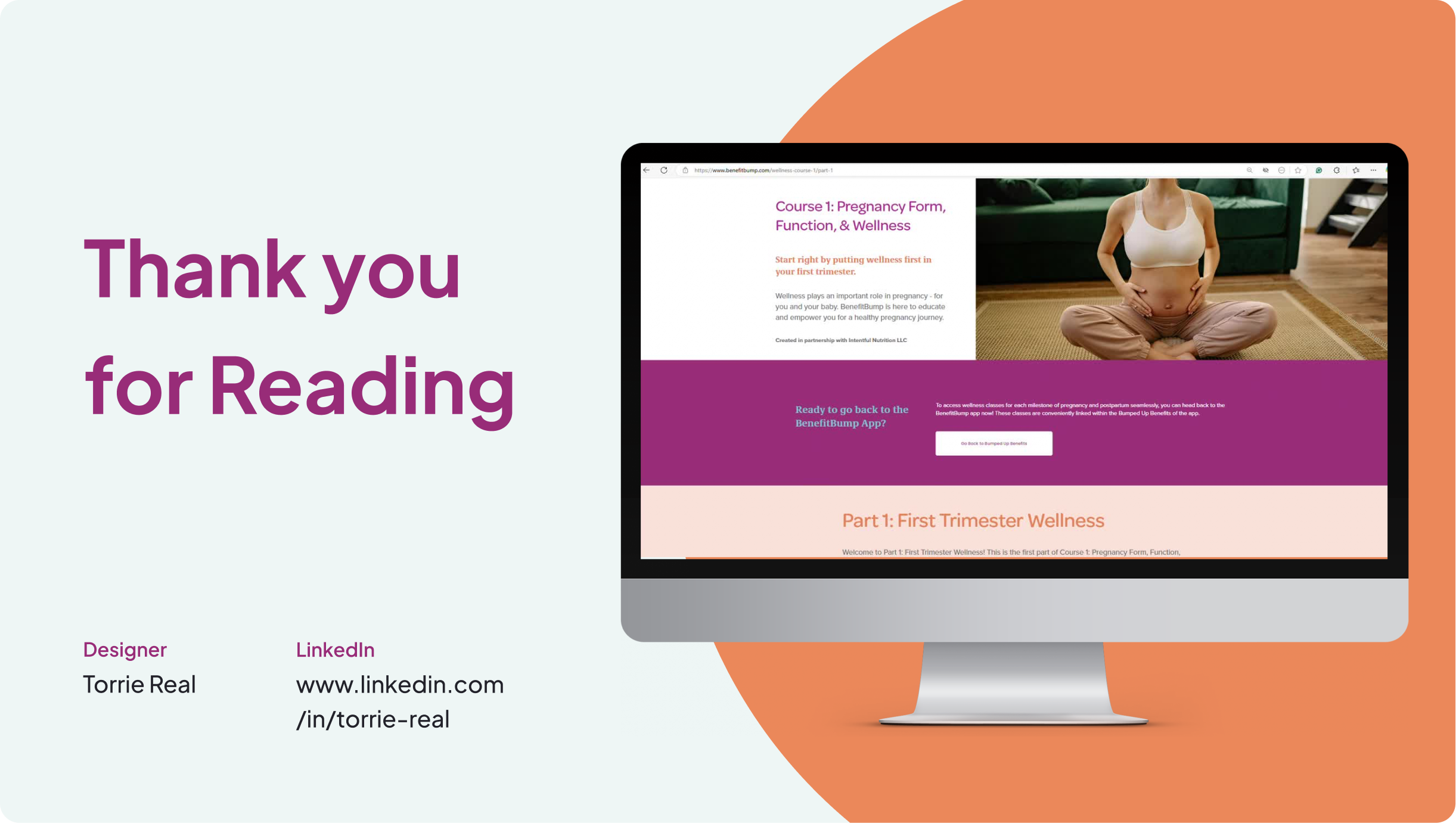
Platform integration and conversion design
One of the project's unique challenges was platform integration. As a startup, our app was evolving rapidly. After weighing accessibility and iteration needs, I proposed housing the classes on a web format while embedding them into the app.
Custom Thumbnails
I designed custom thumbnails for each course module that visually signaled progression through the pregnancy journey.
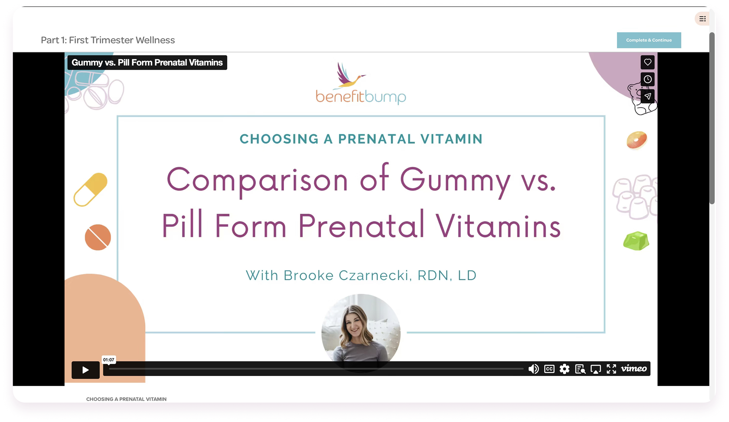
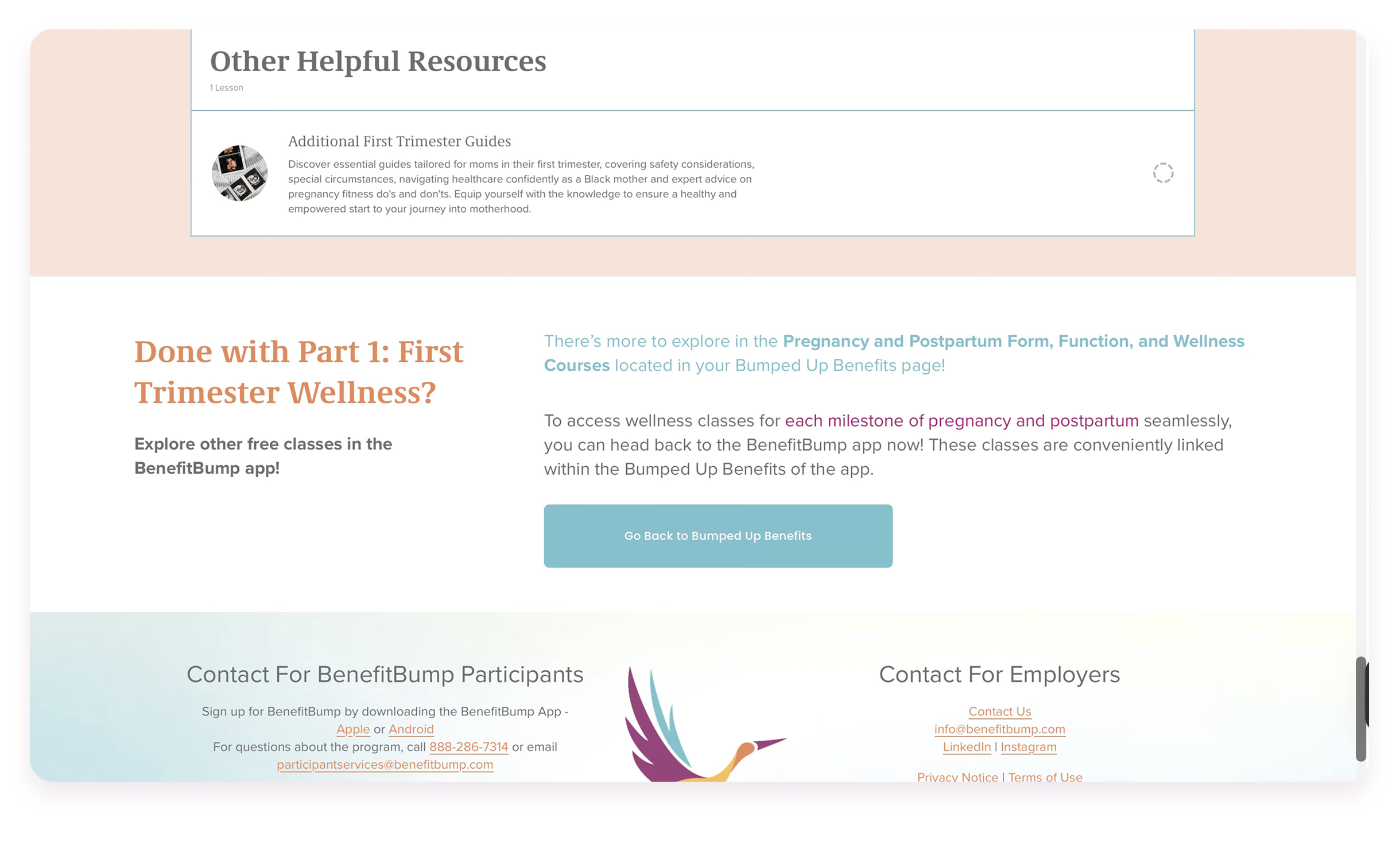
Directing Users Through Embedded Links
I embedded direct links back to the app throughout the course—nudging participants to schedule navigator calls or access benefits.
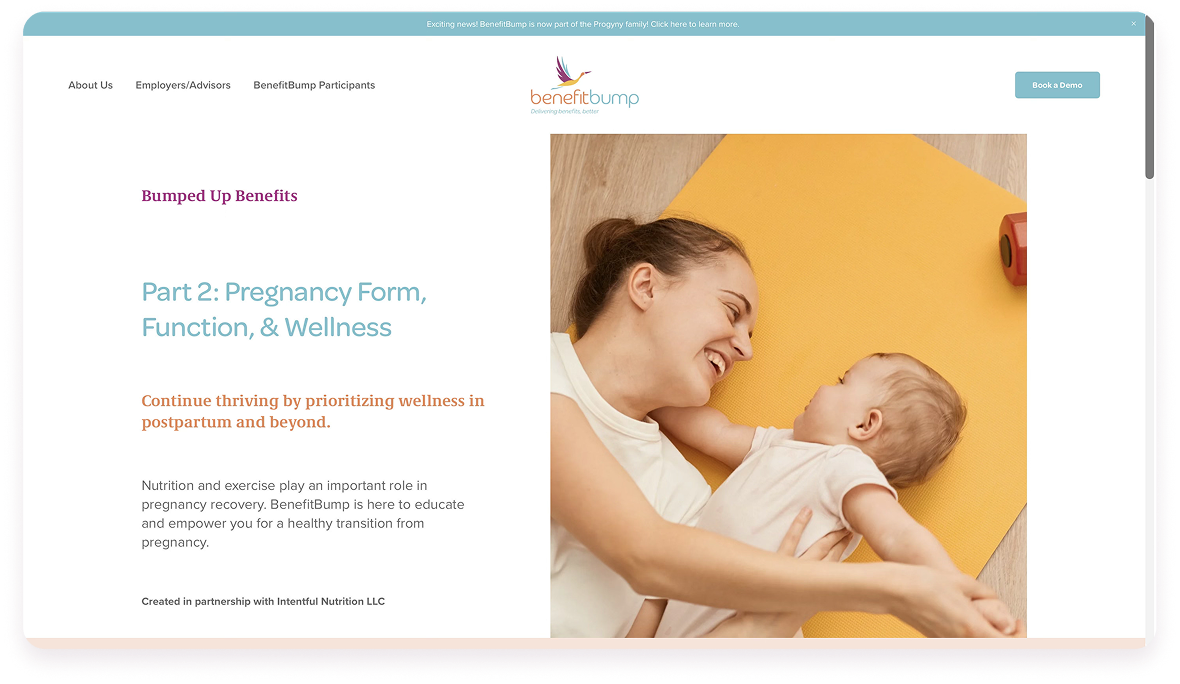
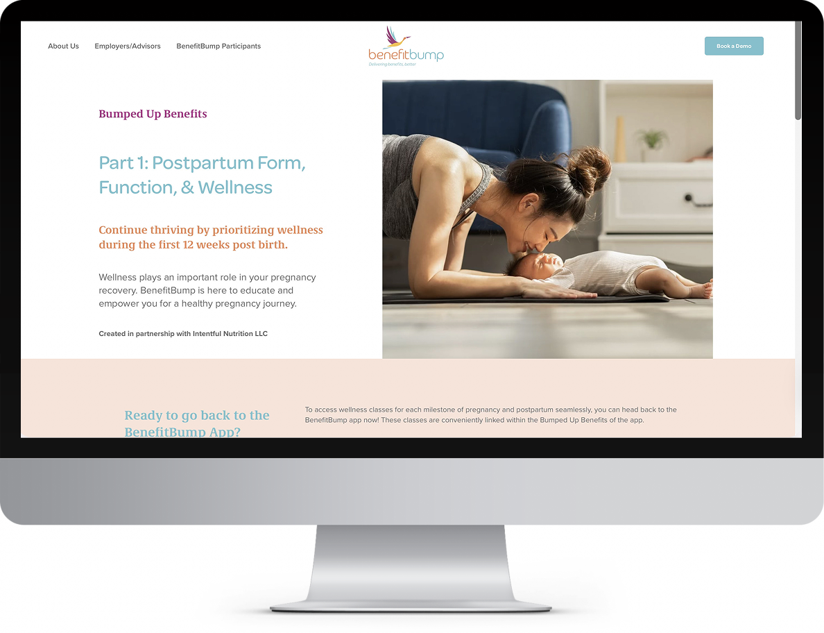
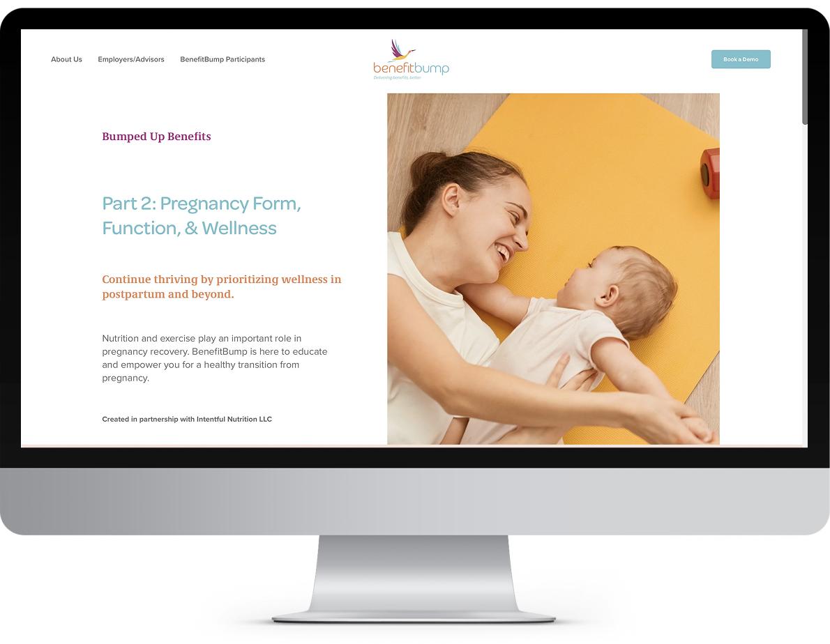
Five modules spanning pregnancy through postpartum
Partum Education
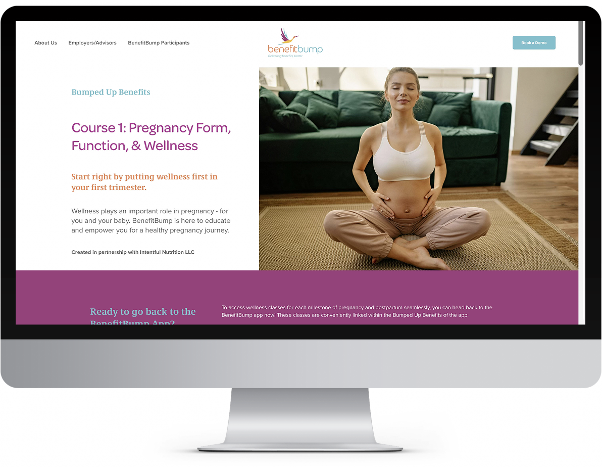
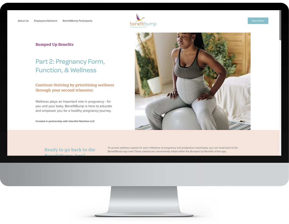
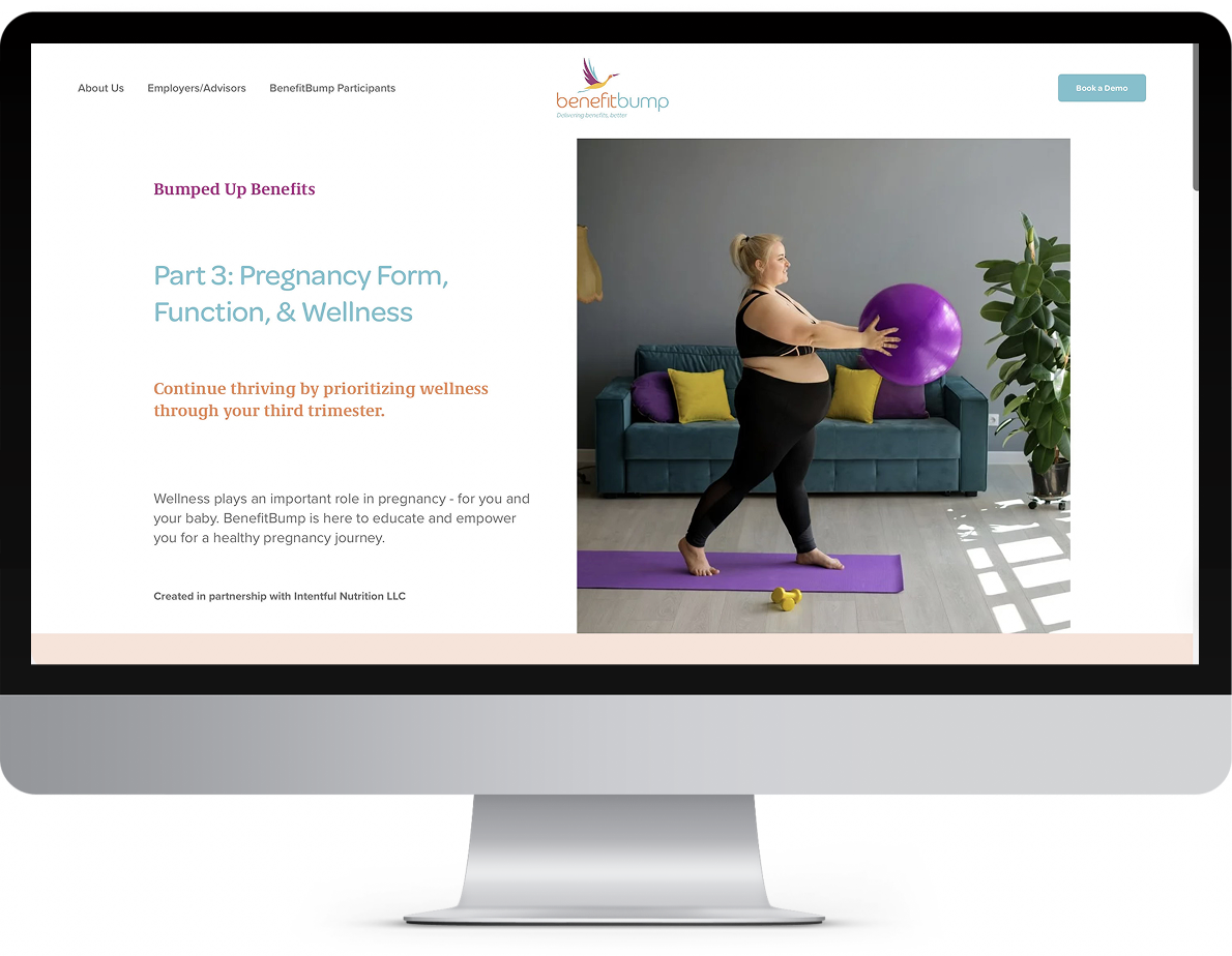
Postpartum Education
Communicating to companies and employees
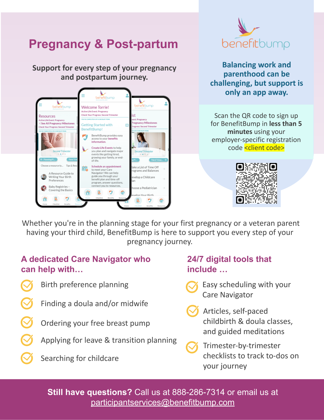
I created flyers that were printed or sent via email to our client companies' HR leadership and to employees via their care navigators.

More than a digital class—a guided, supportive journey
The final product became more than a digital class. It was a guided, supportive journey that parents could trust.
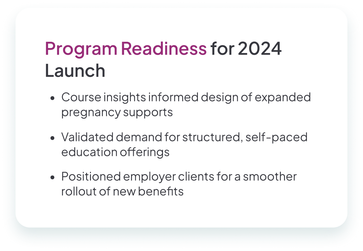
3% longer enrollment
Participants in the pregnancy life event spent on average 3% longer enrolled across clients.
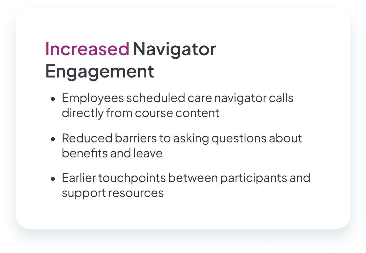
Navigator conversion
Embedded links drove navigator orientation calls, fulfilling a core product goal.
Strong adoption
Clients with predominantly women employees showed especially strong engagement.
Scalable foundation
The course template became the foundation for future product builds.
User needs don't always come directly from users
This project reinforced a key lesson for me as a designer: user needs don't always come directly from users. By working closely with care navigators and analyzing industry trends, I was able to translate indirect feedback into an experience that was both empathetic and impactful.
It also showed me how to thrive in a fast-paced startup environment—balancing user-centered design, business strategy, and product constraints to deliver a solution that felt both meaningful and scalable.