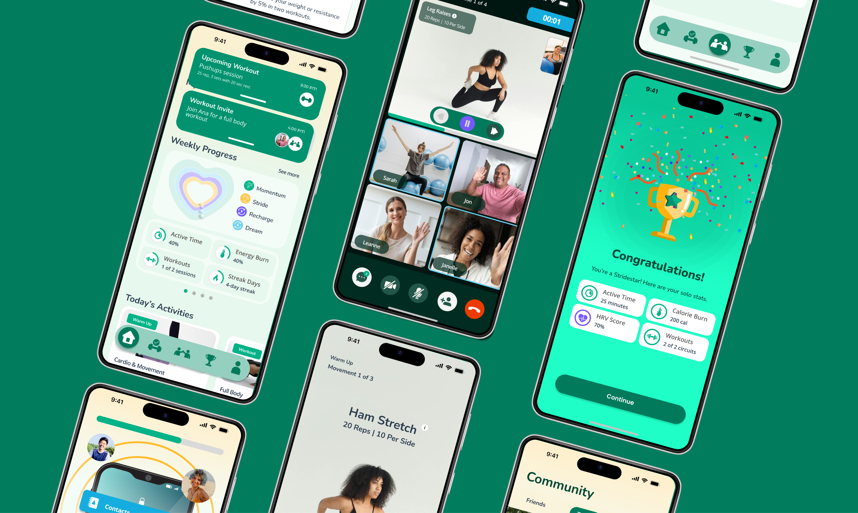
A fitness experience designed for consistency without pressure
StrideWell is a fitness experience designed to support consistency without pressure. The goal was to make it easy to return after missed days while using community and group goals to encourage motivation. As the sole designer, I created a fitness experience framed as supportive, shared, and sustainable over time.
Reframing fitness as a shared experience rather than a solo obligation
Stridewell began as a capstone project based on a scenario describing a mature fitness app struggling with retention. The original brief focused on adding messaging features to increase engagement. However, as I moved into research, it became clear that messaging alone would not solve the problem. Users weren't disengaging due to a lack of communication tools—they were disengaging because existing fitness systems failed to support them when motivation naturally declined.
This updated version reframes fitness as a shared experience. By embedding messaging, shared workouts, and flexible challenges directly into the core experience, the app replaces short-lived motivation with social momentum.

Refining the problem through research
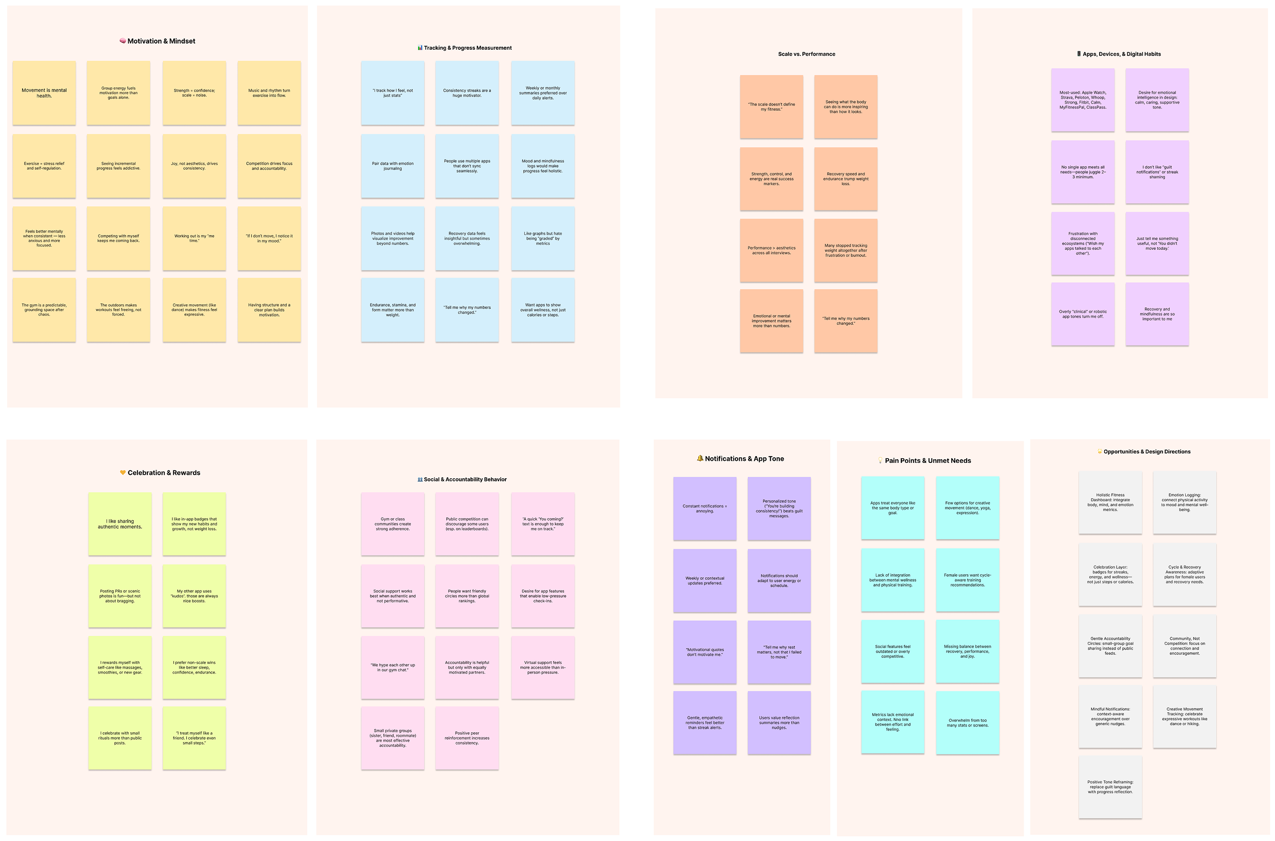
To understand why users disengage, I conducted brief guerrilla qualitative interviews with people at local fitness centers. These conversations focused on emotional experience—how missed days feel, how social features create pressure, and what actually helps people return after disruption.
Accountability matters more than metrics
"I stay motivated when someone's counting on me—it's easier to show up when it's not just about me."
Progress should be felt, not just measured
"I love seeing progress I can feel—like lifting more or breathing easier—not just numbers on a screen."
Social connection fuels consistency
"Celebrating with others is major for me. That's why I do group workouts in the mornings."
Flexibility prevents giving up
"I need to be able to change things as my body needs. I usually give up if I don't."
Mapping Results
A consistent pattern emerged. Motivation was front-loaded and fragile. Users often started strong, but once routines were interrupted, they felt behind. This research challenged a core assumption: the problem was not "how do we motivate users more?" but rather "how do we design a system that supports consistency when motivation fluctuates?"
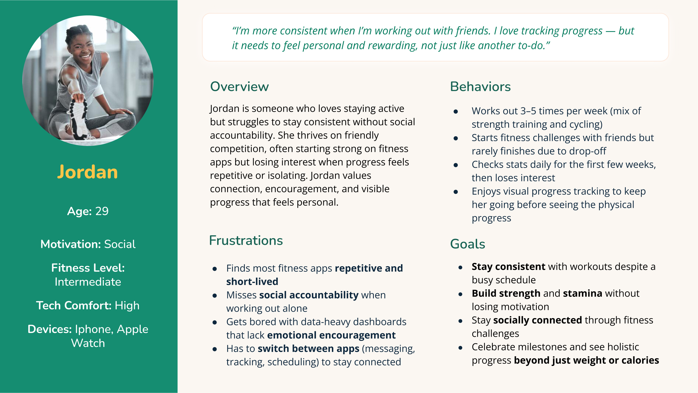
Jordan: Designing for real behavior, not ideal behavior
I created the persona Jordan to represent the most common behavioral pattern: someone who values fitness and social connection but struggles to stay consistent when motivation becomes isolated or routine-driven.
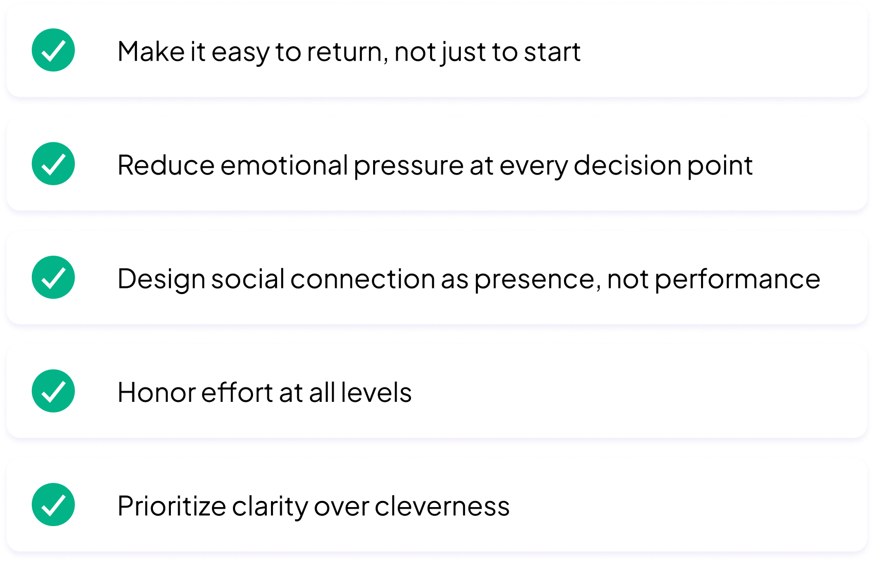
Design principles as constraints
After synthesizing research insights, I established a small set of experience principles that functioned as practical constraints rather than aspirational ideals.
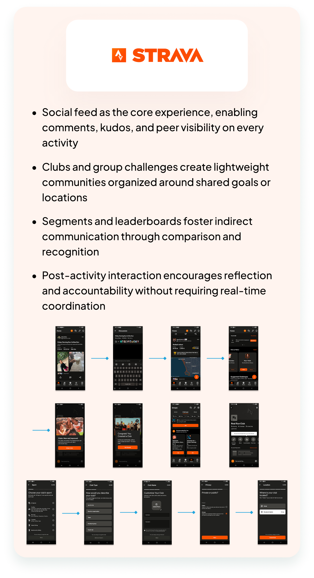
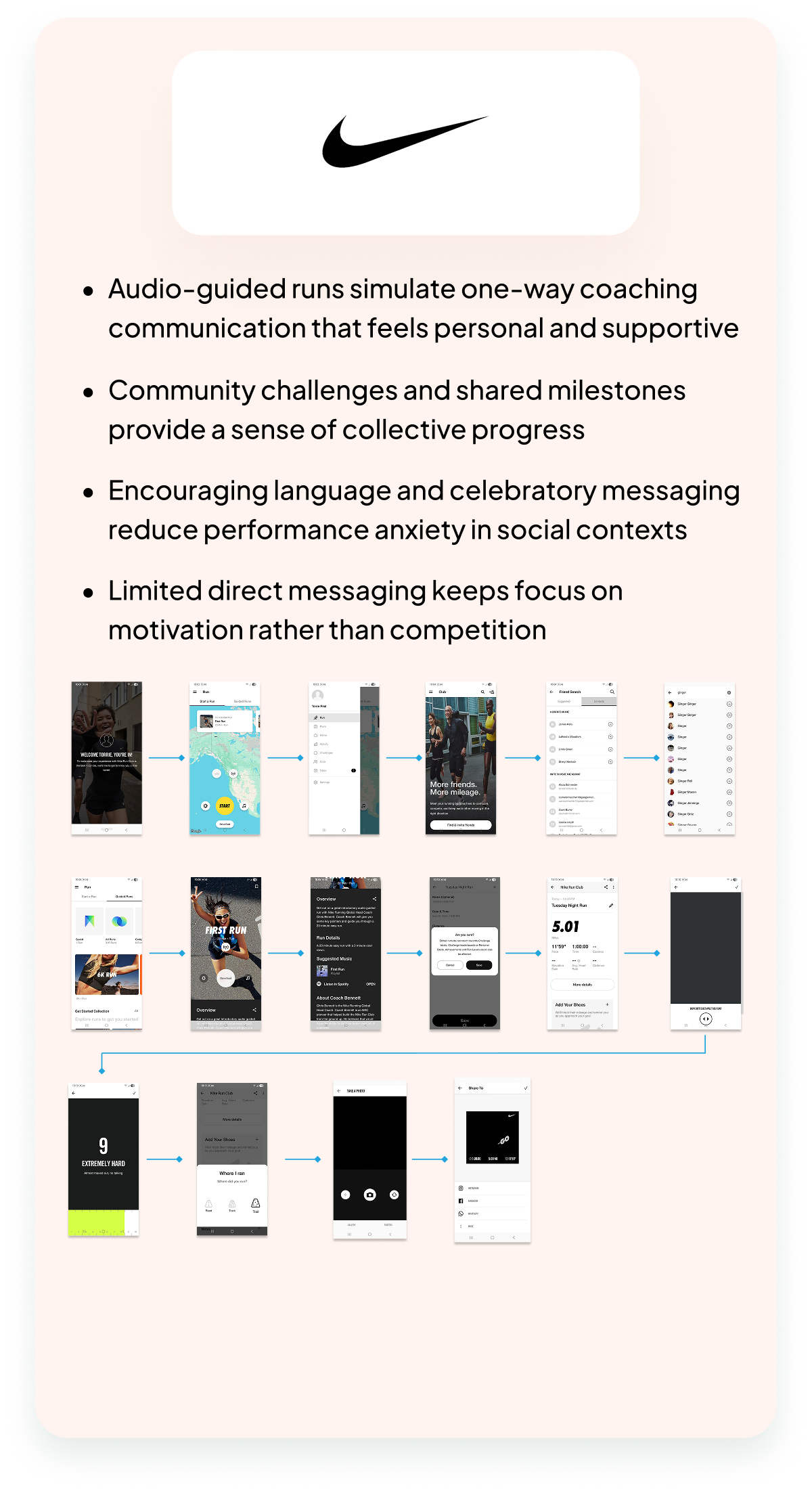
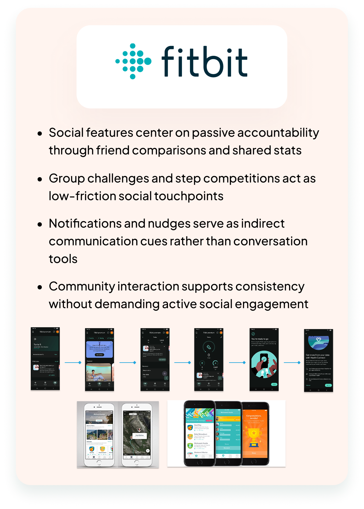
Analyzing Strava, Nike Run Club, Fitbit, and Peloton
I analyzed leading fitness apps across key criteria including community features, motivation systems, coaching support, and message integration.

Creating a connected, forgiving experience loop
I defined Stridewell's core loop as: Open the app → assess energy and intent → choose how to participate → complete movement → receive acknowledgment → feel supported enough to return.
Return after disruption
Make it emotionally easy to come back after a break.
Participation over perfection
Any form of showing up still counts.
Movement as connection
Associate fitness with social support, not pressure.
Recovery as important as activation
Design for the low-motivation moments, not just peak energy.
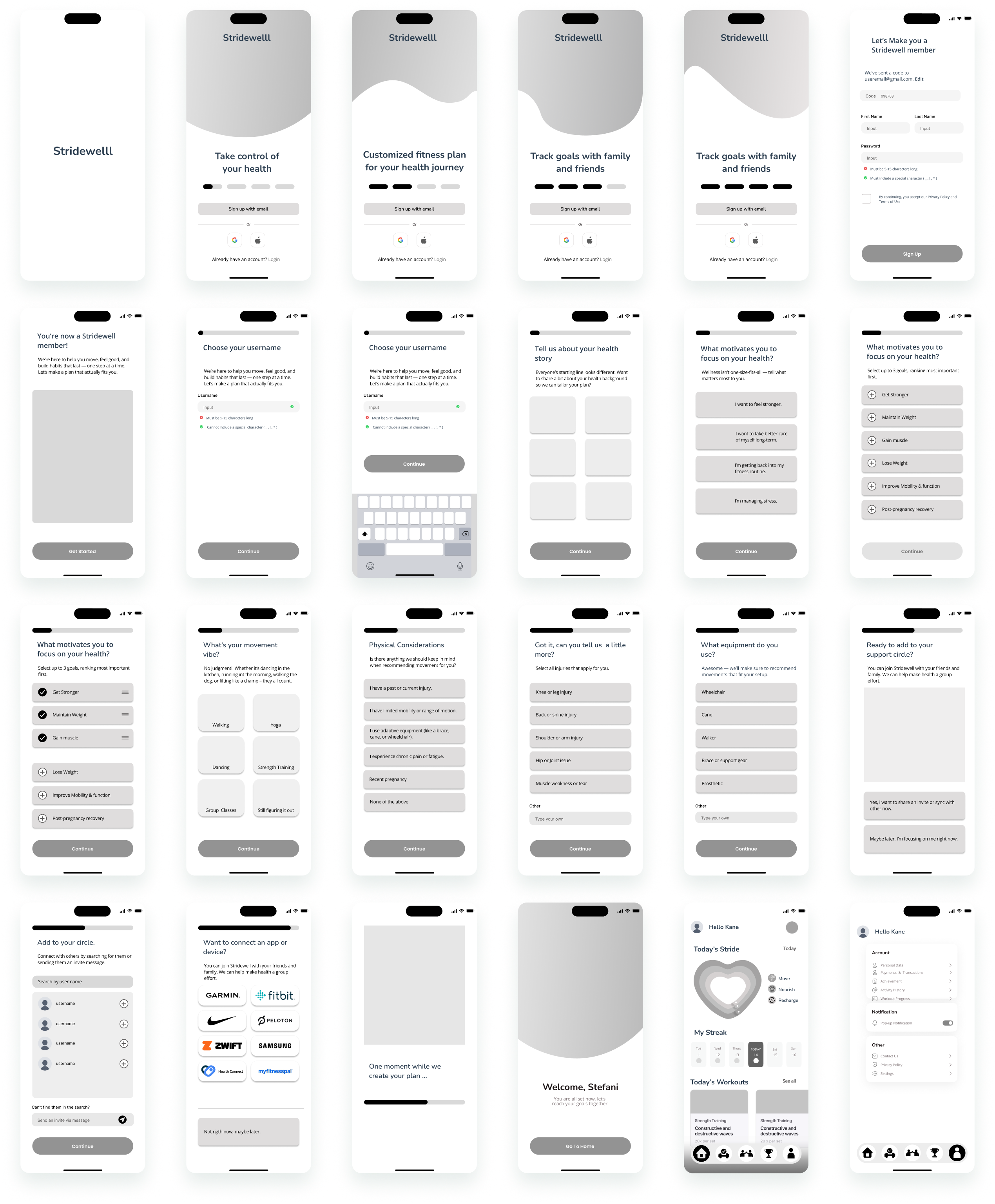
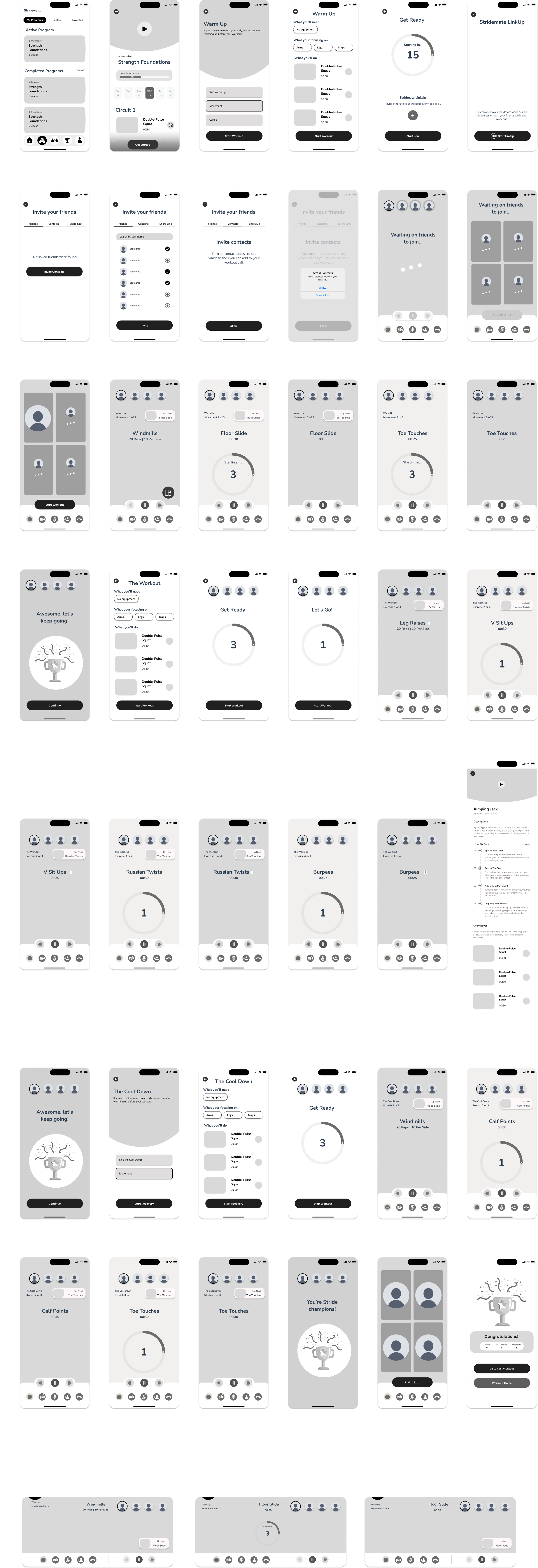
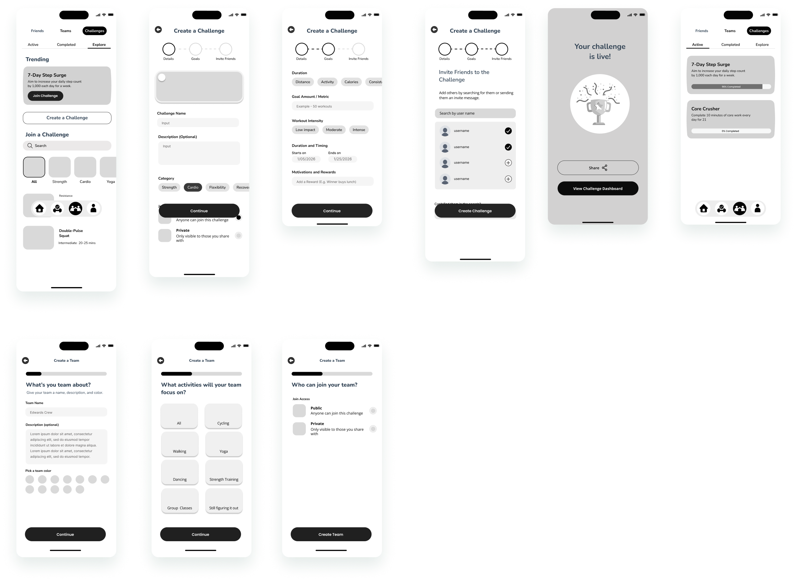
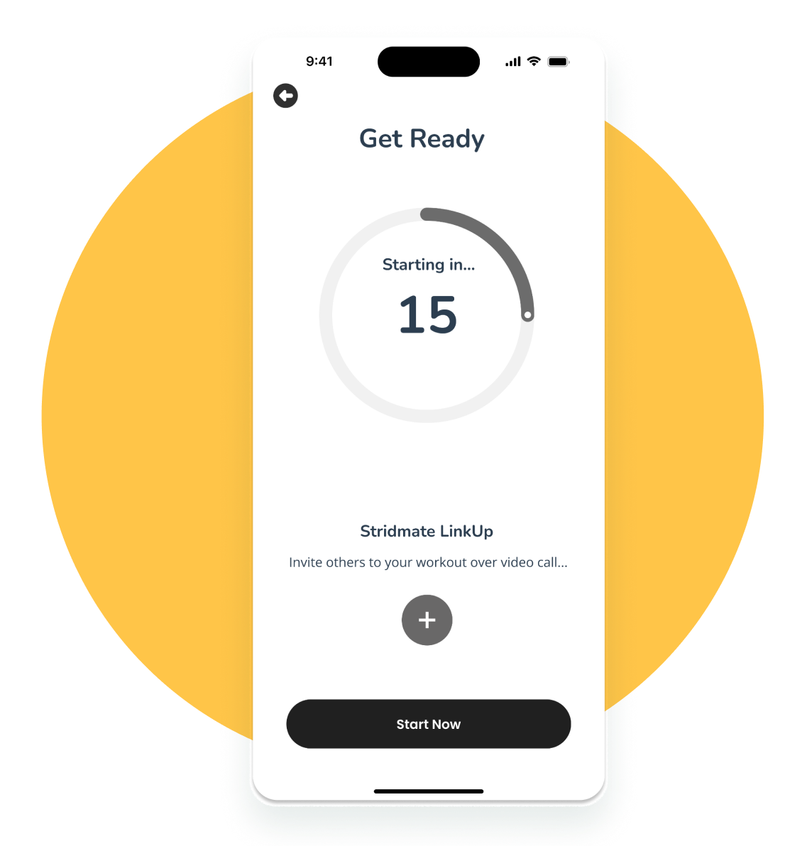
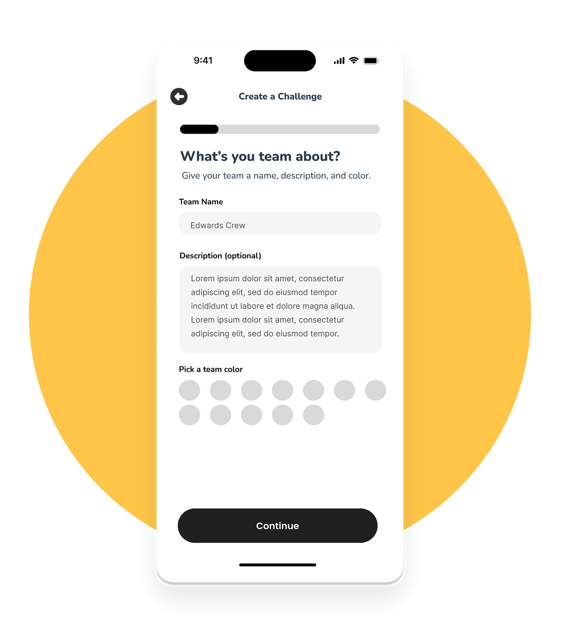
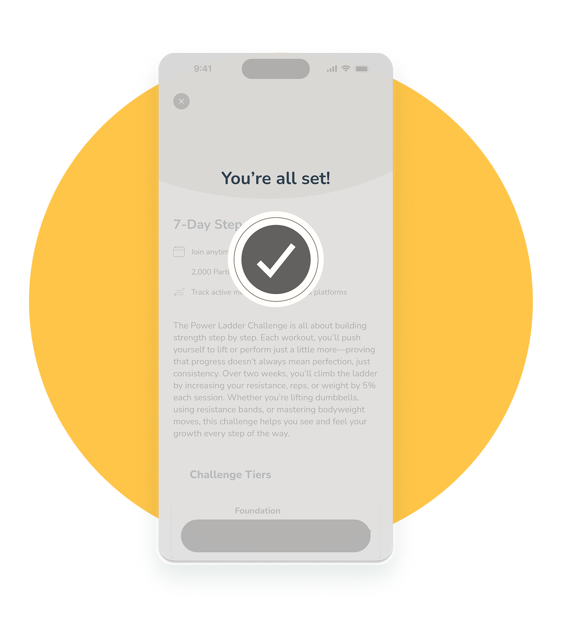
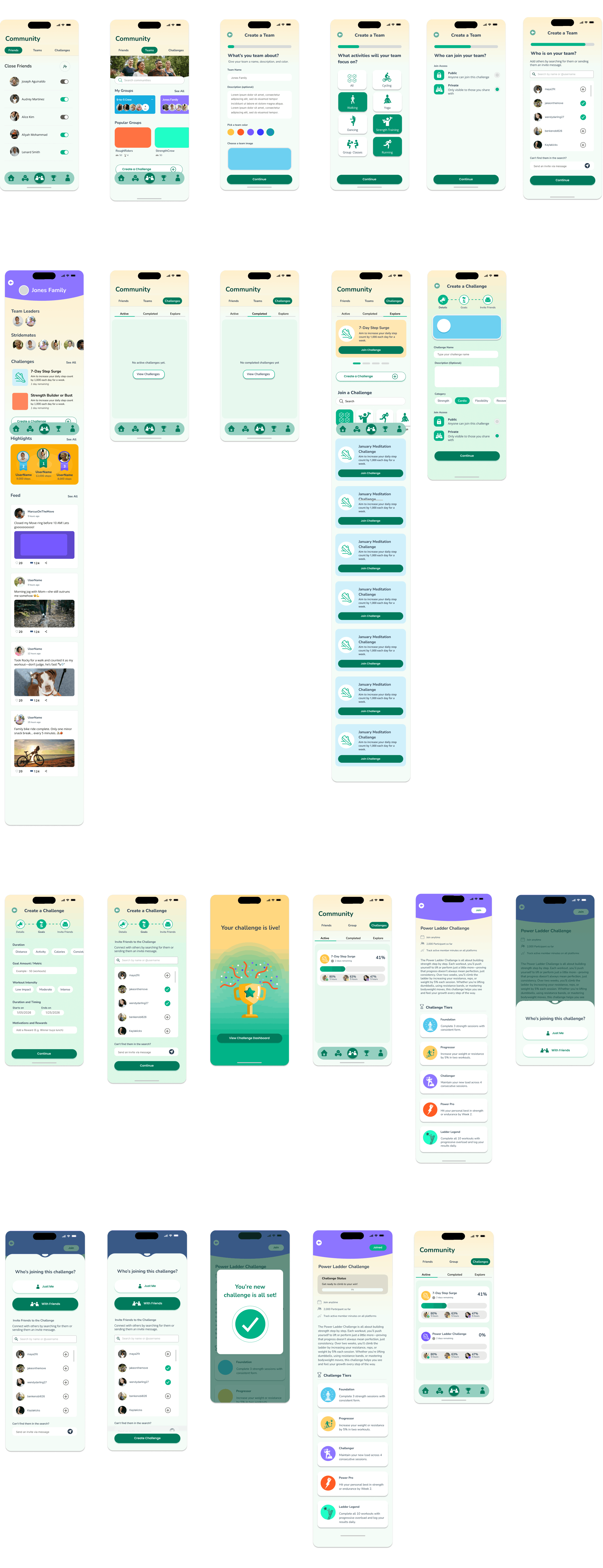
Exploring onboarding, workouts, and challenges
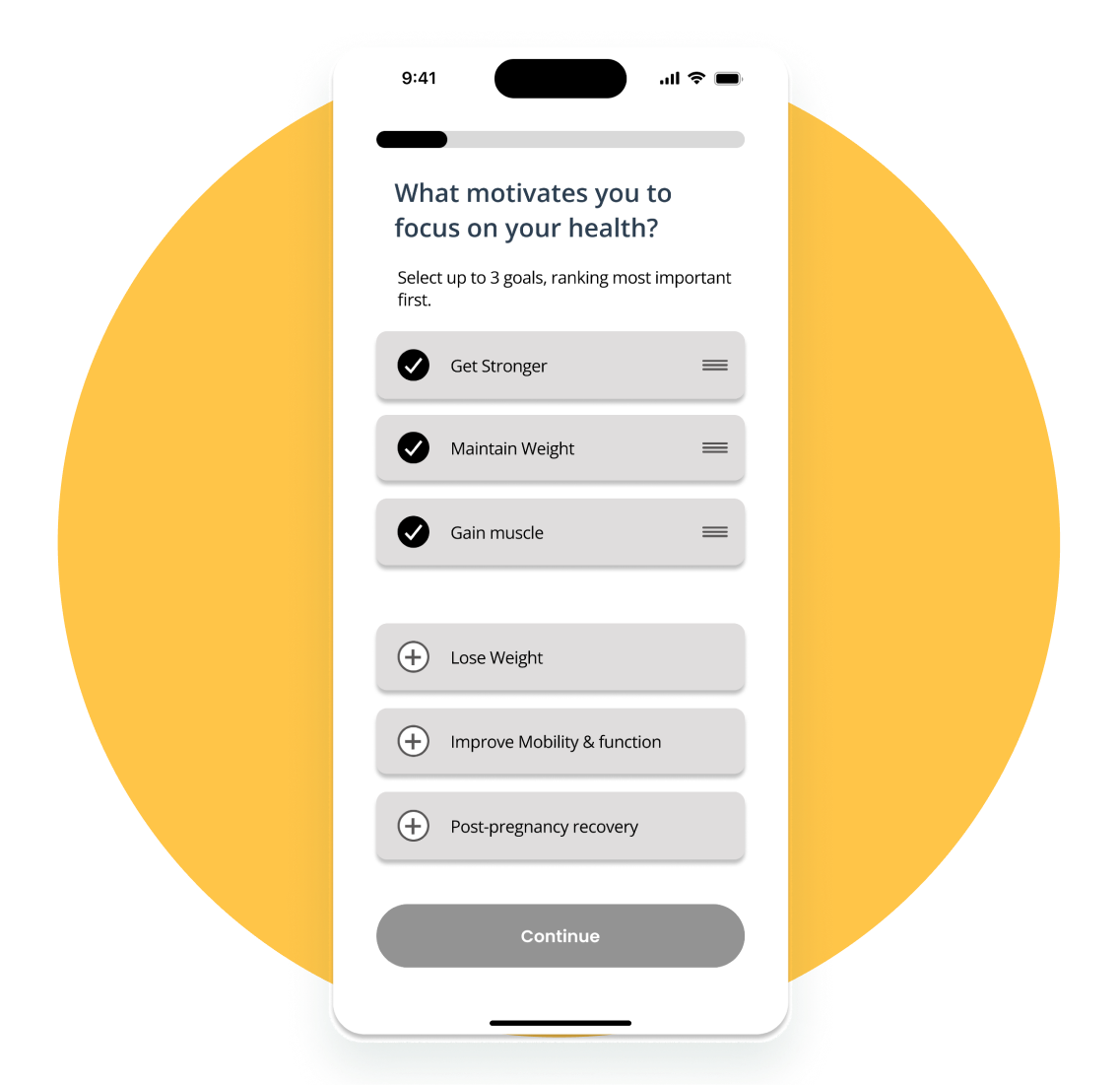
1. Onboarding Wireframes
The onboarding flow moves from personal motivations to physical considerations, helping users feel understood.
2. Workout Flow Wireframes
Each step guides users from setup to completion with clear actions, flexible options, and minimal friction.
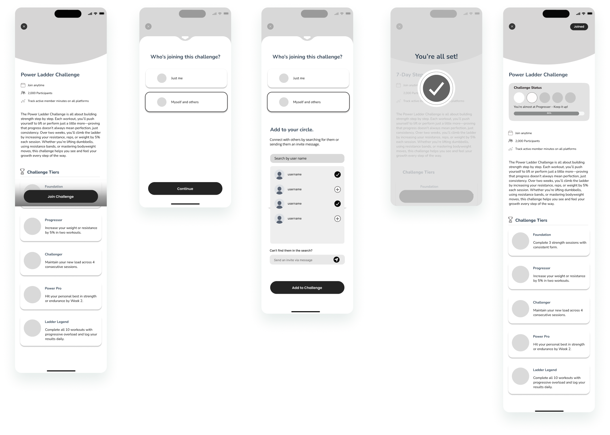
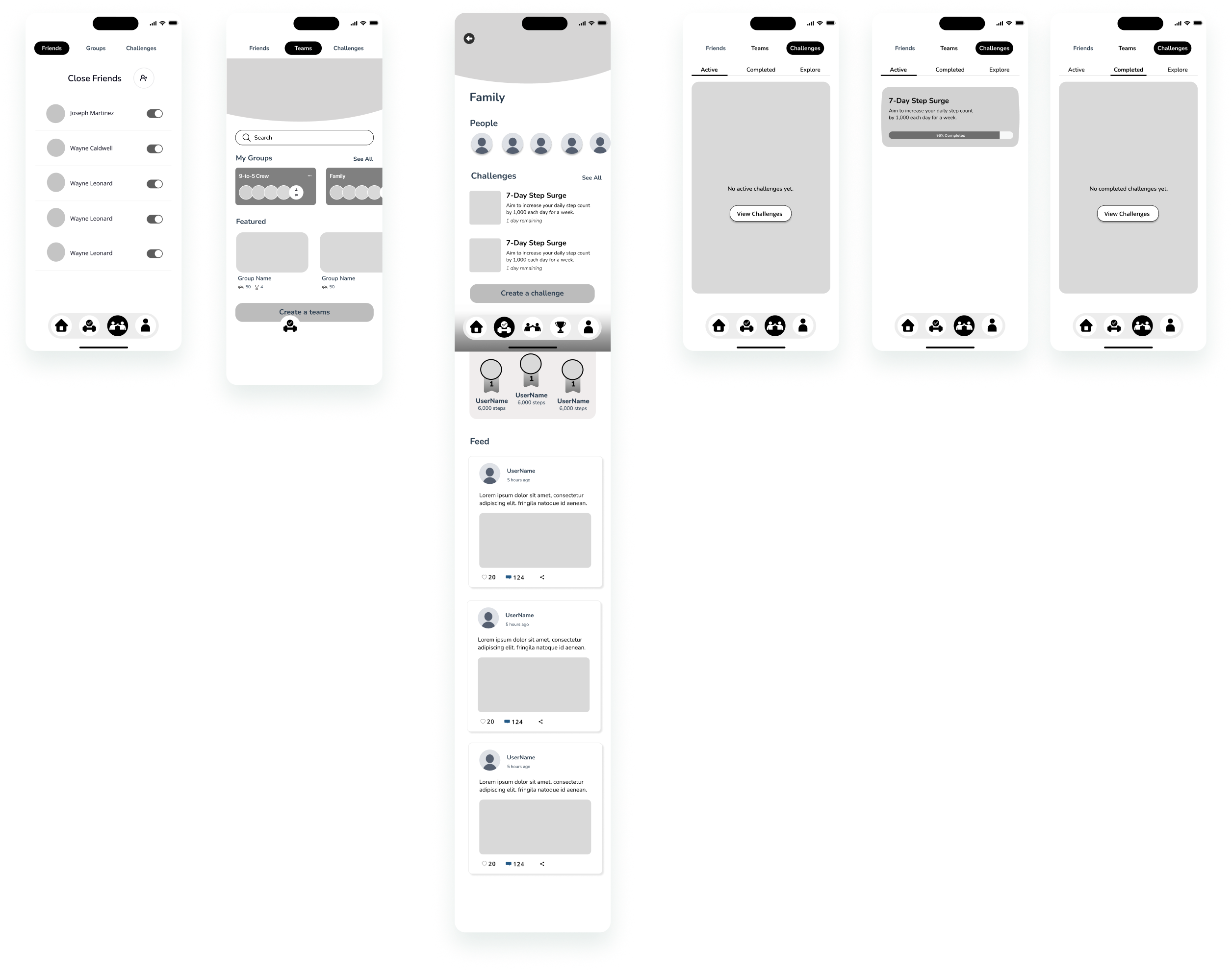
3. Challenge Flow Wireframes
Clear steps, visual cues, and clean layouts guide users through joining or creating challenges with ease.
A palette balancing warmth, clarity, and emotional reassurance
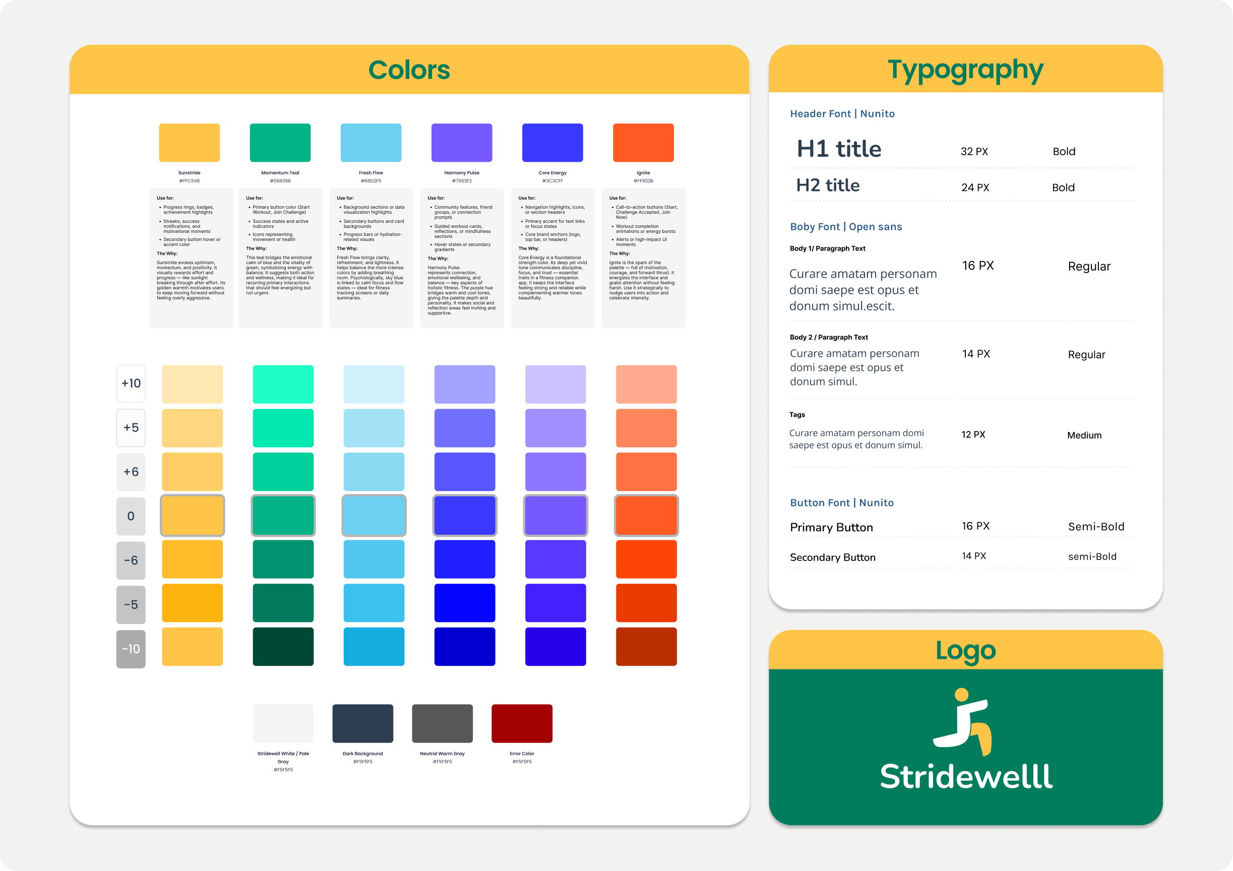
Introduces warmth and optimism. Signals encouragement, helping the experience feel welcoming.
A grounding, stabilizing color conveying trust, growth, and forward movement.
Adds emotional depth and a sense of care. Reinforces the app's role as a compassionate guide.
Used sparingly to draw attention and motivate action at key moments.
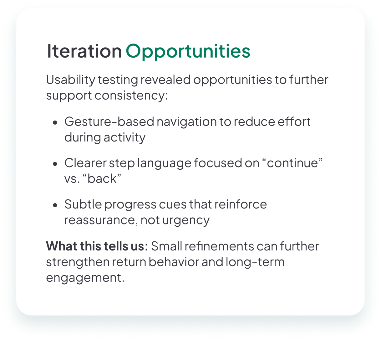
Users were interested but hesitated where social expectations were unclear
1. Onboarding needs more clarity
People appreciated the friendly onboarding but wanted clearer explanations for why information was requested.
Change: Added contextual explanations and a save-and-finish-later option.
2. Starting workouts was confusing
Users could find workouts but wanted a short preview before auto-start.
Change: Added workout previews and clarified virtual workout labels.
3. Group creation needed personal touches
Creating a group was exciting but users wanted to add group photos, emojis, or team colors.
Change: Added group customization and lightweight family profiles.
4. Challenges needed more feedback
Everyone loved challenges but got tripped up connecting them to groups.
Change: Added confirmation states and ready-made challenge options.
5. Labels and buttons needed clarity
Some users clicked the wrong buttons because icons looked similar.
Change: Differentiated button icons and added ring labels with descriptions.
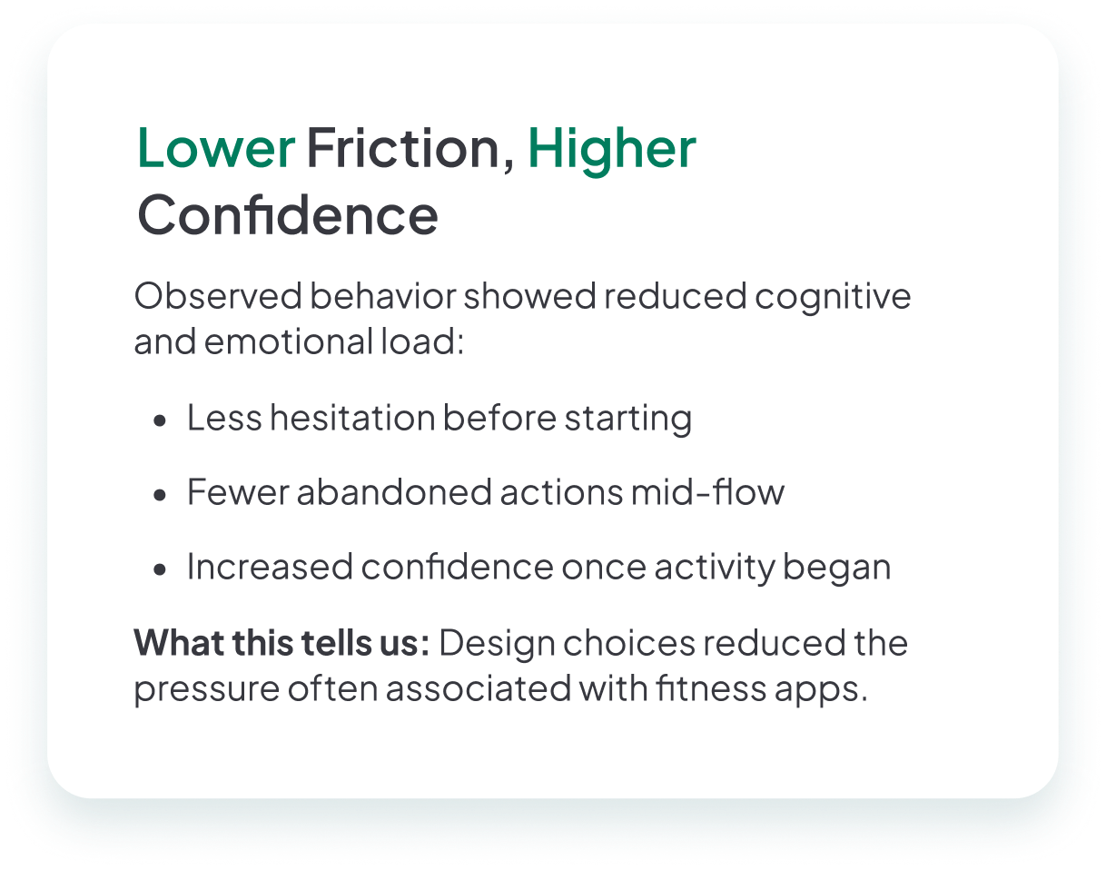
Clear improvement—from caution to confidence
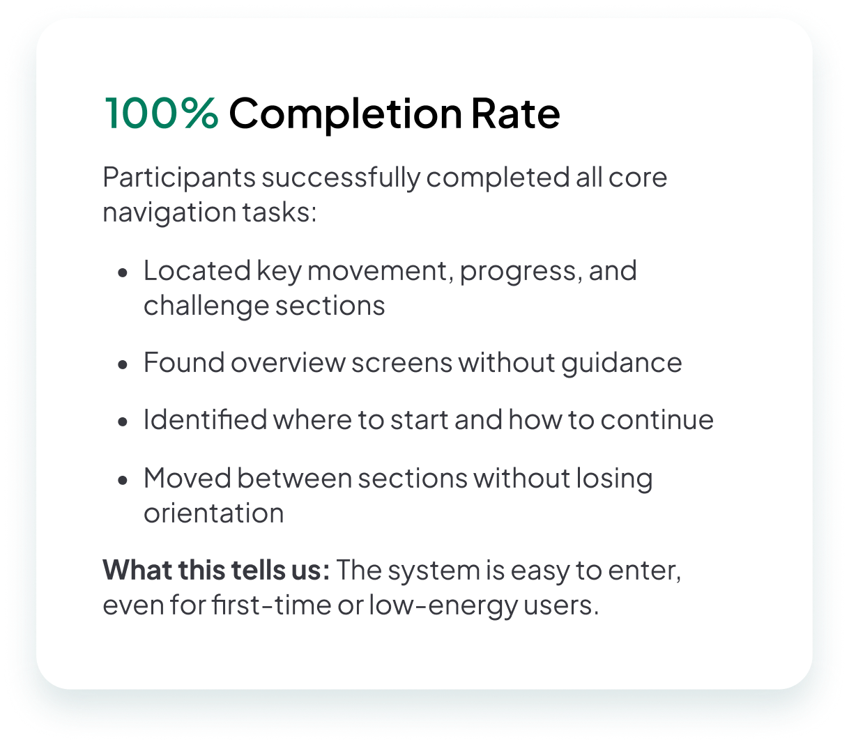
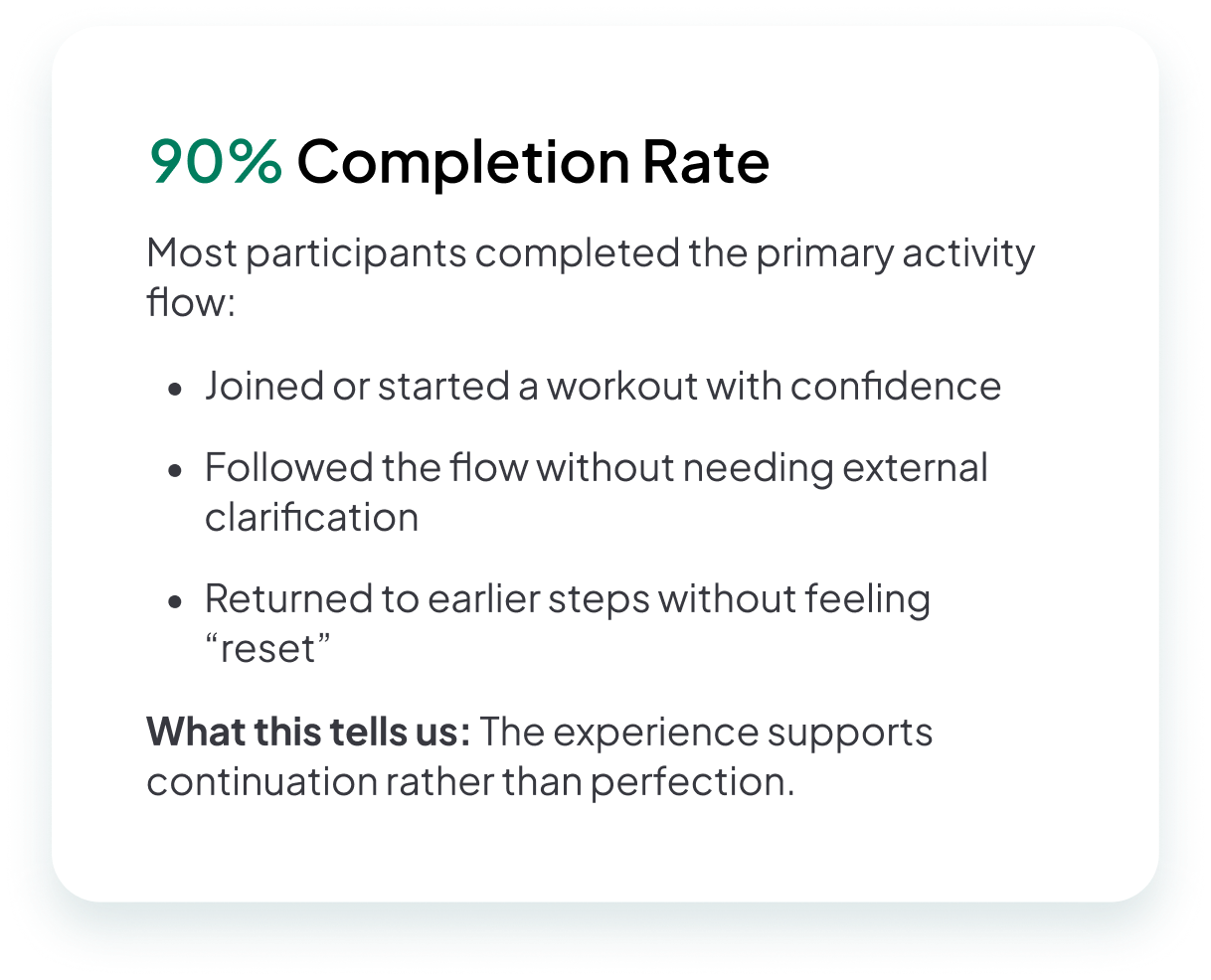
Round 2 testing showed clear improvement. Participants moved through key flows with less hesitation and asked fewer clarification questions. Emotionally, users described the final experience as supportive, calm, and reassuring. Overall, emotional responses shifted from caution and self-consciousness to confidence and ease—directly aligning with the project's core goals.
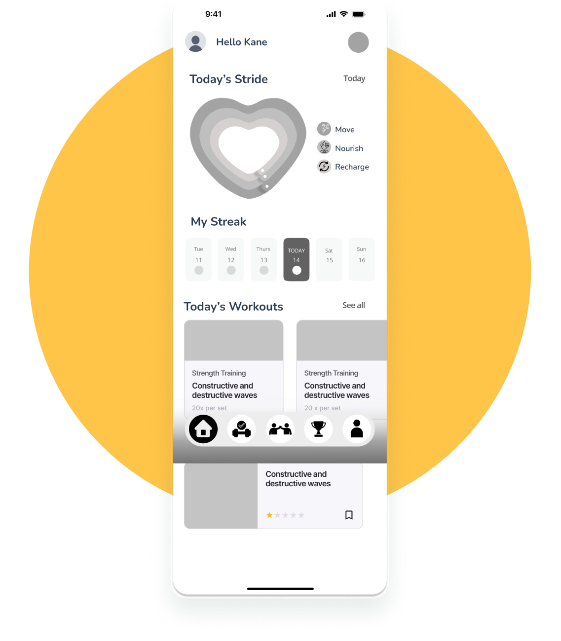
A fitness experience built for real life
The final Stridewell experience is designed as a calm, supportive fitness companion that meets users where they are. Unlike traditional fitness apps that overwhelm users with data, rigid plans, or streak-based pressure, Stridewell prioritizes reassurance and momentum.
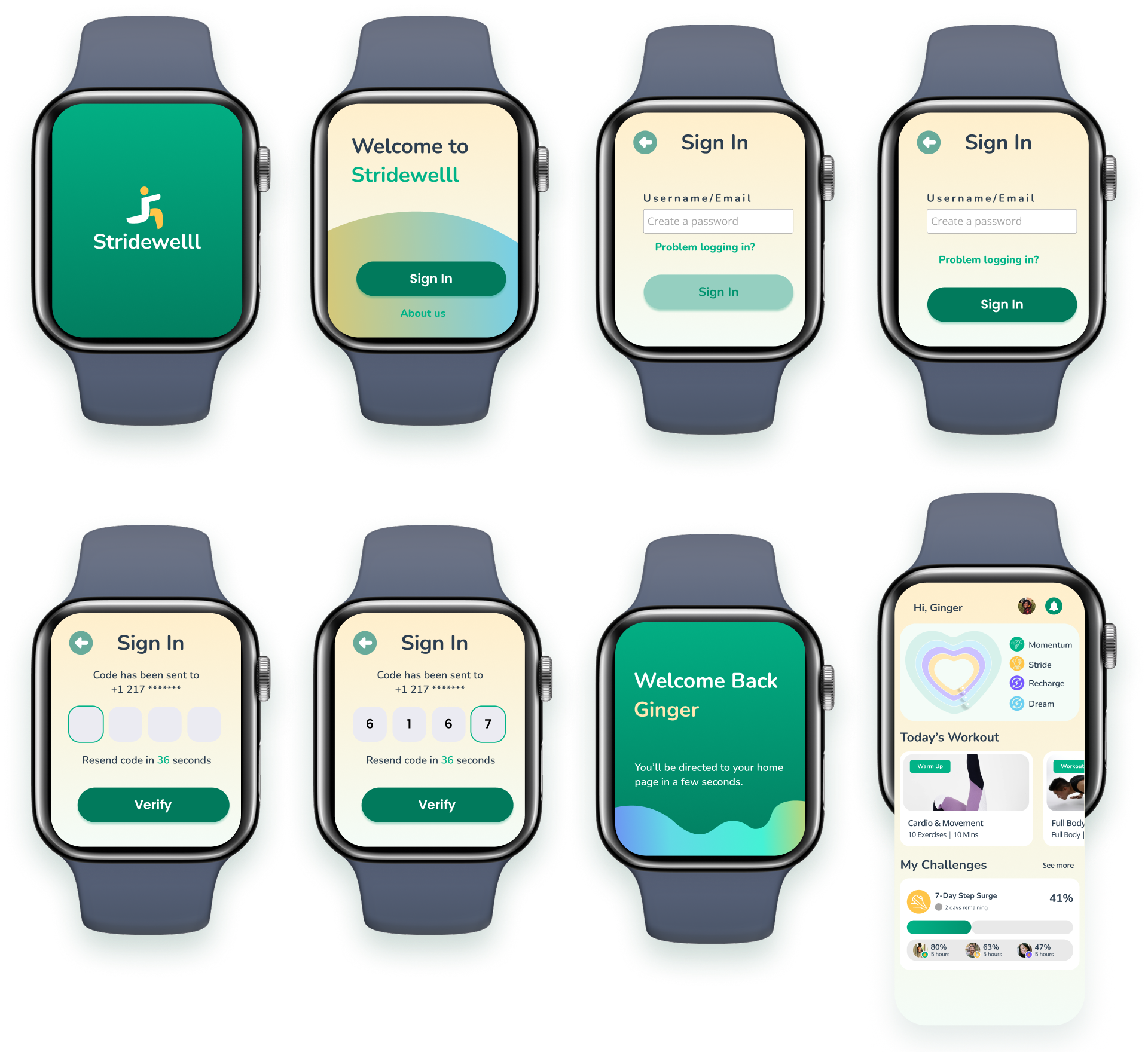
Future Exploration: Smart Watch Design
Engagement sustained through trust, not pressure
Stridewell supports the original business goal of sustained engagement by focusing on return behavior rather than peak activity. User wellbeing is treated as a leading indicator of product success.
Reduced hesitation
Users moved through flows with less second-guessing and fewer clarification questions.
Emotional safety
Users described the experience as supportive, calm, and non-judgmental.
Return behavior
Design makes it emotionally easy to come back after breaks without guilt.
Social without pressure
Social features feel human rather than performative, supportive rather than competitive.
Designing for behavior change means designing for low motivation
This project fundamentally reshaped how I think about motivation and behavior change. I learned that motivation is not something designers can reliably create—it's something we have to design around. Habits break, life intervenes, and motivation fluctuates. The most impactful designs are not the ones that perform best when users feel energized, but the ones that make returning feel possible after disruption.
Stridewell reinforced that features don't drive behavior—systems do. Designing features in isolation creates fragmentation; designing systems creates momentum. This project strengthened my confidence in making principled trade-offs: choosing emotional safety over short-term engagement, clarity over feature density, and flexibility over rigid structure.