I led the design of BenefitBump’s pregnancy education course to address a growing gap between the support expecting employees needed and how pregnancy benefits were actually experienced in practice. Working closely with care navigators, operations, and leadership, I was intentional about how the course fit within BenefitBump’s broader service model and employer partnerships. The result was a structured, supportive education experience that builds confidence early, reduces fragmentation, and scales alongside the company’s evolving family benefits strategy.
Design Lead, UX Researcher, UI Designer, Brand Creator
June-August 2024
SquareSpace, Canva, Microsoft Teams
As someone with a background in maternal health and healthcare accessibility, I’ve long believed that pregnancy education should feel both practical and comforting. At BenefitBump, I had the opportunity to design a new set of self-paced pregnancy classes — a project born out of two urgent needs.
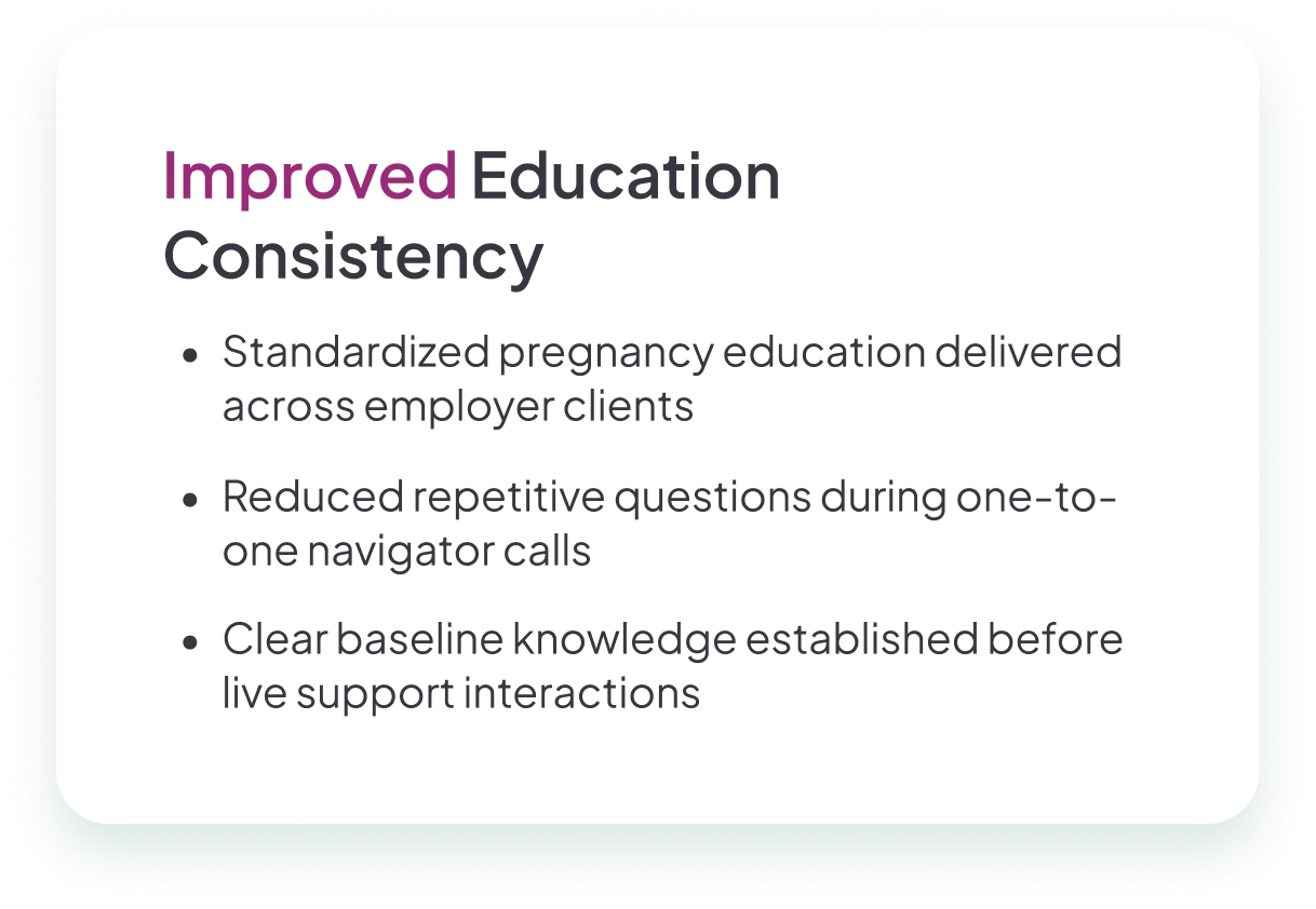
First, care navigators were consistently reporting that expecting parents lacked a trusted, centralized source of education, and call logs revealed a recurring pattern of questions. Second, the broader market was shifting: while insurers were scaling back direct pregnancy support, consumer demand for virtual classes was rising. This created a clear gap — and an opportunity for us to fill it.
Bedtime storytime is meant to be connective and grounding. However, as FableFox’s content library grew, the experience increasingly demanded cognitive effort from adults who were already managing tired children, time pressure, and competing needs. Parents described feeling overwhelmed by choice, unsure whether they were selecting the right story, and frustrated by how long it took to get started.
The core tension was not a lack of content. It was decision fatigue. Families wanted storytime to feel calm, but the product required too much thinking at the wrong moment.

First, care navigators were consistently reporting that expecting parents lacked a trusted, centralized source of education, and call logs revealed a recurring pattern of questions. Second, the broader market was shifting: while insurers were scaling back direct pregnancy support, consumer demand for virtual classes was rising. This created a clear gap — and an opportunity for us to fill it.
Instead of direct user interviews, I partnered closely with those who knew our participants best: care navigators and their managers. Through working sessions with CN leads, the operations director, and our leadership team, I asked questions like:
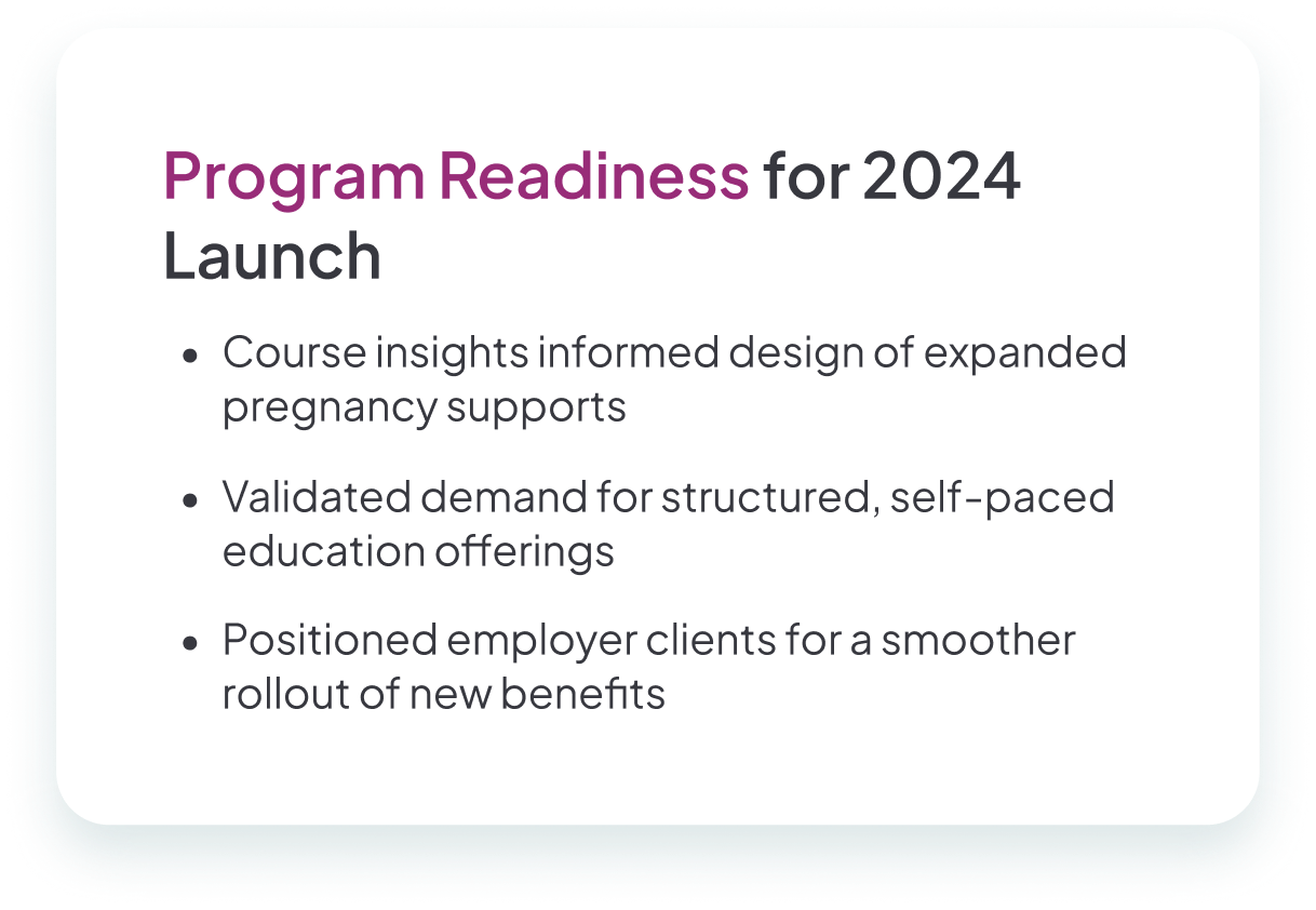
Industry research and client vendor data also pointed to a trend: major insurers were moving toward virtual classes, but not always with a supportive, user-centered lens. That gap reinforced our mission — to create not just content, but a guided, empathetic experience.
Once the scope was clear, I built a detailed project plan, including timeline, deliverables, and cross-functional ownership. To set us up for repeatable success, I also created a template digital course preparation document, which later became the foundation for future product builds.
Industry research and client vendor data also pointed to a trend: major insurers were moving toward virtual classes, but not always with a supportive, user-centered lens. That gap reinforced our mission — to create not just content, but a guided, empathetic experience.
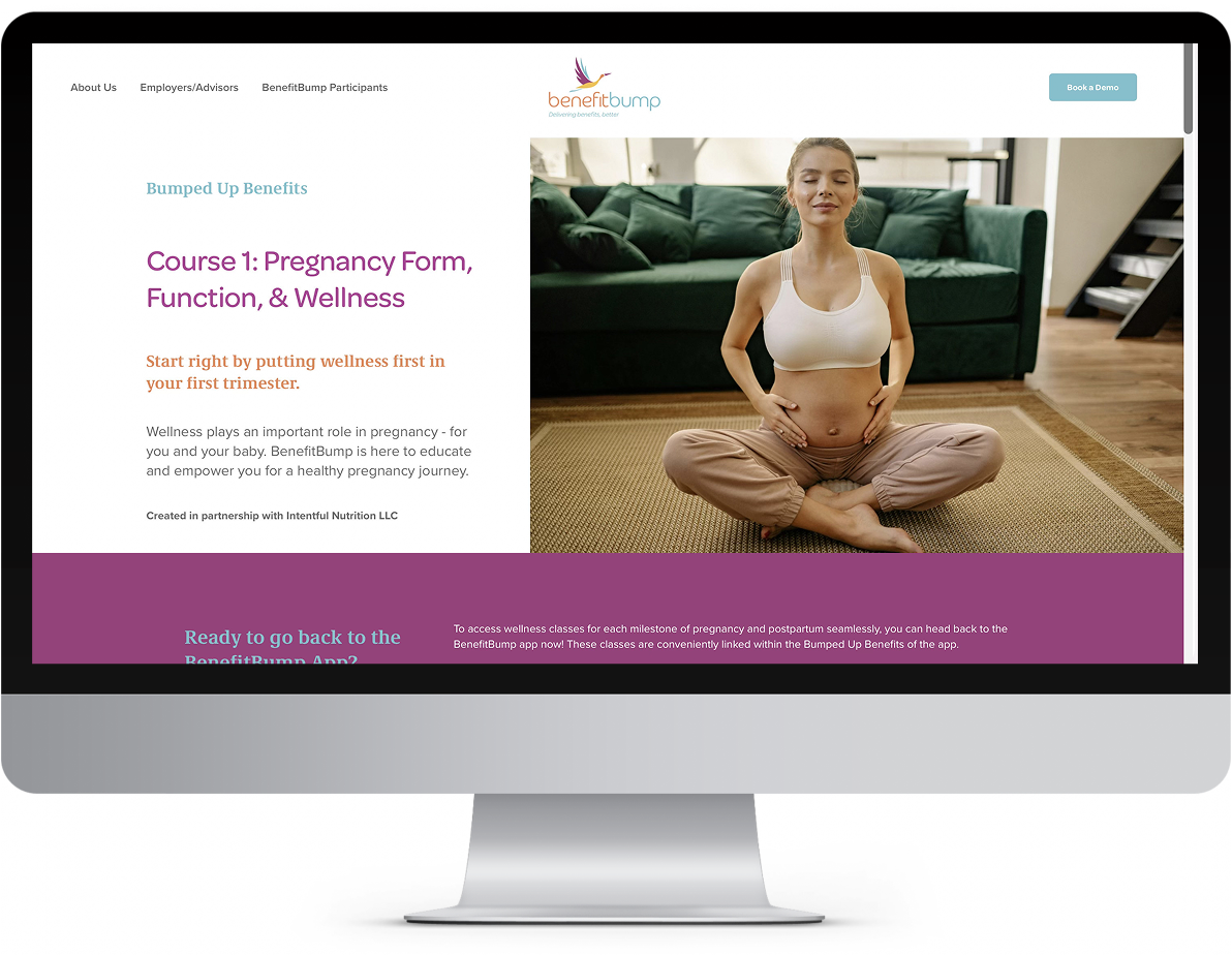
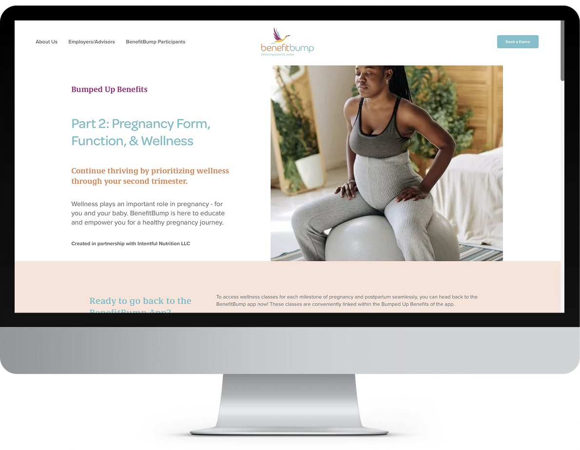
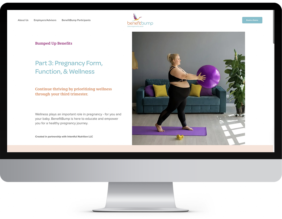
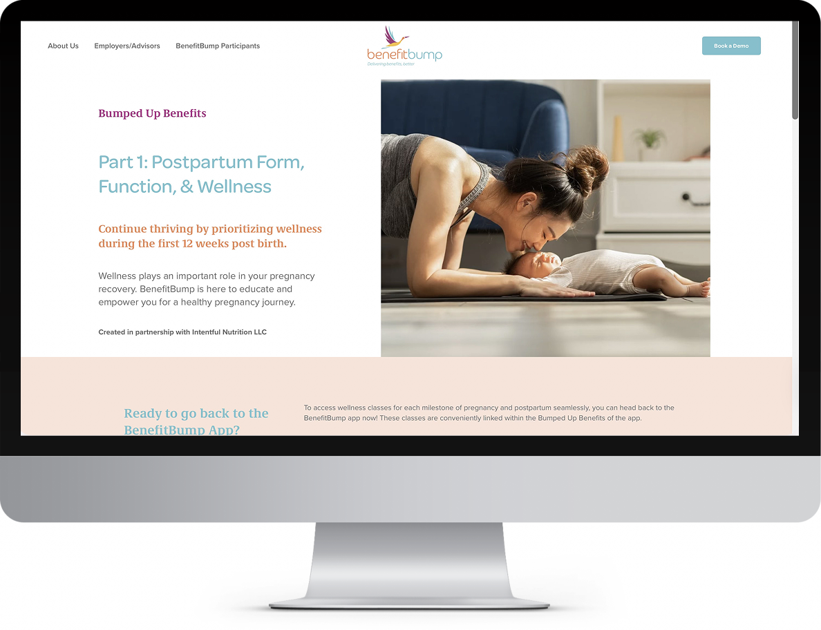
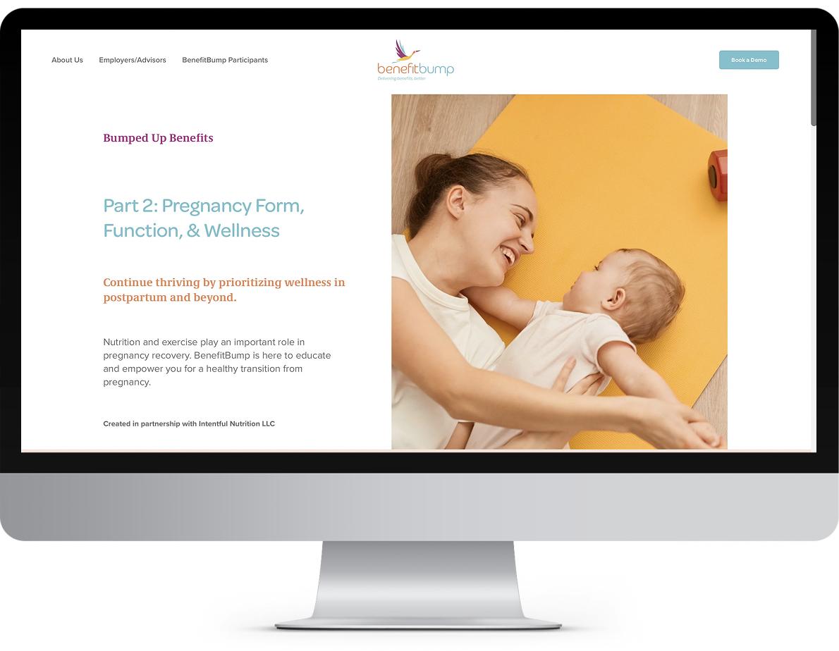
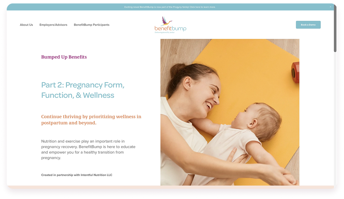
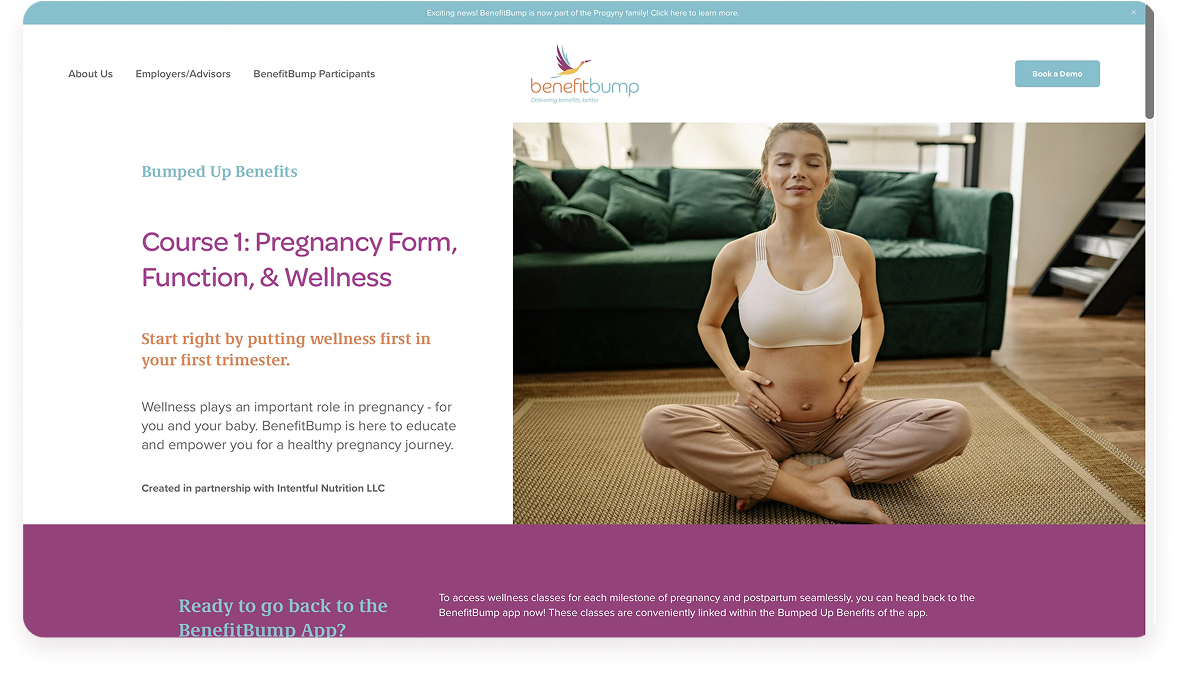
Using the brand guide as a foundation, I leaned into soft, calming colors and modern, legible typography. Subtle accents reflected themes of family and growth, while headers and visual hierarchy guided parents step by step.
I designed a card-based layout with generous spacing, allowing parents to focus on one idea at a time. Each section flowed naturally, mirroring the rhythm of pregnancy.
Lessons were broken into scannable sections with consistent buttons and interactive elements. High contrast ensured readability on all devices, so parents never struggled to see key information.
From the first screen, the course avoided a clinical tone. Instead, it welcomed parents into a space that felt professional yet personal — signaling that they were cared for, not just instructed.
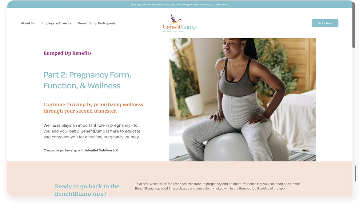
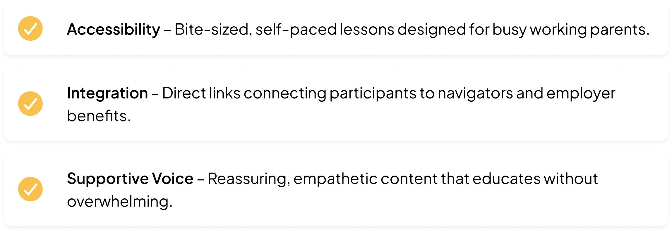
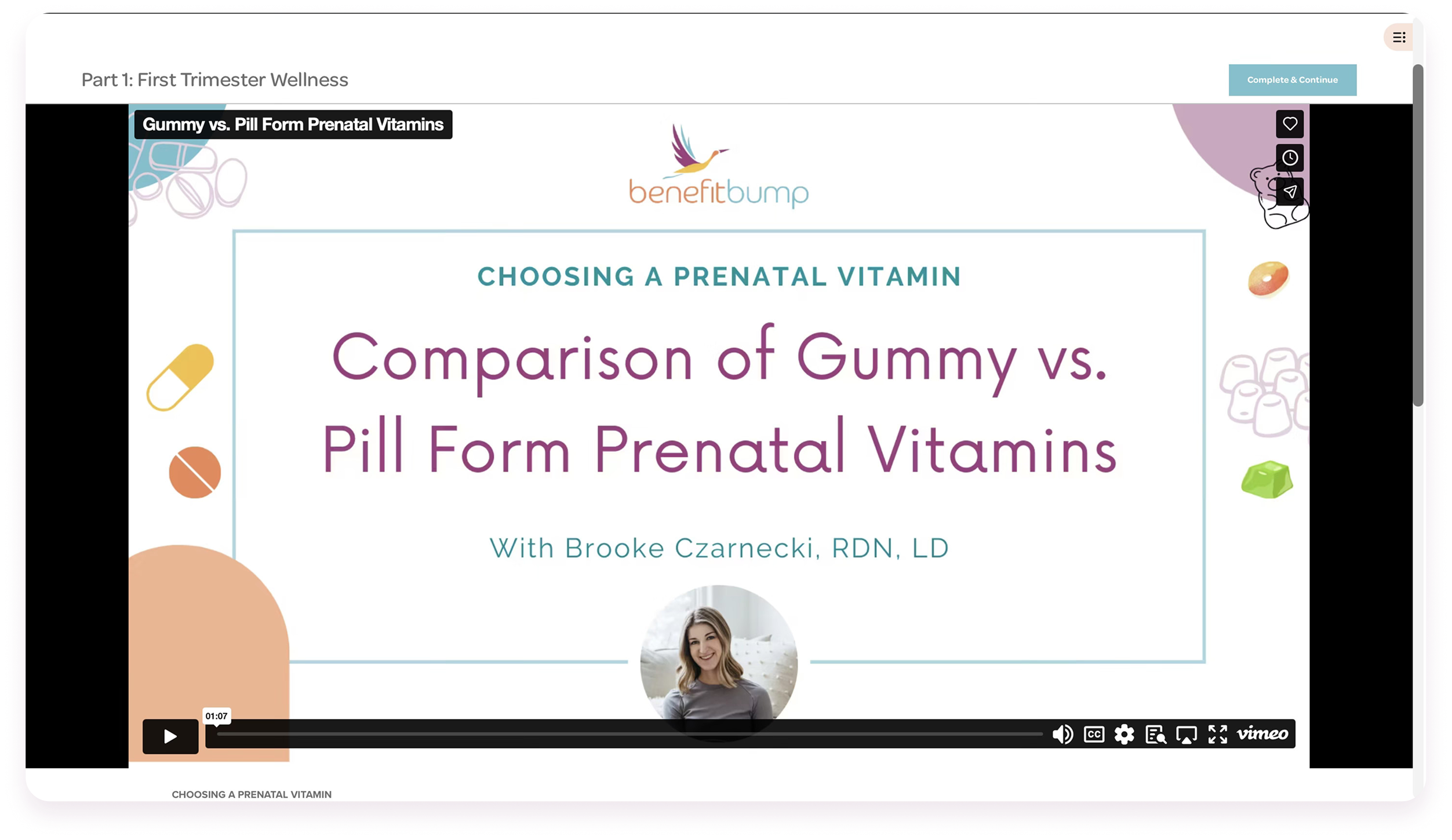
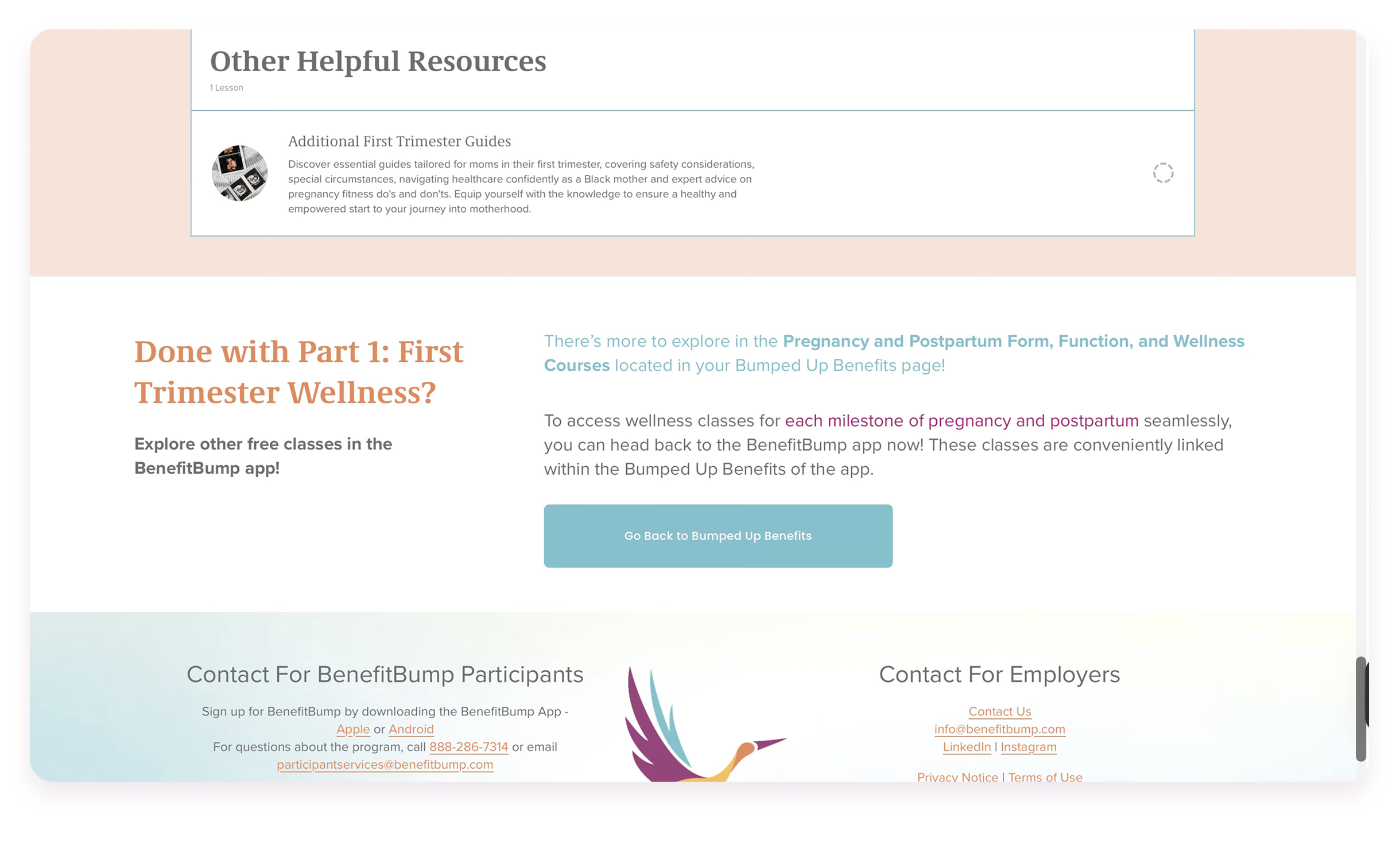
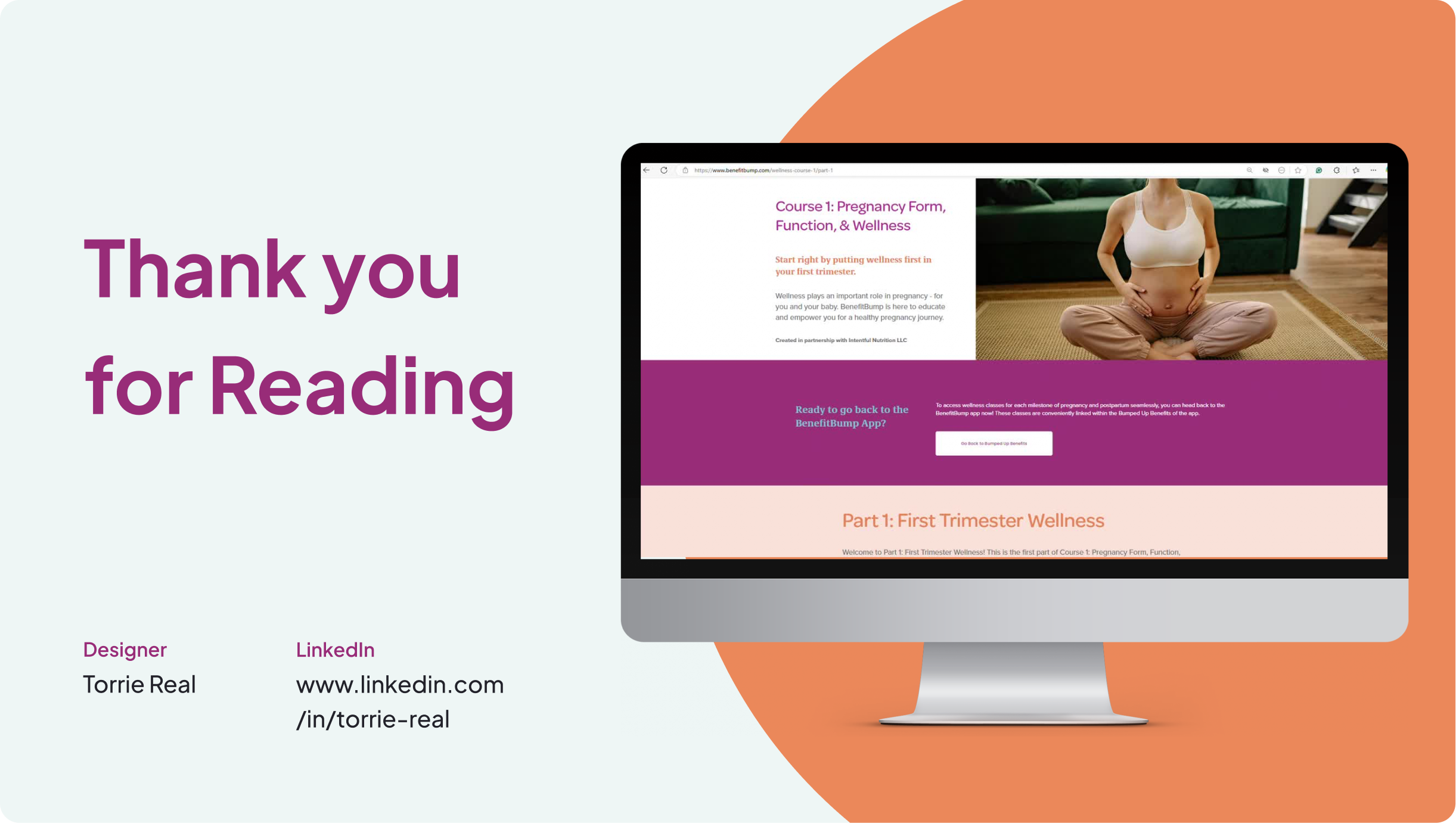
One of the project’s unique challenges was platform integration. As a startup, our app was evolving rapidly. After weighing accessibility and iteration needs, I proposed housing the classes on a web format while embedding them into the app.
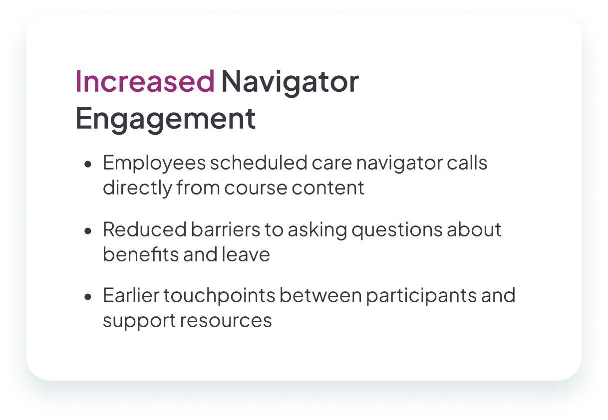
To keep the experience cohesive, I embedded direct links back to the app throughout the course — nudging participants to schedule navigator calls or access benefits. This structure allowed us to grow with new expert features while keeping the learning flow simple.
To keep the experience cohesive, I embedded direct links back to the app throughout the course — nudging participants to schedule navigator calls or access benefits. This structure allowed us to grow with new expert features while keeping the learning flow simple.
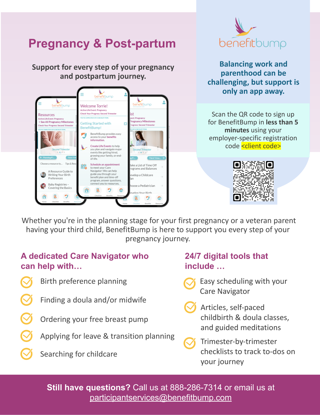
I created flyers that were printed or sent via email to our client companies’ HR Leadership and to employees via their care navigators. I wanted to ensure that parents were actually aware of the new courses, so launch included these communication materials and message pushes.

The final product became more than a digital class. It was a guided, supportive journey that parents could trust.
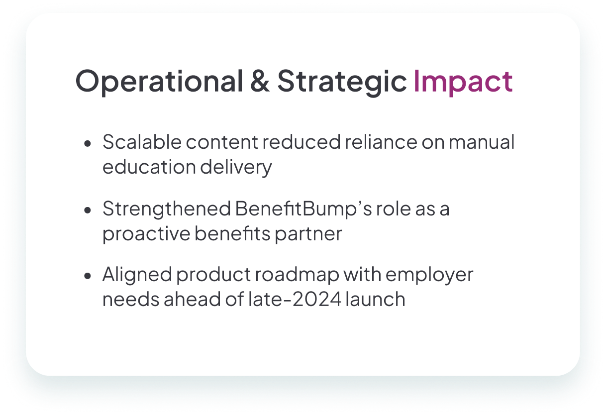
By blending clear structure with a warm, approachable design, the pregnancy classes not only served families — they also strengthened the company’s positioning in a competitive benefits market.
This project reinforced a key lesson for me as a designer: user needs don’t always come directly from users. By working closely with care navigators and analyzing industry trends, I was able to translate indirect feedback into an experience that was both empathetic and impactful.
It also showed me how to thrive in a fast-paced startup environment — balancing user-centered design, business strategy, and product constraints to deliver a solution that felt both meaningful and scalable.

Copyright © Torrie Real