
I led the redesign of FableFox’s storytime experience to address a growing tension between what families want storytime to feel like and how it actually unfolds in practice. As the app’s library expanded, parents and caregivers found themselves spending more time searching, scrolling, and negotiating than reading. This often happened at the exact moment when energy and patience were already low. I focused on transforming story discovery from a stressful, open-ended task into a calm, confidence-building ritual that supports real family dynamics.
Design Lead, UX Researcher, UI Designer, Logo Designer
5 Day Sprint, 2025
Figma, Adobe Illustrator
Bedtime storytime is meant to be connective and grounding. However, as FableFox’s content library grew, the experience increasingly demanded cognitive effort from adults who were already managing tired children, time pressure, and competing needs. Parents described feeling overwhelmed by choice, unsure whether they were selecting the right story, and frustrated by how long it took to get started.
The core tension was not a lack of content. It was decision fatigue. Families wanted storytime to feel calm, but the product required too much thinking at the wrong moment.
To understand the problem space, I conducted interviews with parents and grandparents who regularly read to children between the ages of one and twelve. These participants represented the people most often responsible for initiating storytime and navigating shared reading on tablets.


What emerged was a clear reframing of the problem. Families do not approach storytime as entertainment or content consumption. They view it as a ritual that signals transition, closeness, and calm at the end of the day. Adults are frequently tired, short on mental bandwidth, and trying to balance multiple children’s needs at once.
A key insight was that more choice did not feel empowering in this context. As libraries grew, adults did not want deeper browsing or more control. They wanted fewer, clearer decisions. This revealed that the challenge was not discovery in the traditional sense, but decision support under emotional and time pressure.
Across roles, one need remained constant: caregivers wanted clarity, reassurance, and a sense that they weren’t navigating recovery alone.
To better understand the solution landscape for adults children, I completed a lean competitor review to analyze their story search features.

Personalization: Tailored to kids’ ages, themes, and attention spans.
Multi-Child Friendly: Quick queuing for multiple preferences.
Simplicity: Intuitive filters and large visuals for parents & grandparents.
Based in user interviews and researching the solution of competitors, I concluded that the solution would have the following 5 components:

Based on research, I established a small set of guardrails to guide design decisions. I prioritized speed over precision, focused on reducing cognitive load rather than expanding choice, and designed explicitly for low-energy moments. I avoided dense browsing, abstract filters, and flows that assumed users had time or patience to explore. These principles helped maintain focus and prevented feature creep as the solution took shape.
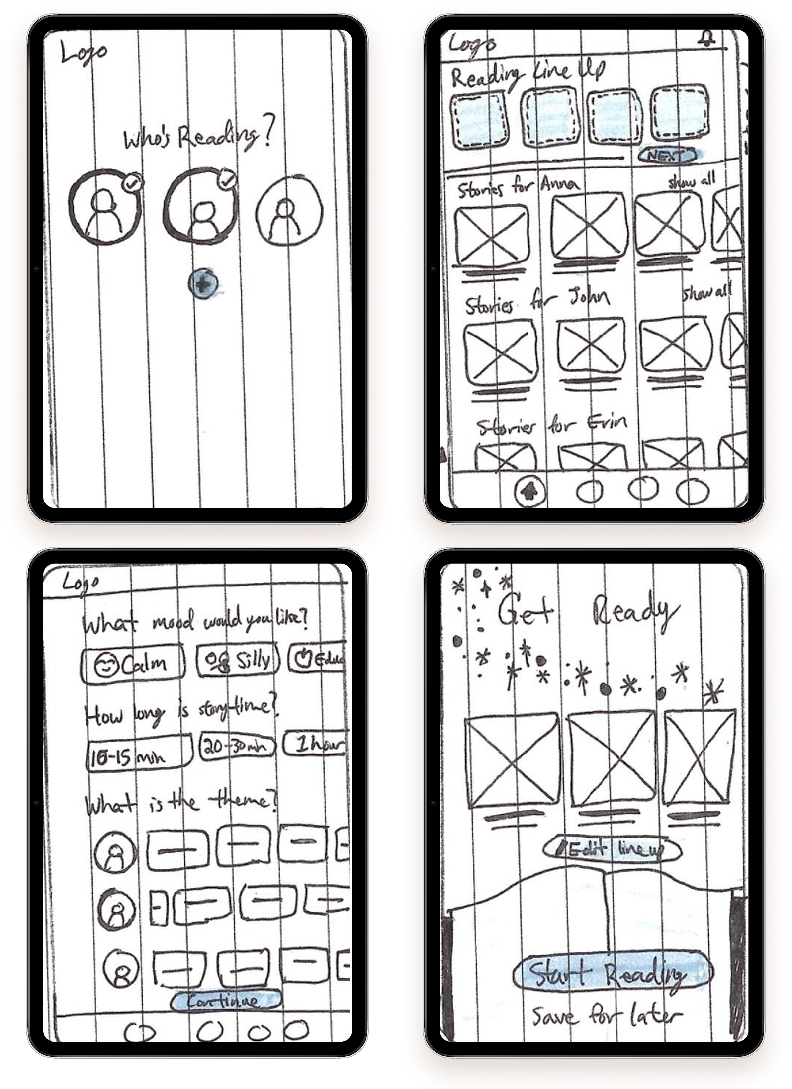
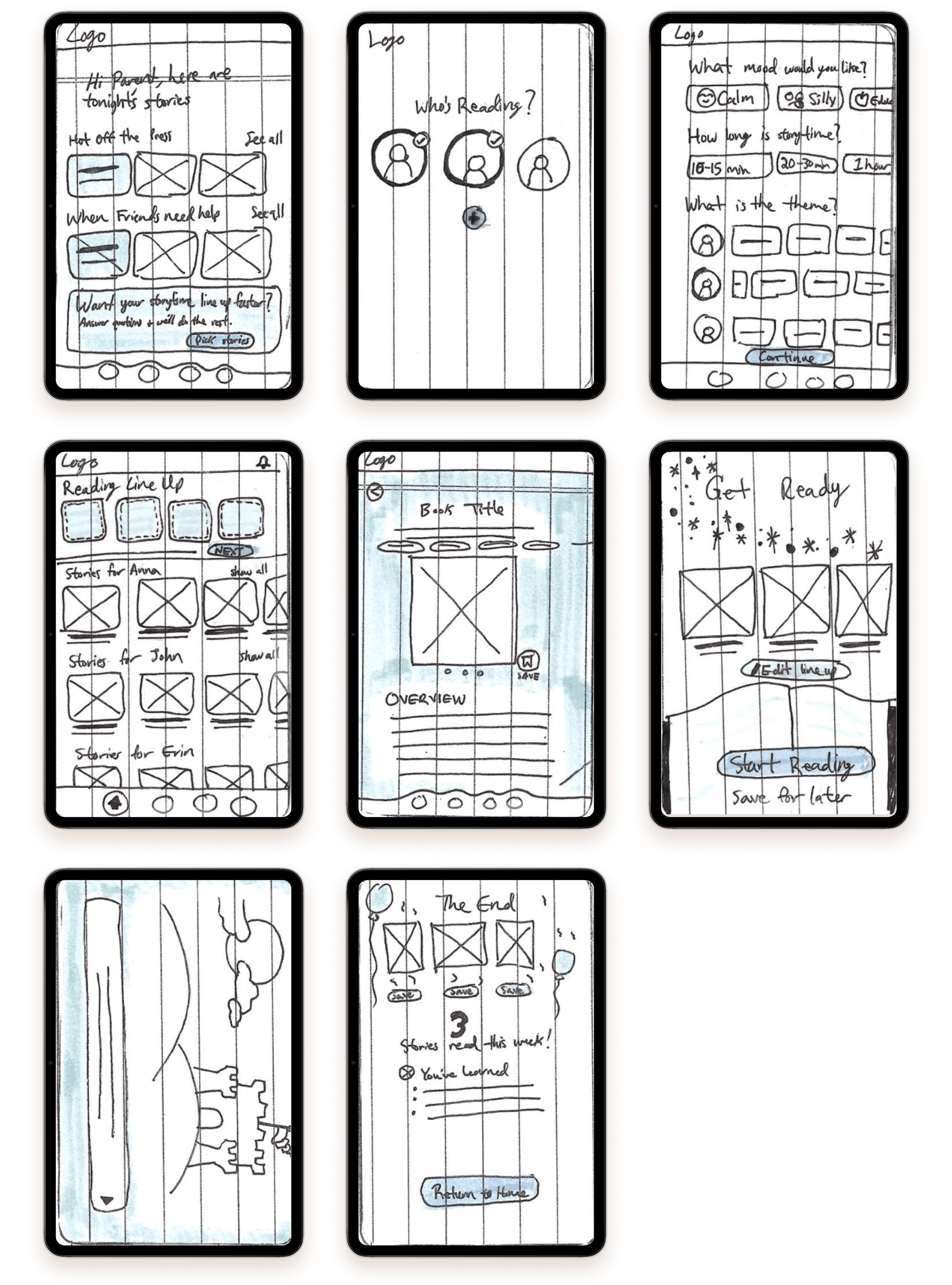
Rather than committing immediately to one approach, I explored three different storytime flows to test how much guidance and control felt supportive.
The first concept used guided recommendations, walking parents through a step-by-step narrowing process based on age, time, and mood. The second explored lightweight filters layered onto browsing to preserve flexibility while reducing friction. The third concept completely reframed the story discovery process. It treated the task as preparation for a reading session rather than choosing a single story. Through evaluation and testing, the third approach proved to be the most effective. It aligned with how families actually experience storytime as a sequence of moments that often involve multiple children and changing attention spans. While it required slightly more upfront structure, it reduced downstream friction and helped adults feel prepared rather than reactive.
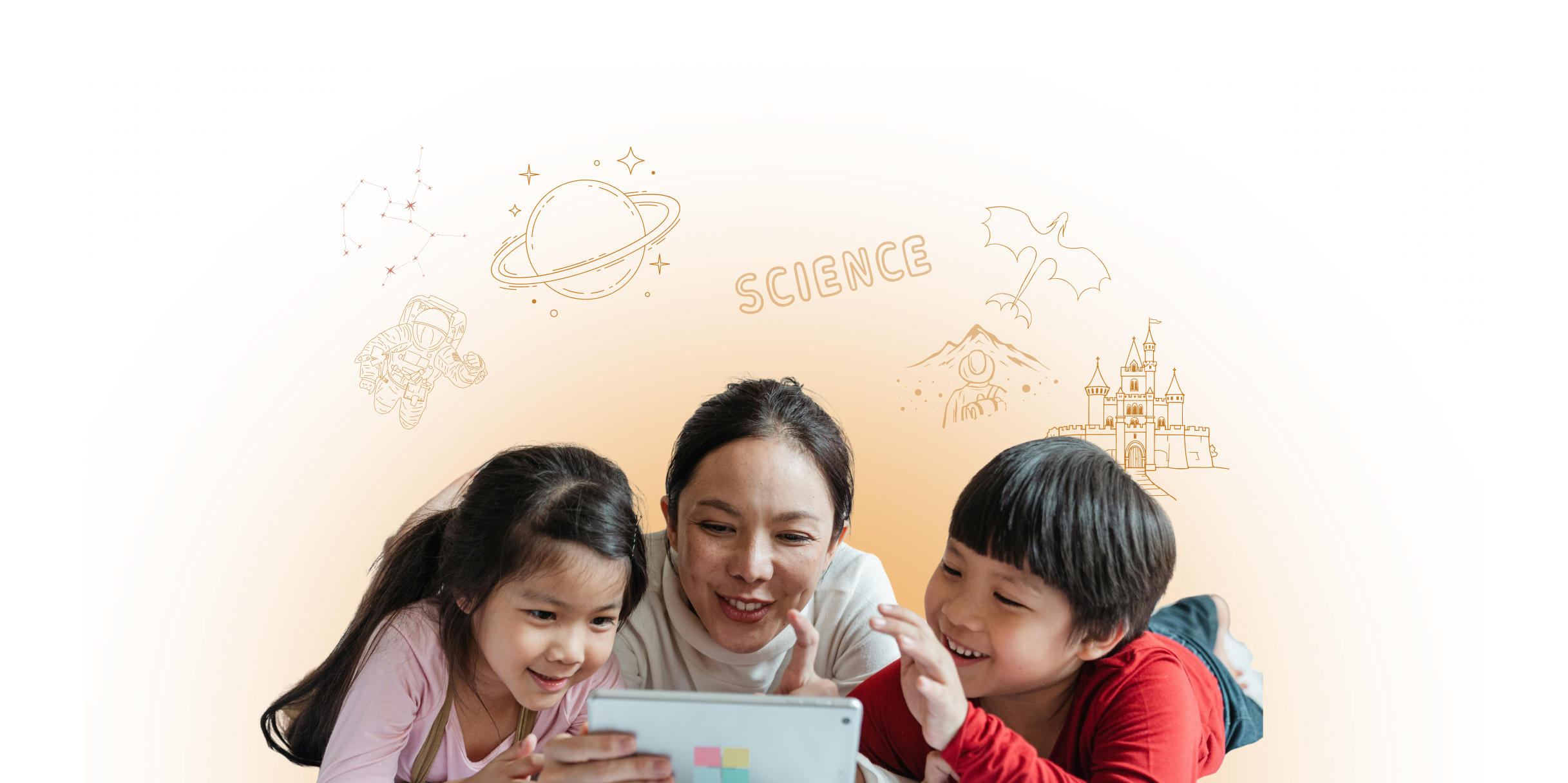
After building the foundational wireframes, I moved into high-fidelity design to shape CareCup’s visual identity, emotional tone, and interactive feel. My goal was to create an experience that felt warm, reassuring, and empowering—directly addressing the stress, isolation, and uncertainty caregivers described during research.
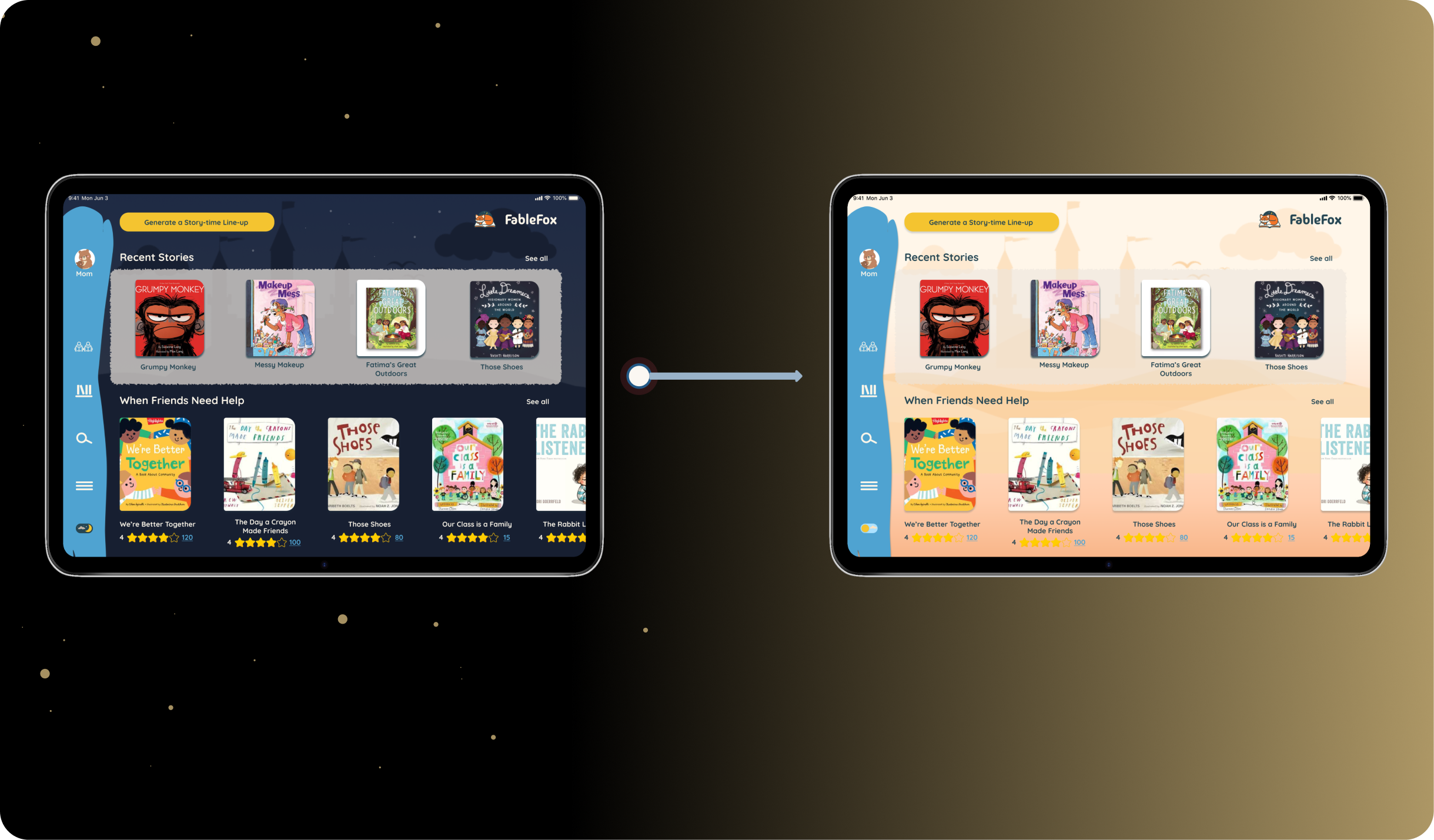
I designed a day-to-night option that blends whimsy with practicality, giving the app a playful yet functional touch. Switching to night mode helps parents gently signal the transition to bedtime, creating a smoother routine for children.
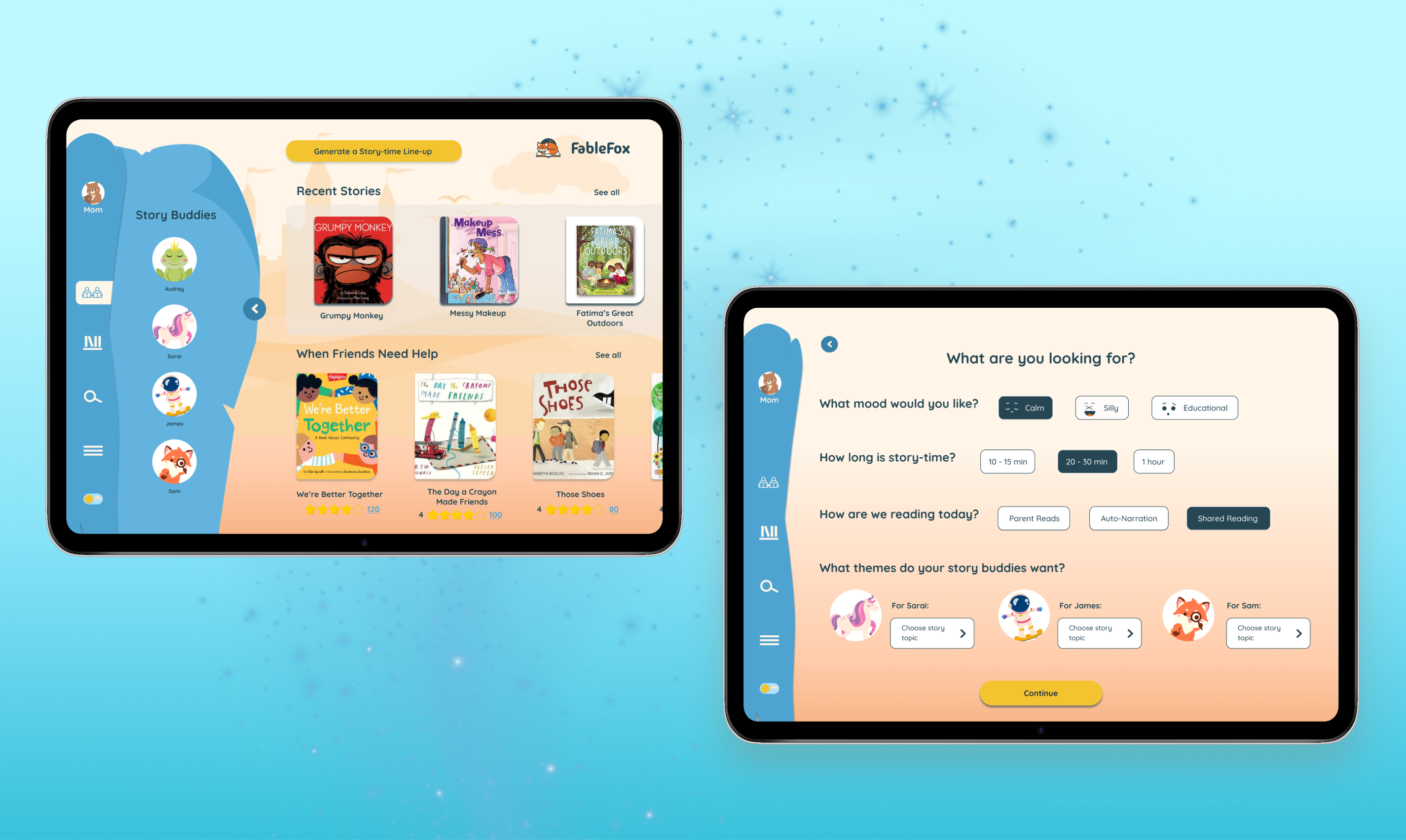
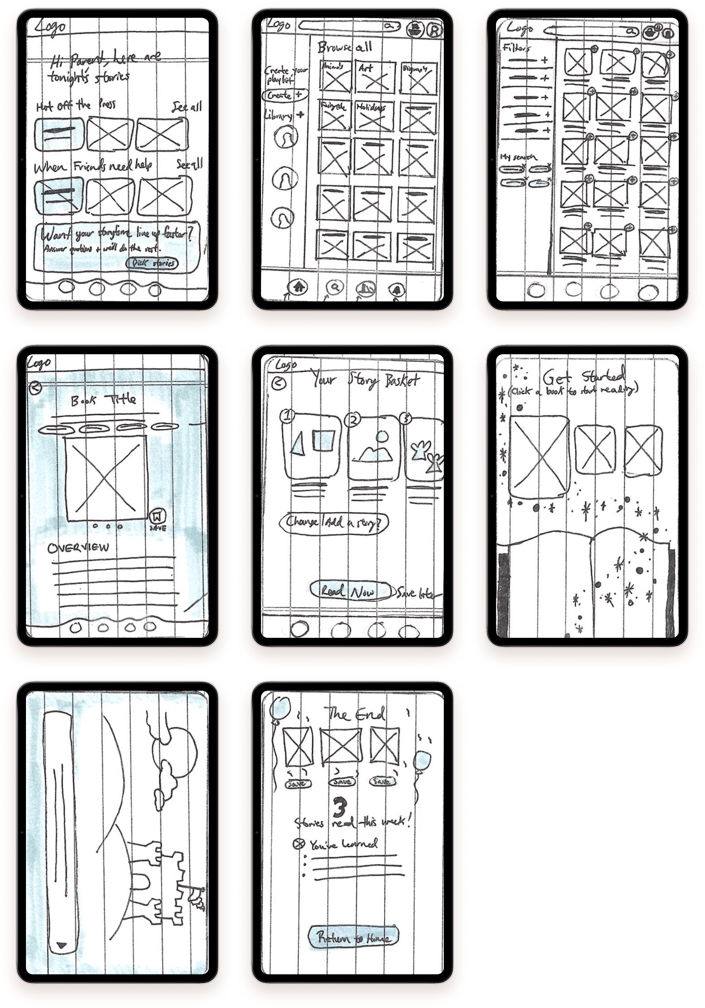
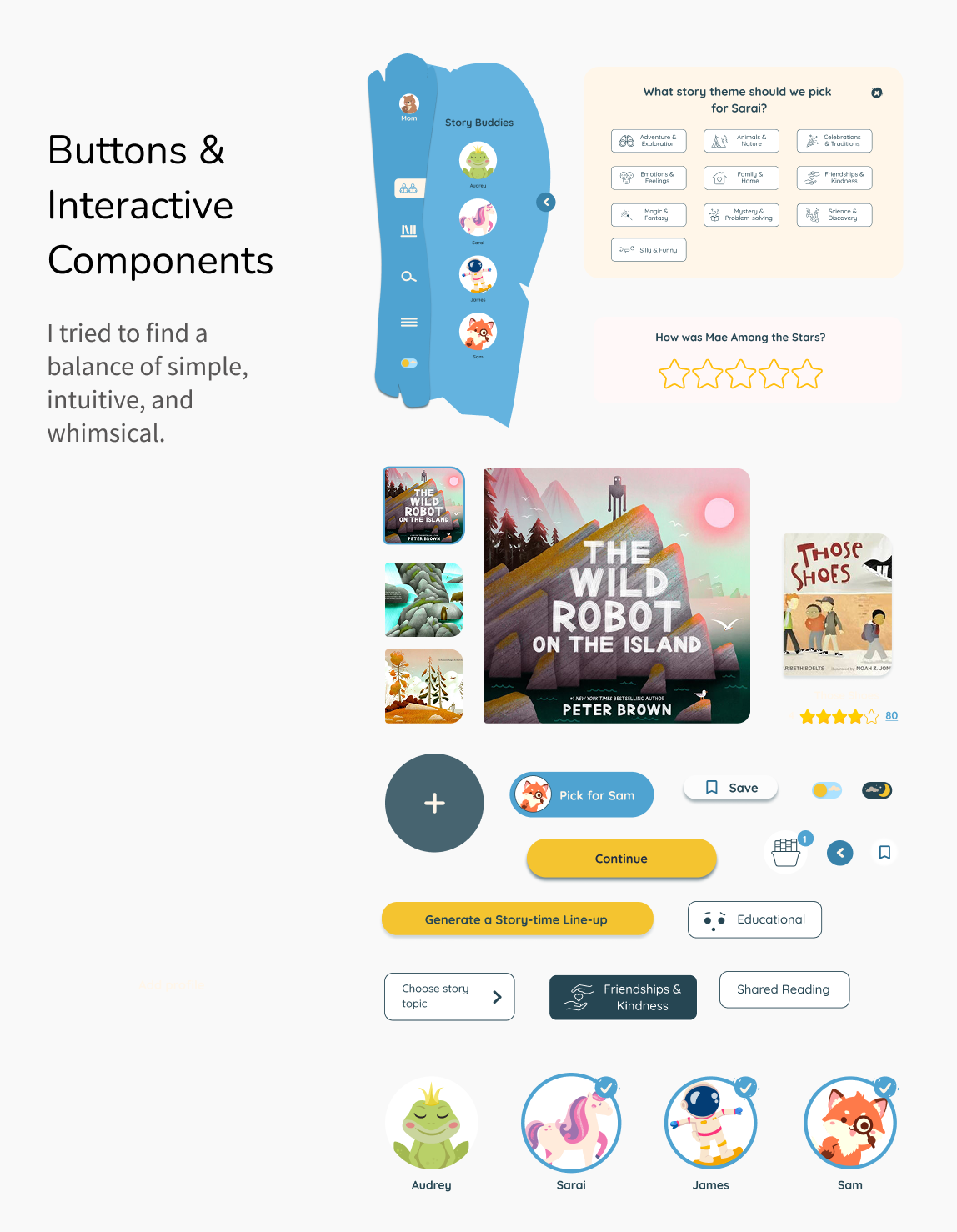
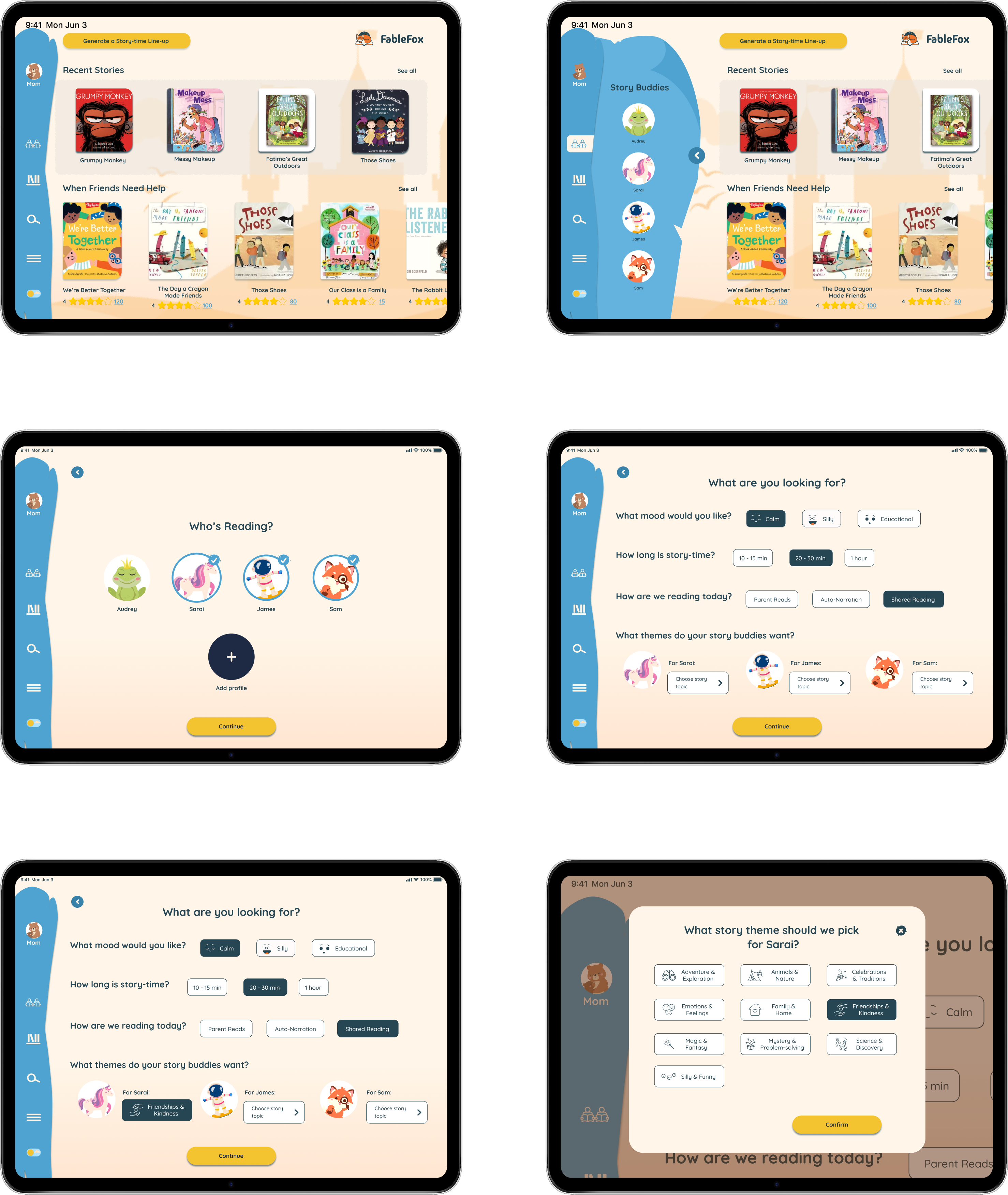
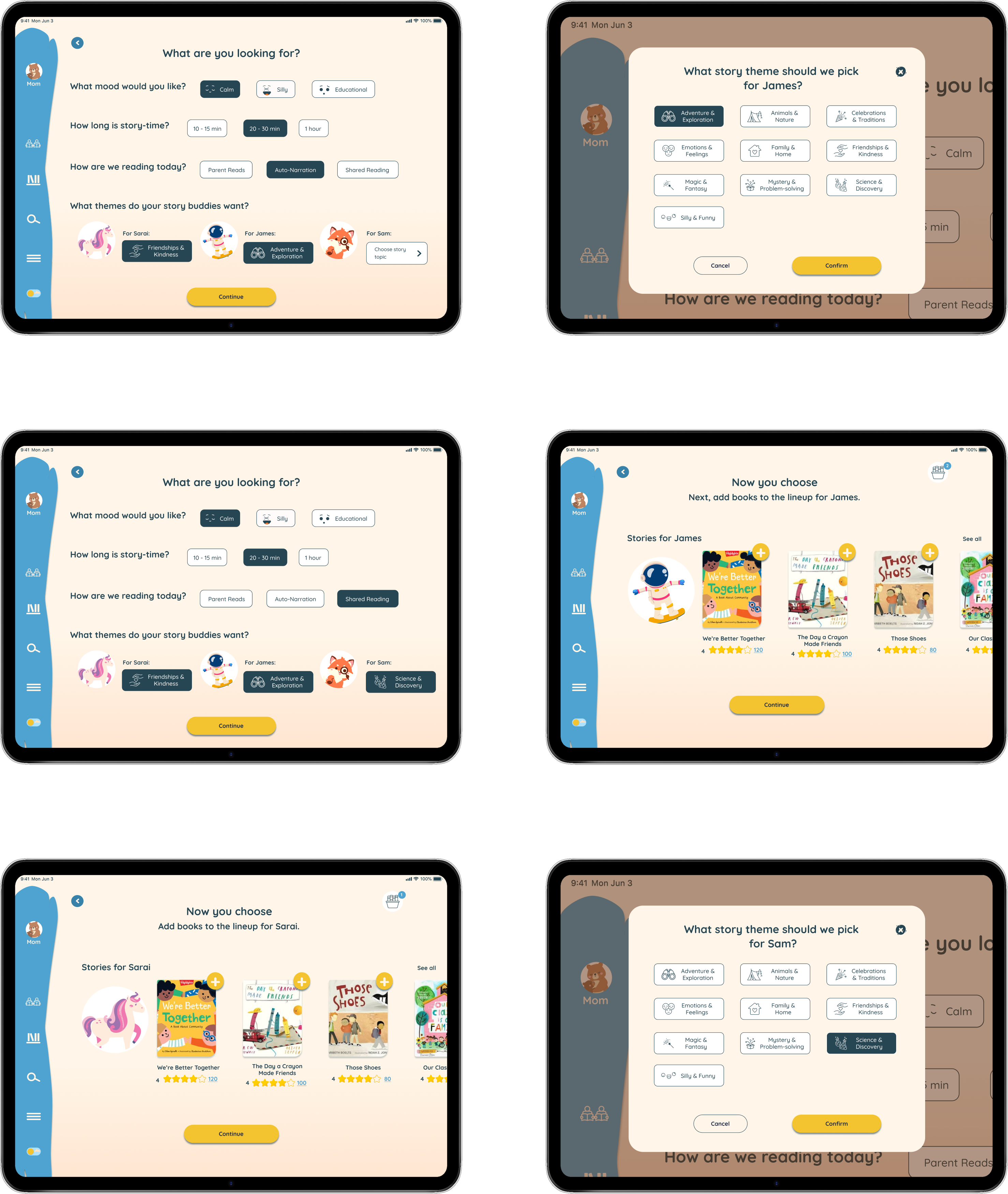
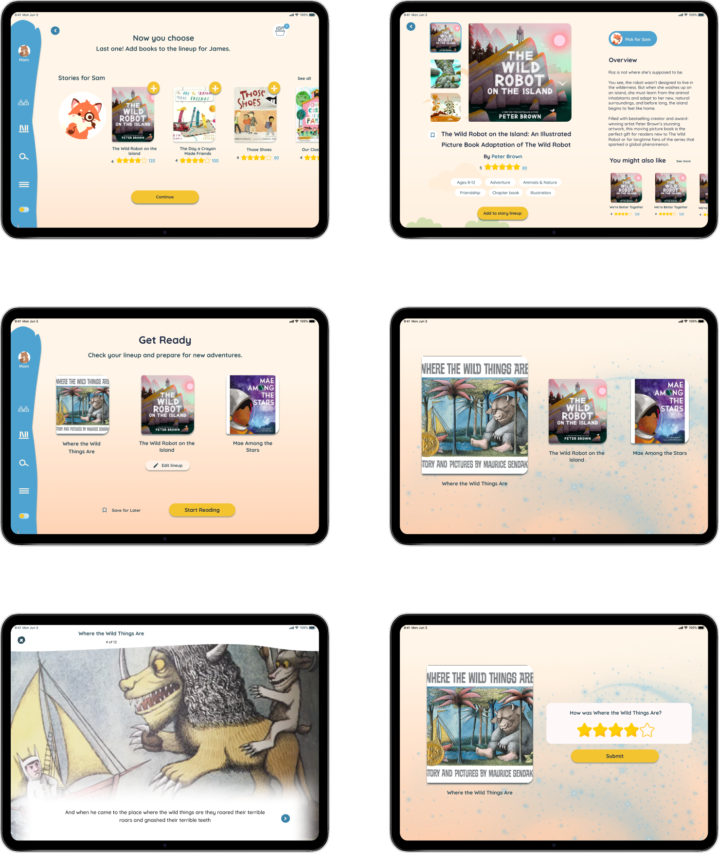
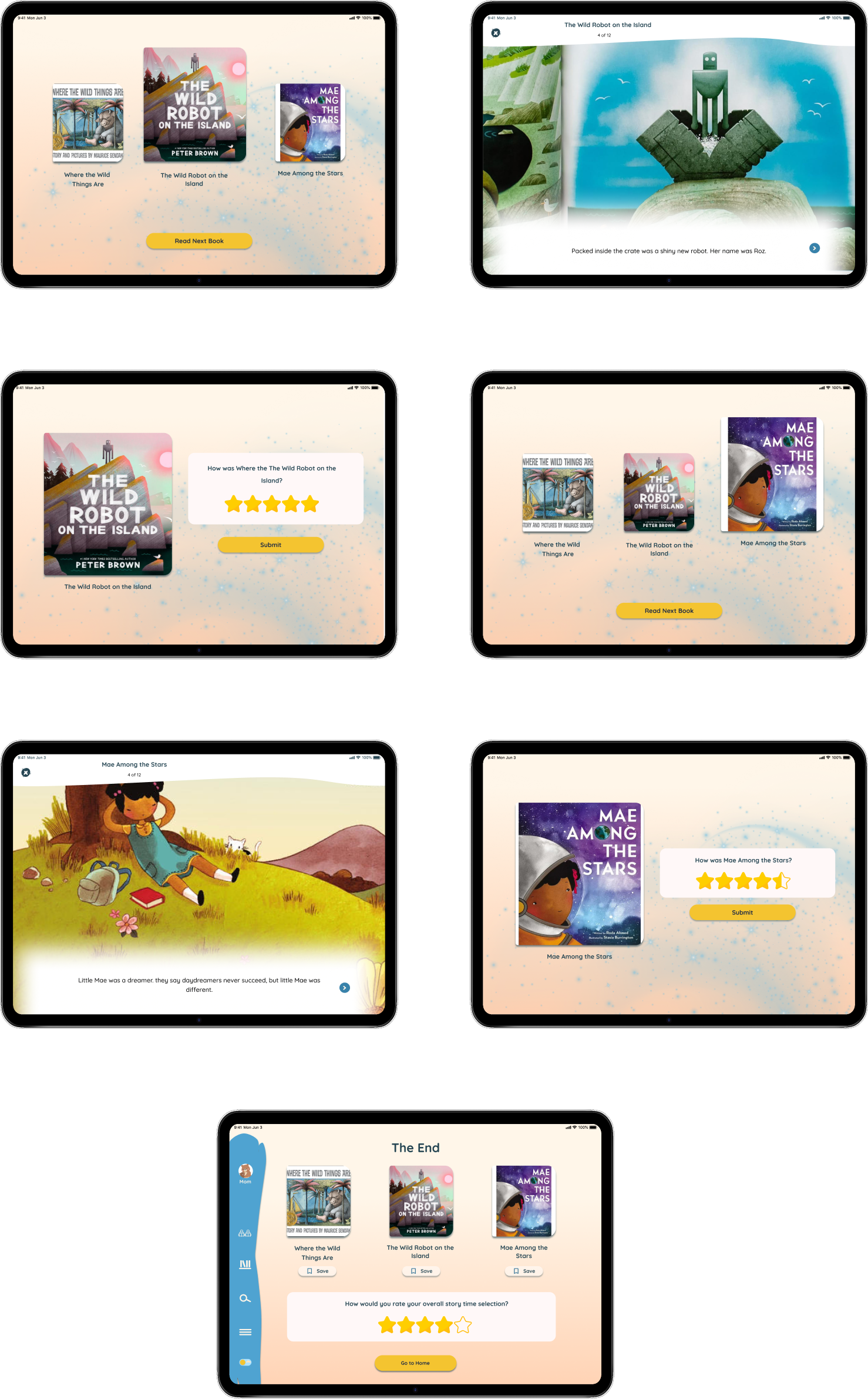
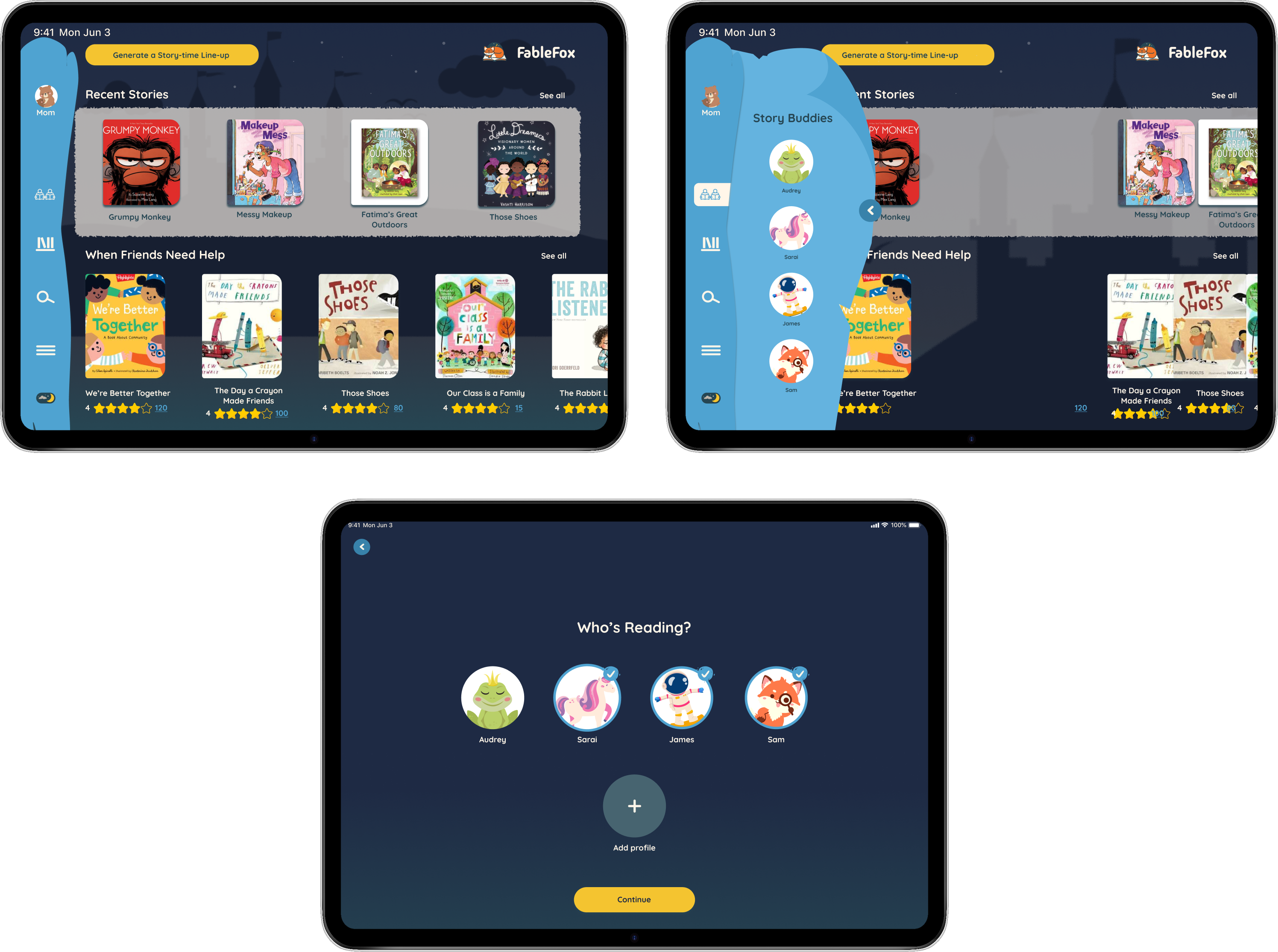
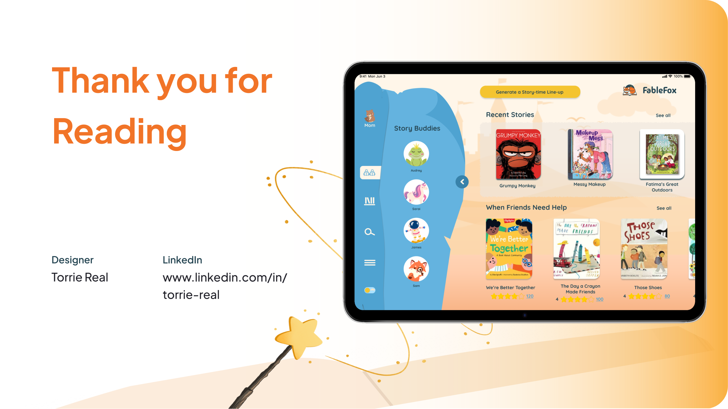
The final design introduces a Storytime mode that shifts the app from browsing into preparation. Instead of searching endlessly, parents are guided to quickly assemble a short queue of stories based on their children’s ages, the time available, and the overall energy of the moment.
Once reading begins, the experience flows seamlessly through the queued stories without requiring families to stop and re-decide. Lightweight filters allow quick adjustments without overwhelming users, while clear labels and large touch targets make the experience accessible for grandparents and shared use.
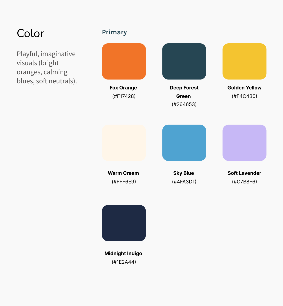
Visual design reinforces the emotional intent of storytime. Warm, muted colors, generous spacing, friendly typography, and soft illustrations create a calm, supportive atmosphere. Day and night considerations ensure the interface feels appropriate during bedtime, helping signal a transition into rest.
I was especially intentional about simplifying the transition from selection to reading by removing unnecessary confirmations. I also slowed down moments where reassurance mattered, such as reviewing the queue before starting.
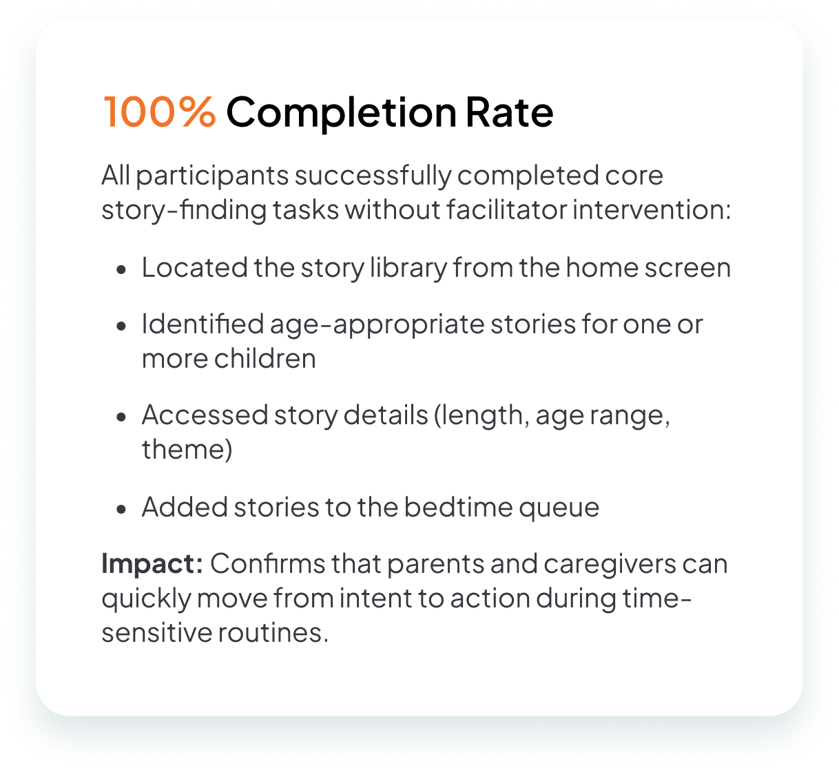
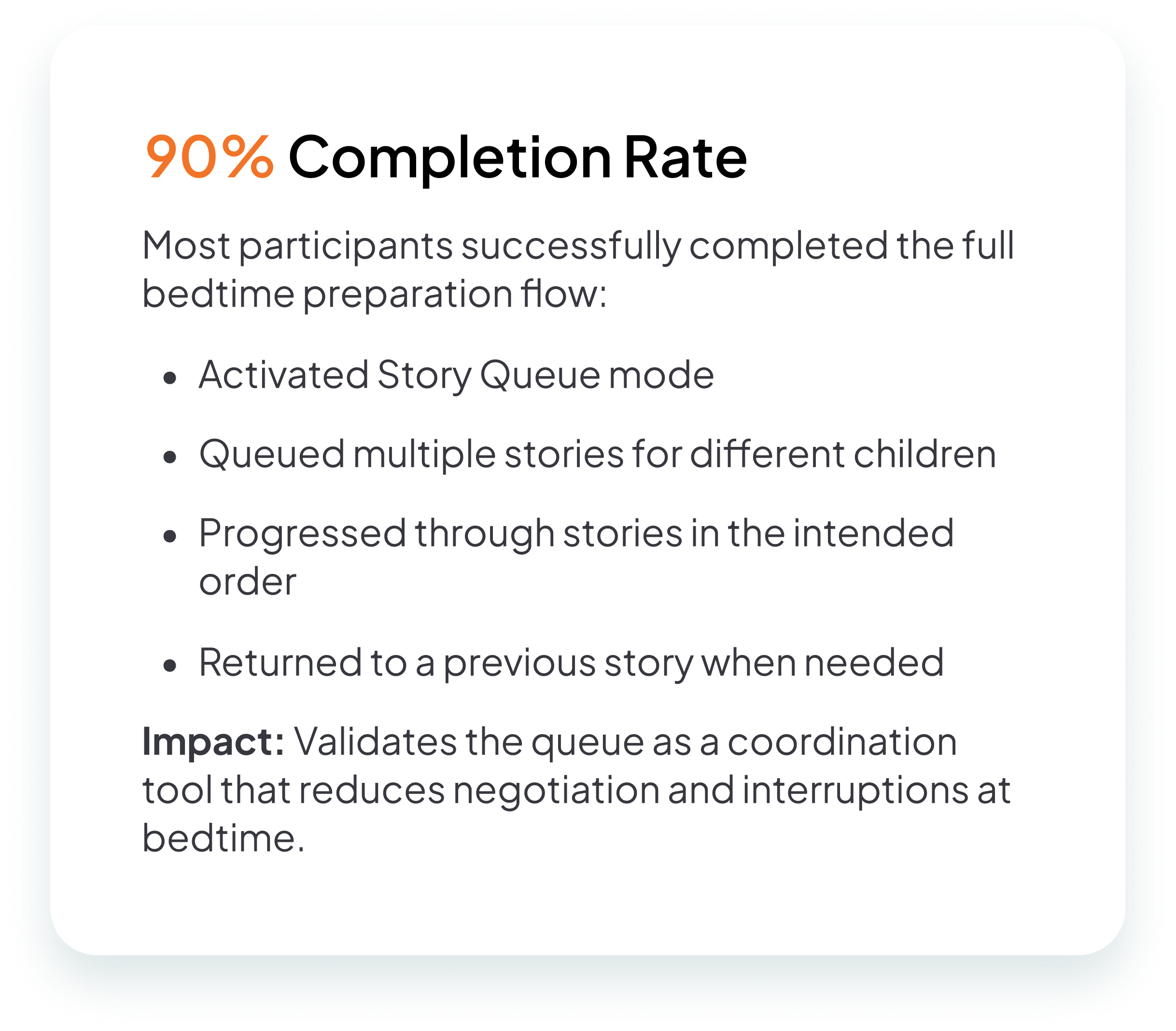
I tested the experience with five participants, focusing on filters, browsing behavior, and the story queue. Testing revealed areas where language needed clarification, icons needed additional support, and multi-child functionality needed to be more explicit. Iterating on these findings helped reduce hesitation and improve confidence. Participants moved through the flow with fewer backtracks and clearer next steps.
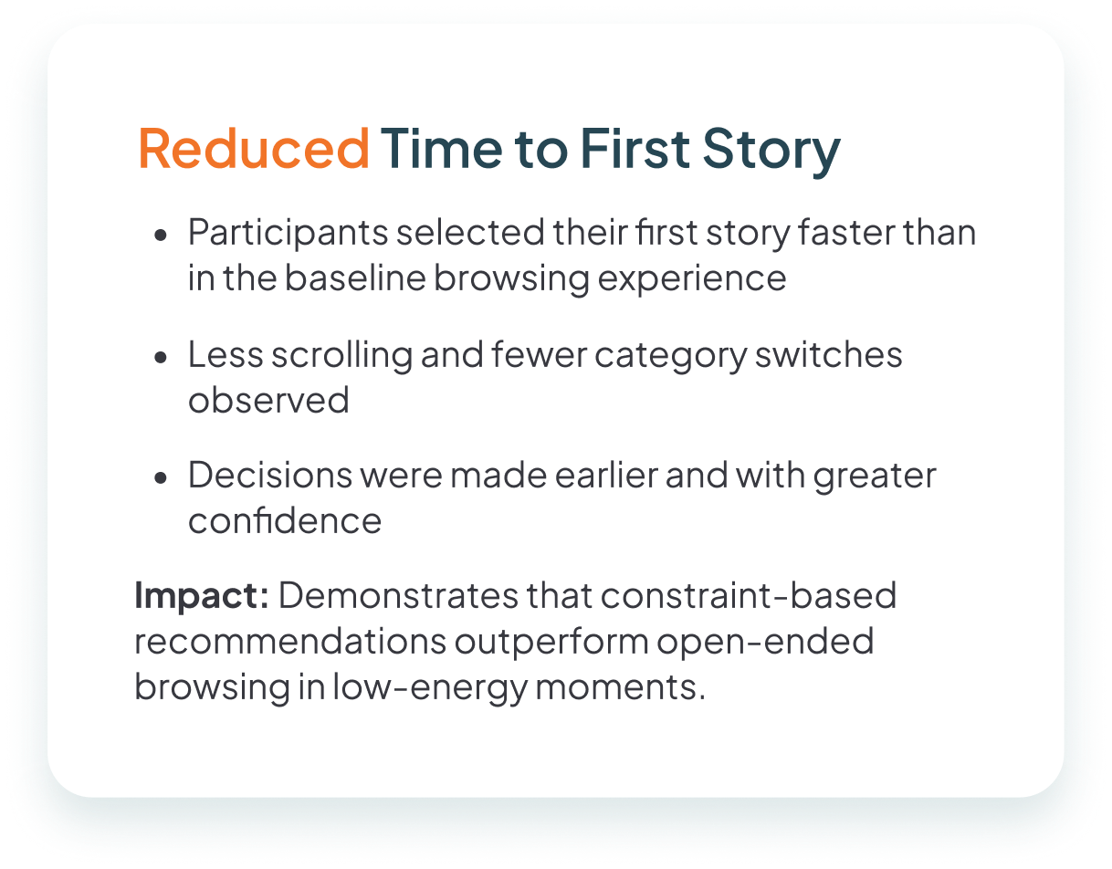
Usability testing showed strong qualitative signals of success. Participants reached reading decisions more quickly and with noticeably less second-guessing. Several described feeling calmer and more prepared before starting. This emotional outcome aligned directly with the project’s goals.
One moment stood out when a parent, after building a short queue, paused and said, “This feels like I’ve already done the work.” That reaction captured the core impact of the design. Stress and uncertainty were replaced with confidence before reading even begins.
From a product perspective, the design allows FableFox’s library to scale without overwhelming users and differentiates the app as one built around real family routines. It also establishes a foundation for future personalization and multi-child use cases without increasing complexity.
This project reinforced that designing for families is about designing for coordination, not individuals. The most effective solutions reduce negotiation and quietly support alignment without calling attention to the system. I also rethought my assumptions about personalization. In emotionally loaded moments, better personalization is often about timing, defaults, and framing rather than more options. Designing for low-energy moments requires restraint, predictability, and clarity. Finally, this work strengthened my confidence in using research to narrow focus and say no. Good design is often defined as much by what you remove or avoid as by what you add.

Copyright © Torrie Real