
CareCup is a gamified learning and support app designed to help caregivers navigate the transition from hospital to home with confidence. It brings together bite-sized education, expert guidance, and peer support in one compassionate digital space—using a reward-based system to motivate progress and reinforce confidence during complex caregiving journeys.
Design Lead, UX Researcher, UX Designer, UI Designer, Brand Creator
March-April 2025
Figma, Adobe Illustrator, Miro
CareCup is a digital companion designed to help caregivers feel confident, supported, and less alone during one of the most stressful moments in healthcare: bringing someone home from the hospital. The project began with a simple question—what if caregivers had a companion as caring as they are?—and evolved through research, synthesis, and two rounds of usability testing into a guided, emotionally supportive experience that blends education, expert help, and community.
Hospital discharge is a critical but fragmented point in care. Patients are often sent home with dense instruction packets, limited follow-up, and little consideration for the people responsible for carrying out recovery at home. Research shows high readmission rates tied to medication confusion, missed warning signs, and lack of coordinated support. In this gap, caregivers become the de facto care managers—often without training, tools, or emotional support. While hospitals optimize for efficiency, caregivers are left navigating uncertainty, stress, and isolation. This disconnect framed the core challenge of the project: how might a digital product support caregivers where the healthcare system falls short?
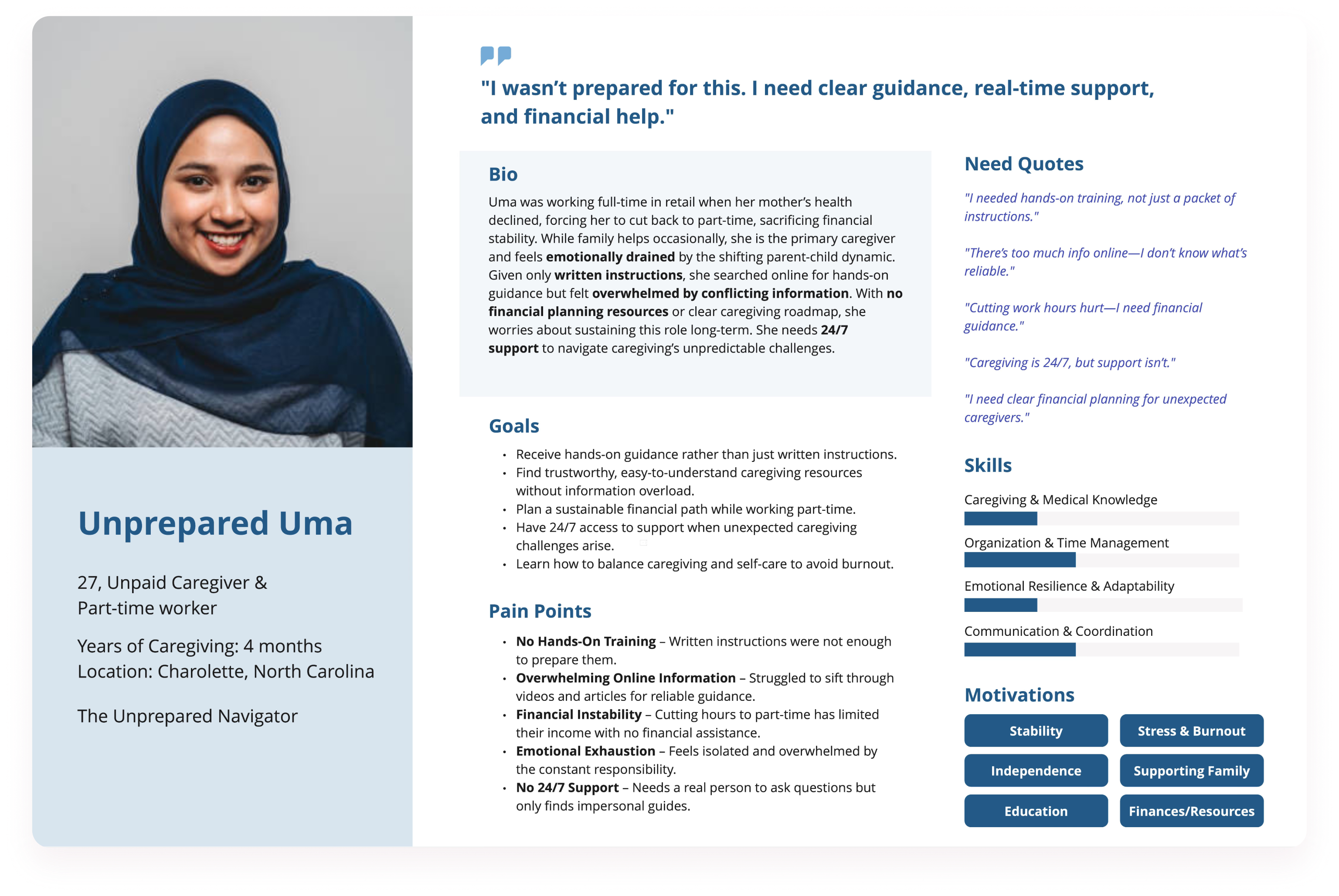
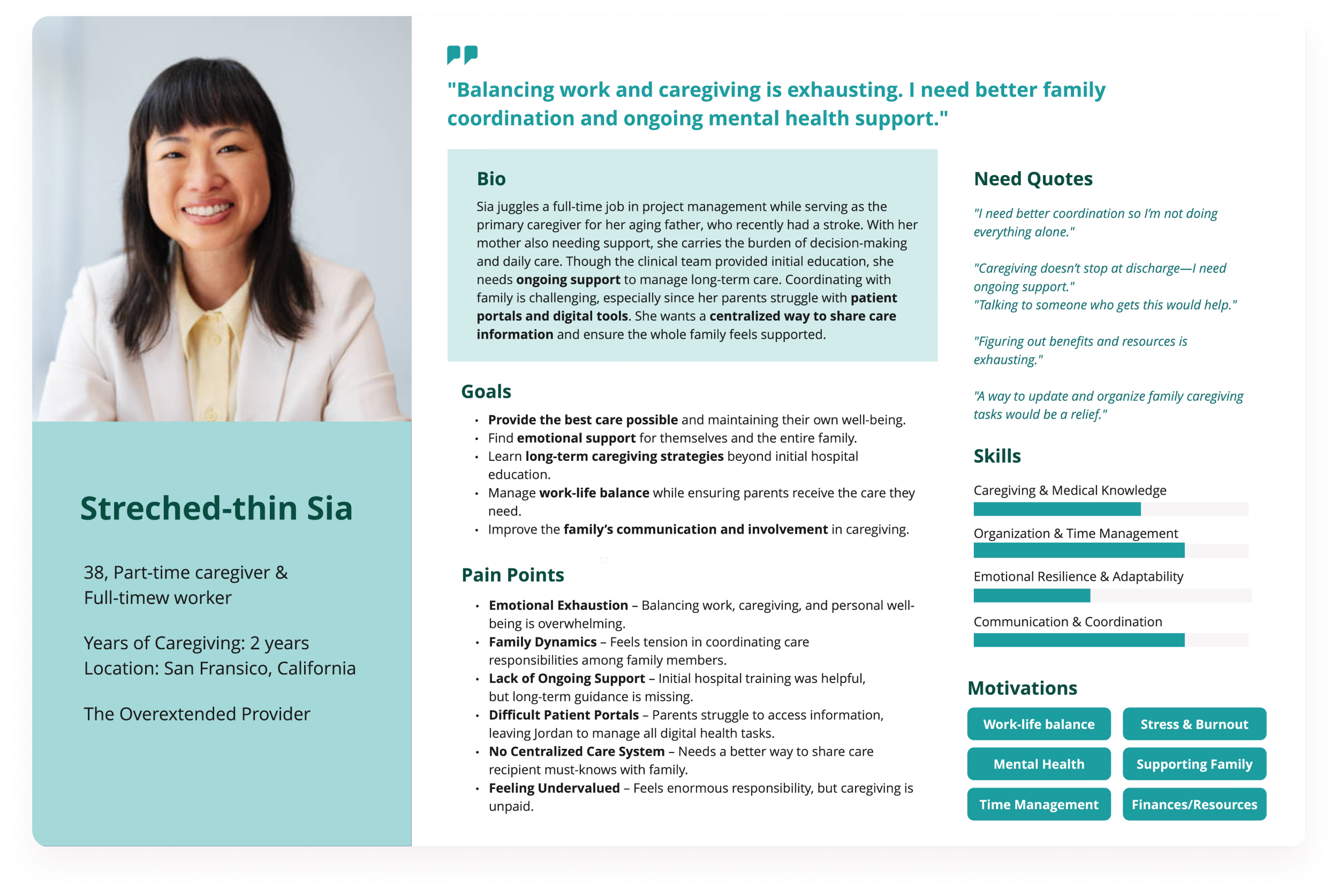
To understand this experience from the caregiver’s perspective, I conducted five 30-minute, one-on-one interviews with caregivers aged 25–55 who had managed a hospital-to-home transition within the past year. Participants were recruited through caregiver communities and screened to ensure they were U.S.-based and caring for adults with complex recovery needs. Three participants were professional caregivers, and two were unpaid family caregivers. The interviews explored how caregivers experienced discharge, where they sought information, and what support they wished existed. The stories were emotionally consistent. Caregivers described feeling unprepared, overwhelmed, and isolated:


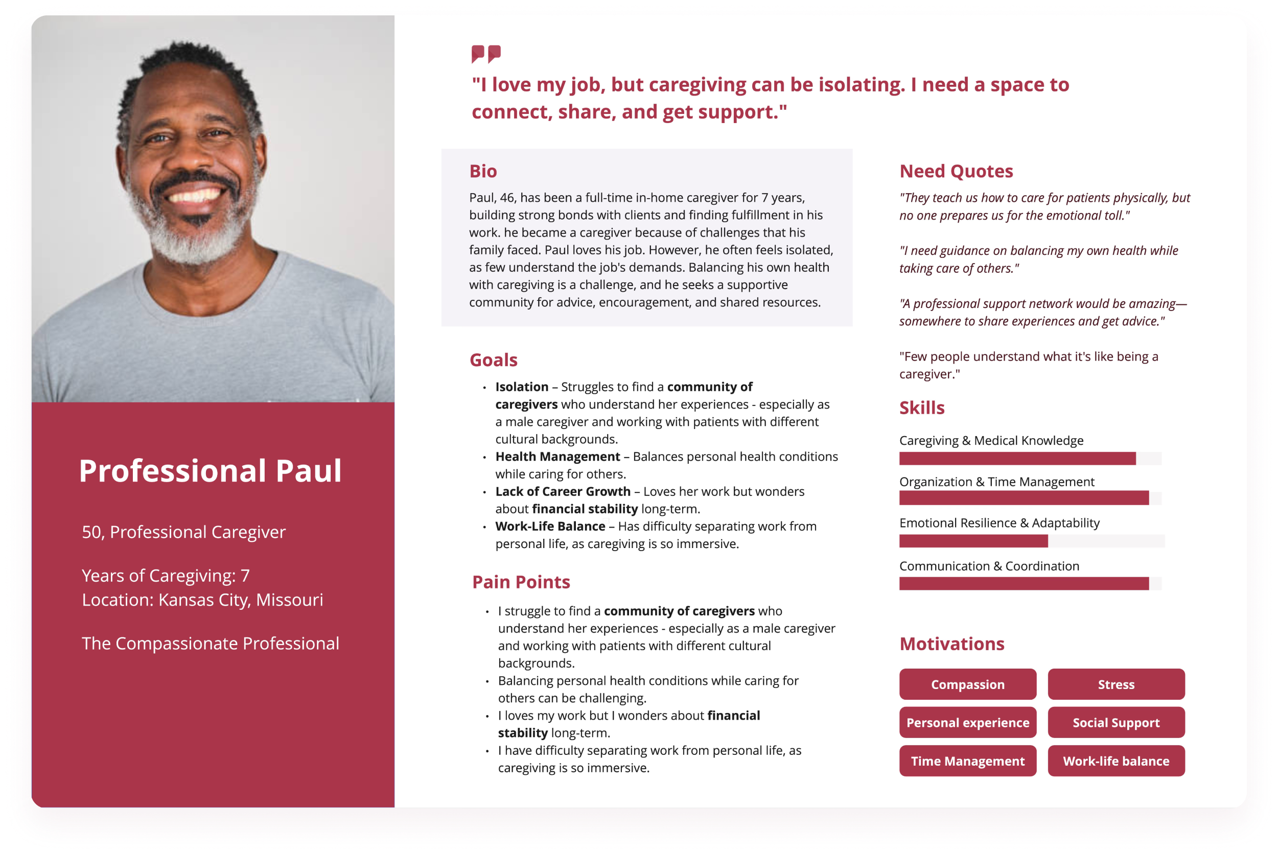
I synthesized findings through affinity mapping and empathy mapping, identifying nine recurring themes including caregiving education gaps, environmental transition challenges, emotional burnout, lack of peer support, and limited access to responsive professional guidance. To ground these insights, I created three personas that reflected distinct caregiving realities:
Across roles, one need remained constant: caregivers wanted clarity, reassurance, and a sense that they weren’t navigating recovery alone.
Caregivers were not struggling because they lacked effort or motivation—they were struggling because the healthcare system handed them responsibility without guidance. After synthesizing research across interviews, empathy maps, and personas, I reframed the challenge away from hospital discharge logistics and toward the caregiver’s lived experience. Caregivers needed more than information. They needed reassurance, structure, and a clear sense of what to do next—especially during the first days at home. This led me to define the core problem as a lack of accessible, emotionally supportive, step-by-step guidance during care transitions.
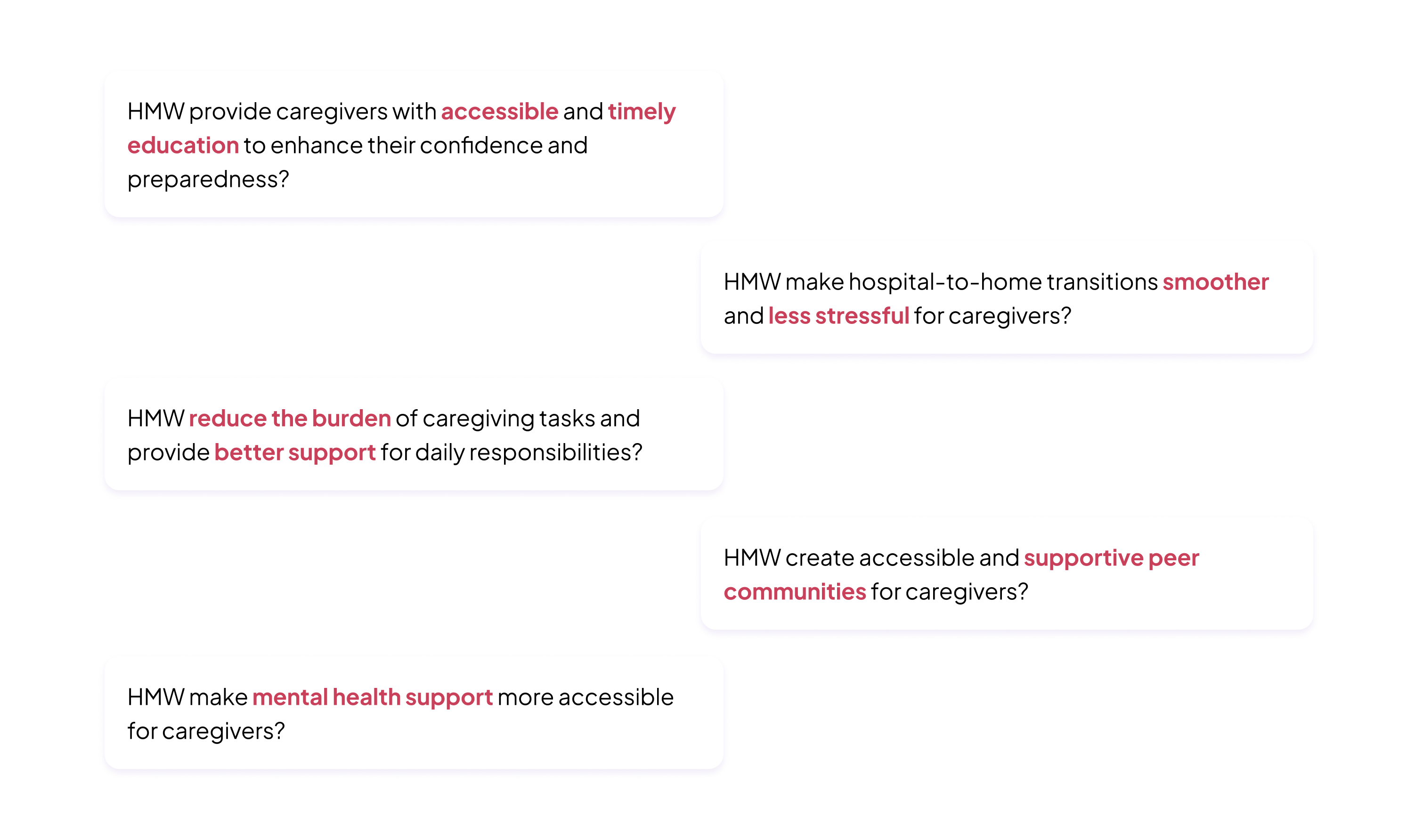
To keep the solution space open while staying grounded in real needs, I translated these insights into a set of “How might we” questions. These focused on improving confidence through education, reducing stress during transitions, supporting emotional wellbeing, and creating spaces for connection. Rather than jumping straight into features, these questions helped me explore why certain experiences might matter before deciding how they should work.
This framing became the foundation for concept exploration. It clarified what CareCup needed to do—and just as importantly, what it didn’t need to do—allowing the next phase to focus on experiences that were both emotionally meaningful and realistically usable.

With the problem defined, I moved into ideation by sketching and clustering concepts around three emerging pillars: guided learning, expert support, and community connection. I explored how caregivers might move between these depending on time, energy, and confidence. Early concepts included bite-sized care lessons, condition-based peer groups, and a way to ask questions without feeling intimidated. I also explored light gamification—not as competition, but as encouragement—using progress indicators and milestones to recognize effort. Each idea was evaluated against a simple lens: does this reduce cognitive load, offer reassurance, and feel usable on a hard day? The strongest concepts were those that combined structure with emotional support, forming the foundation of the CareCup experience.
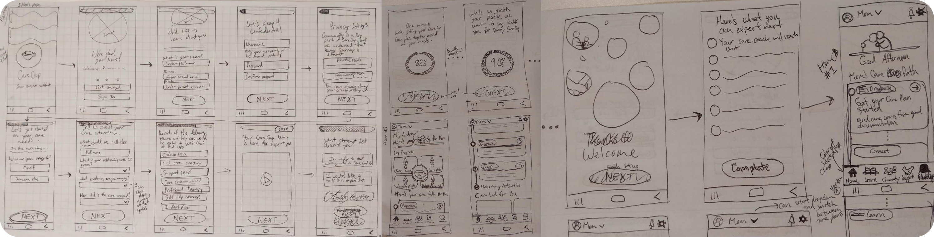
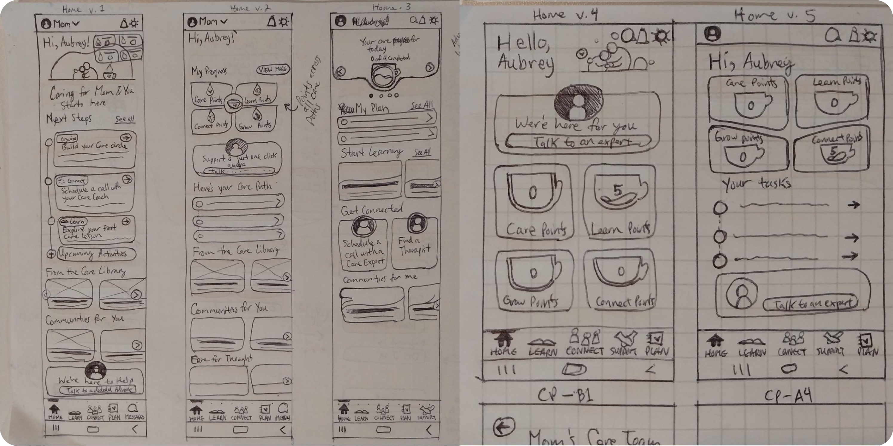
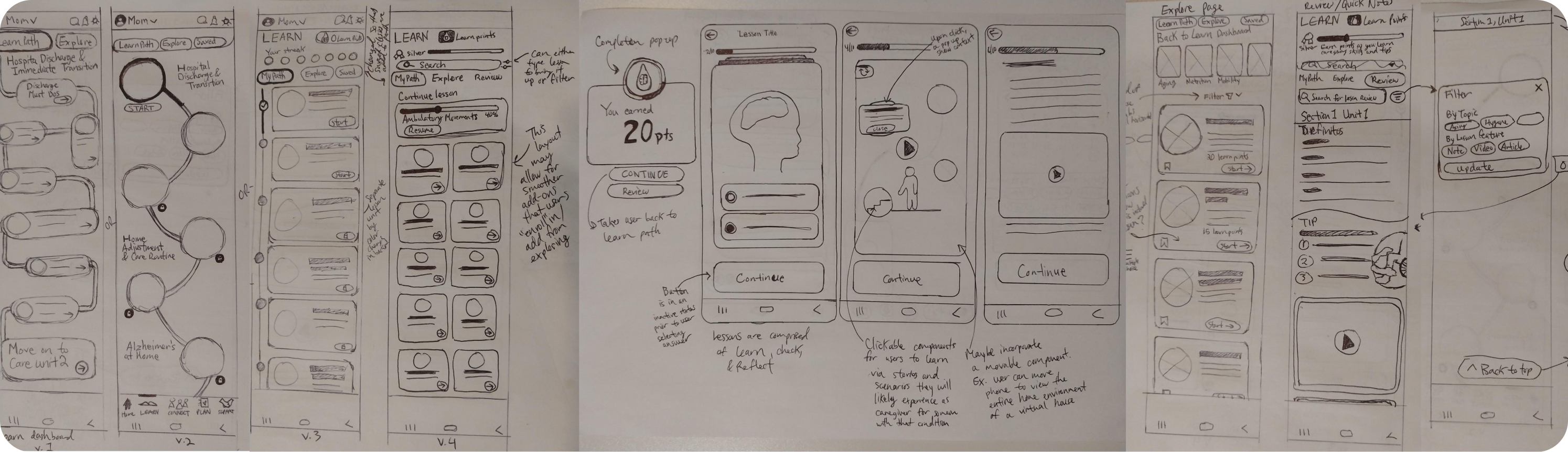

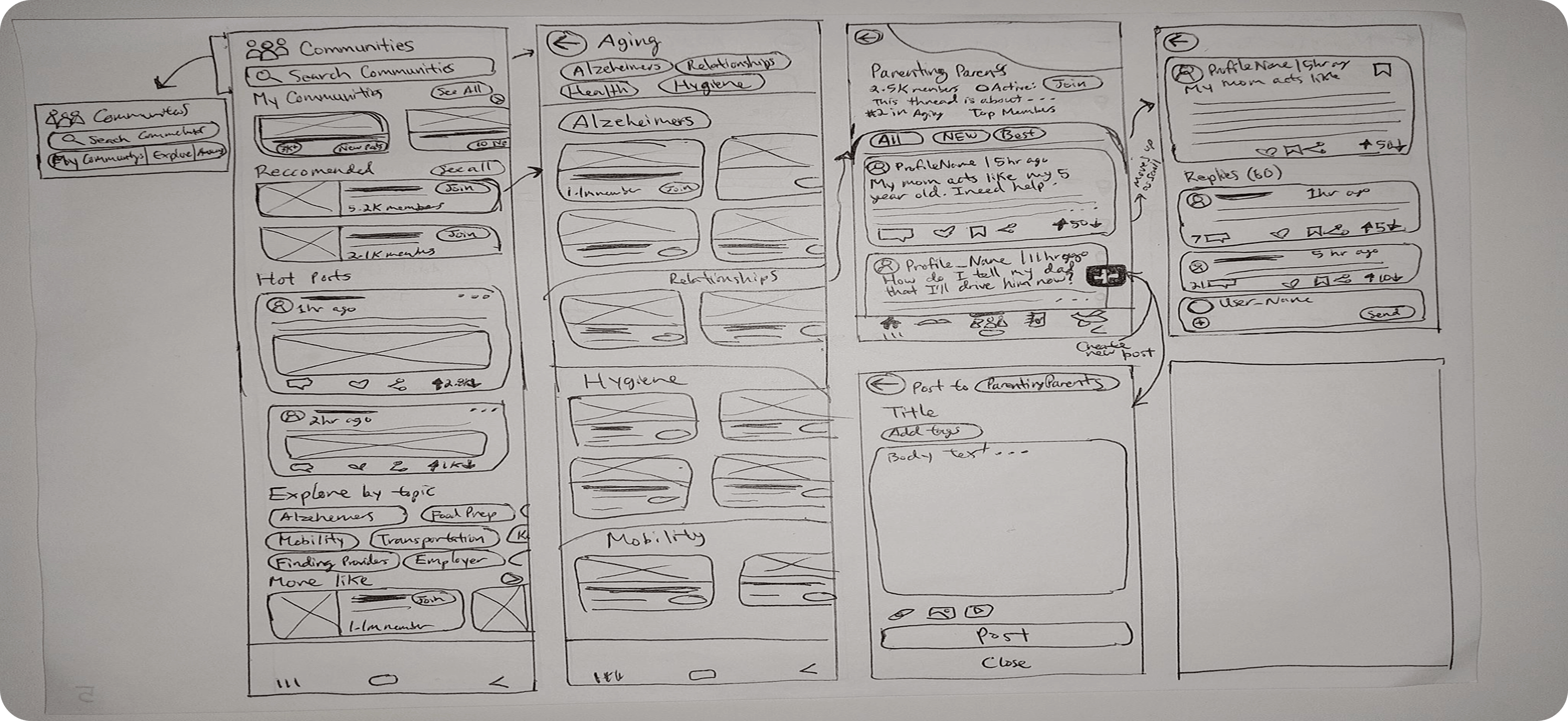
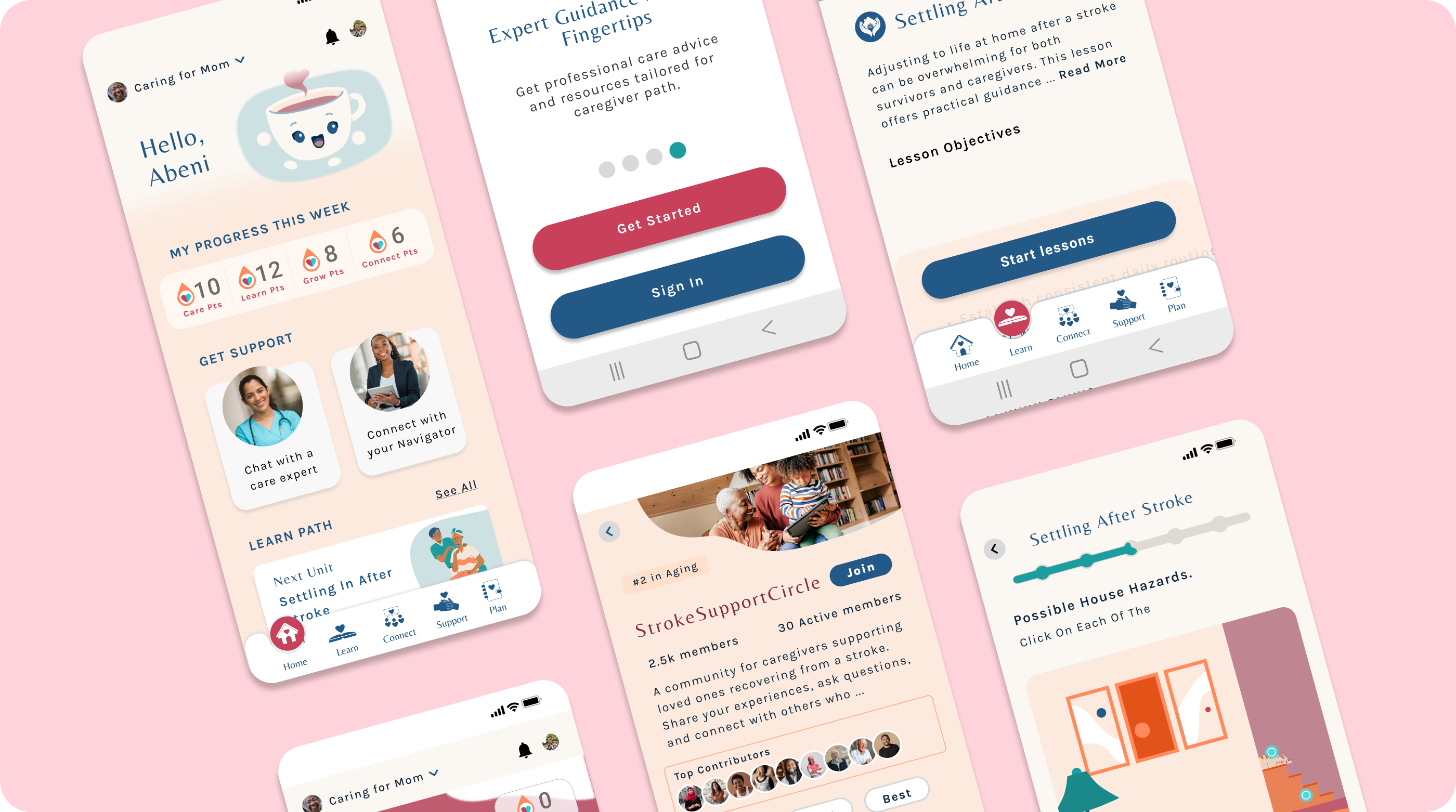
I translated these concepts into early experience flows, mapping how a caregiver would onboard, start a care path, complete a lesson, and seek help. Low-fidelity wireframes focused on clarity rather than aesthetics, allowing usability issues to surface early. Testing revealed that while caregivers appreciated the simplicity, several areas lacked guidance. Lesson overviews didn’t provide enough context, support options felt vague, and community groups were difficult to navigate. These insights led to clearer language, stronger hierarchy, and more explicit guidance before moving into high-fidelity design. Across the interface, major screens were designed to communicate simplicity and confidence:
After building the foundational wireframes, I moved into high-fidelity design to shape CareCup’s visual identity, emotional tone, and interactive feel. My goal was to create an experience that felt warm, reassuring, and empowering—directly addressing the stress, isolation, and uncertainty caregivers described during research.
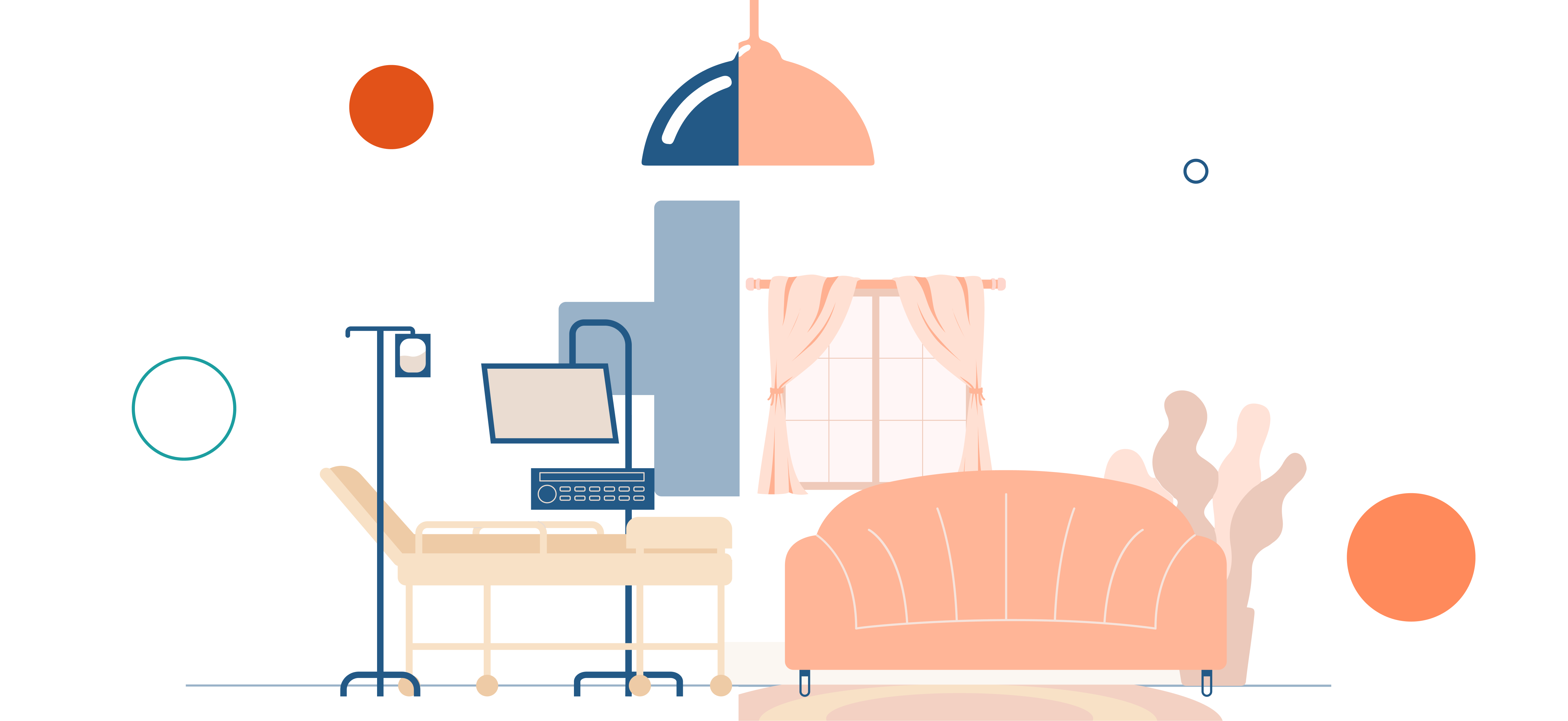
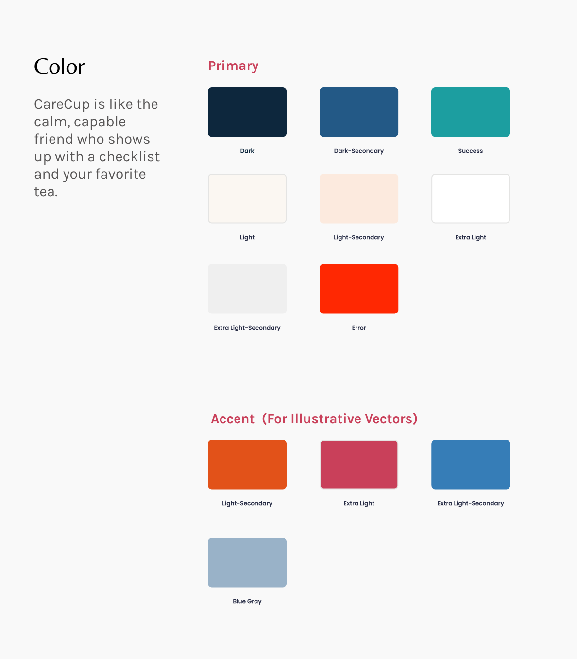
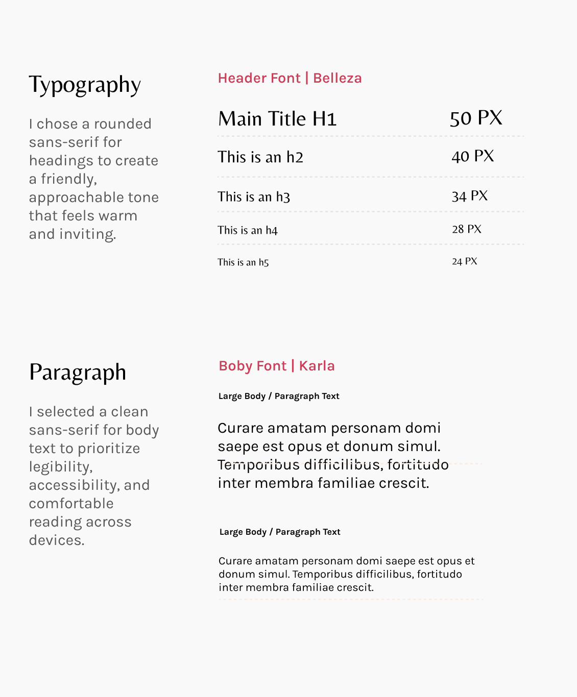
I introduced a soft, welcoming color palette rooted in calming blues and energizing corals, supported by neutral backgrounds for readability. The typography paired a friendly sans-serif for headers with a clean, accessible body font. Together, these choices countered the sterile feeling of traditional healthcare environments and reinforced an atmosphere of comfort and clarity.
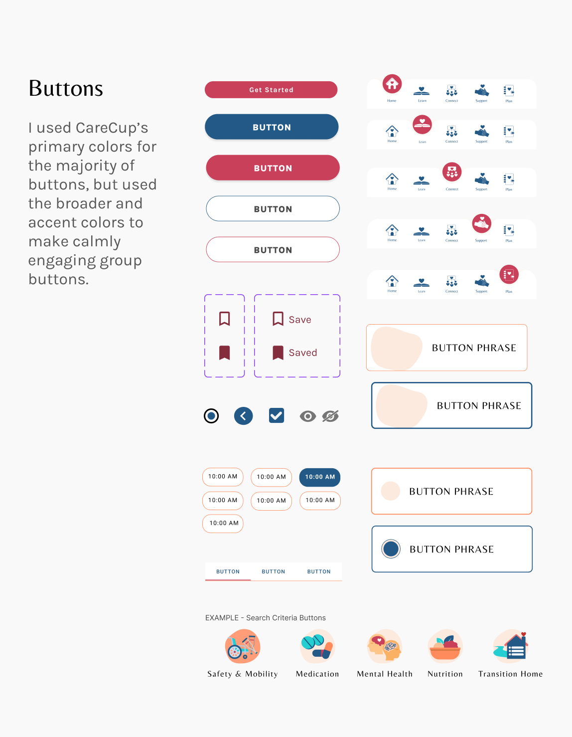
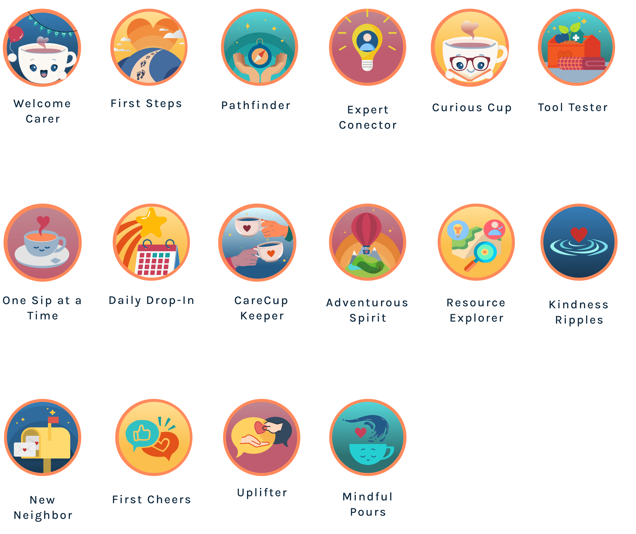
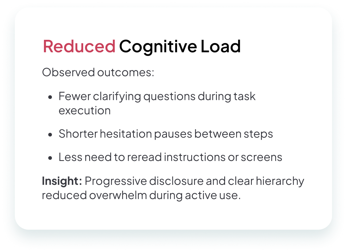
Every visual decision was made to reduce cognitive load while strengthening emotional connection. Rounded shapes, generous spacing, and intuitive hierarchy helped the interface feel like an ally rather than another task. Micro-interactions—such as gentle confetti after completing a lesson—were added to encourage progress through celebration rather than pressure.
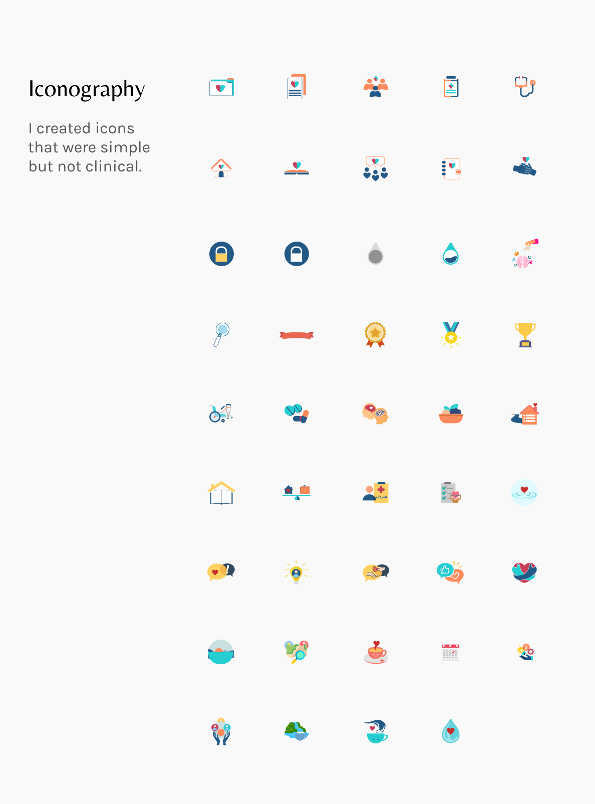
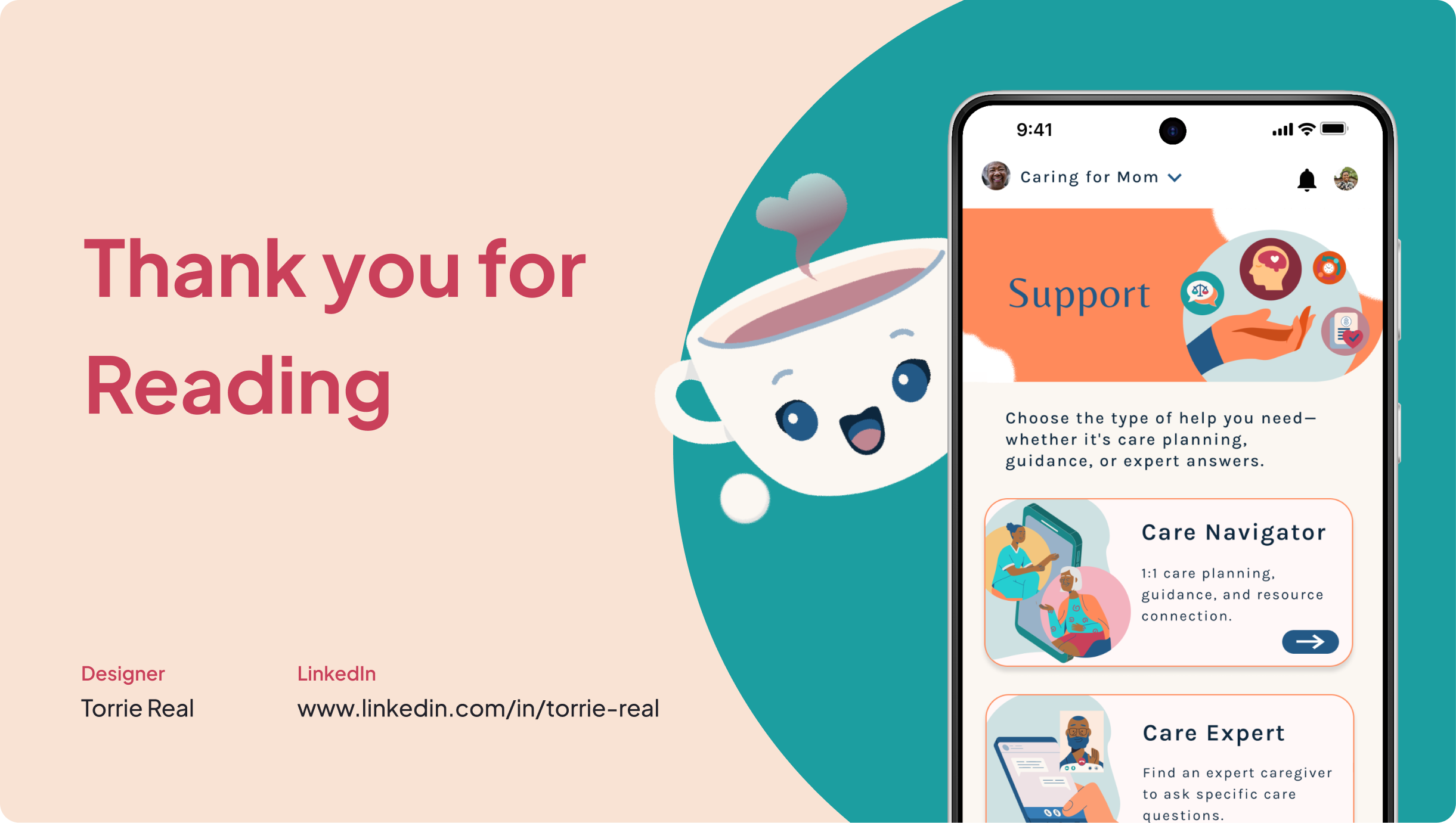
To further humanize the experience, I introduced Cuppy, a smiling cup-shaped mascot who appears at key moments to offer encouragement and acknowledge effort. Cuppy’s consistent tone, movement, and personality created a sense of companionship, softening clinical content and making the app feel more supportive and approachable. Custom vectors and badges extended this emotional layer, recognizing caregiving as meaningful work worthy of affirmation. Designing custom vectors allowed me to infuse CareCup’s visual language with empathy and identity.

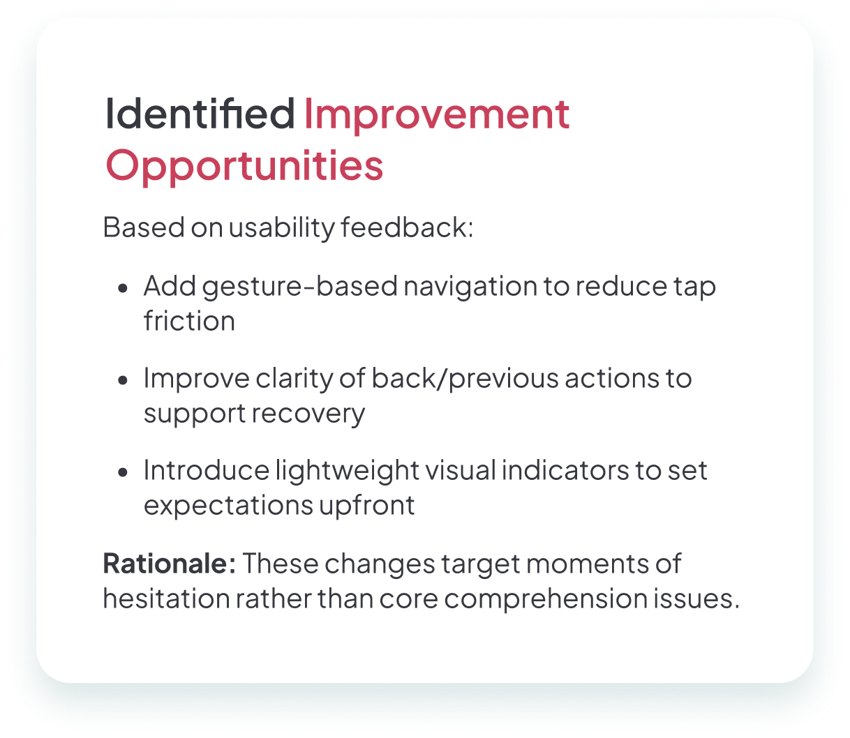
I ran two rounds of usability testing to progressively refine both clarity and engagement. The first round focused on discoverability and comprehension. Caregivers struggled to understand lesson scope, skipped unclear features, and felt unsure about where to ask for help. In response, I simplified labels, clarified support roles, and restructured community categories to reflect real caregiver needs.
Each round sharpened the product. Structural clarity came first; emotional and motivational clarity followed. By iterating in this sequence, CareCup evolved into an experience that felt not only usable, but trustworthy and supportive.
The second round tested the high-fidelity prototype. While users responded positively to the visual tone and overall friendliness of the app, new issues emerged. Long lessons caused scrolling fatigue. The points system felt disconnected from meaningful outcomes. Community spaces were easier to join, but still lacked direction once inside. Users also wanted more transparency around expert credentials and response expectations.

ExperiencBy the end of testing, caregivers described CareCup as:

“I wish we’d had CareCup when my dad came home after his stroke—it would have made those first weeks so much less overwhelming.”
“This would've saved me countless hours searching for foot care during my aunt’s transition home.”
"I'd love to have a real expert to talk to who understands me."
Users could complete core tasks without assistance, understood where to find help, and felt emotionally supported by the tone of the product. The final prototype demonstrated that caregiving tools can be both functional and compassionate—reducing overwhelm while building confidence.
CareCup taught me that designing for caregivers means designing for humanity. I learned to pay attention not just to clicks, but to emotions. A moment of relief or recognition often revealed more than any task metric. I also learned that simplicity can still be powerful. The most meaningful improvements were those that removed friction while honoring caregivers’ time, energy, and dignity.
Designing for both professional and family caregivers deepened my understanding of inclusive design. Each group had different responsibilities, but both needed reassurance and clarity. Adding gentle encouragement through moments like Cuppy and milestone badges helped balance seriousness with support.
CareCup ultimately changed how I approach every project. For me, empathy is now the starting point, not an add-on. The best digital experiences don’t just help people complete tasks. They help people feel capable, supported, and seen. CareCup became a reminder that when we design for caregivers, we are really designing for care itself, creating meaningful support where it’s needed most.

Copyright © Torrie Real