
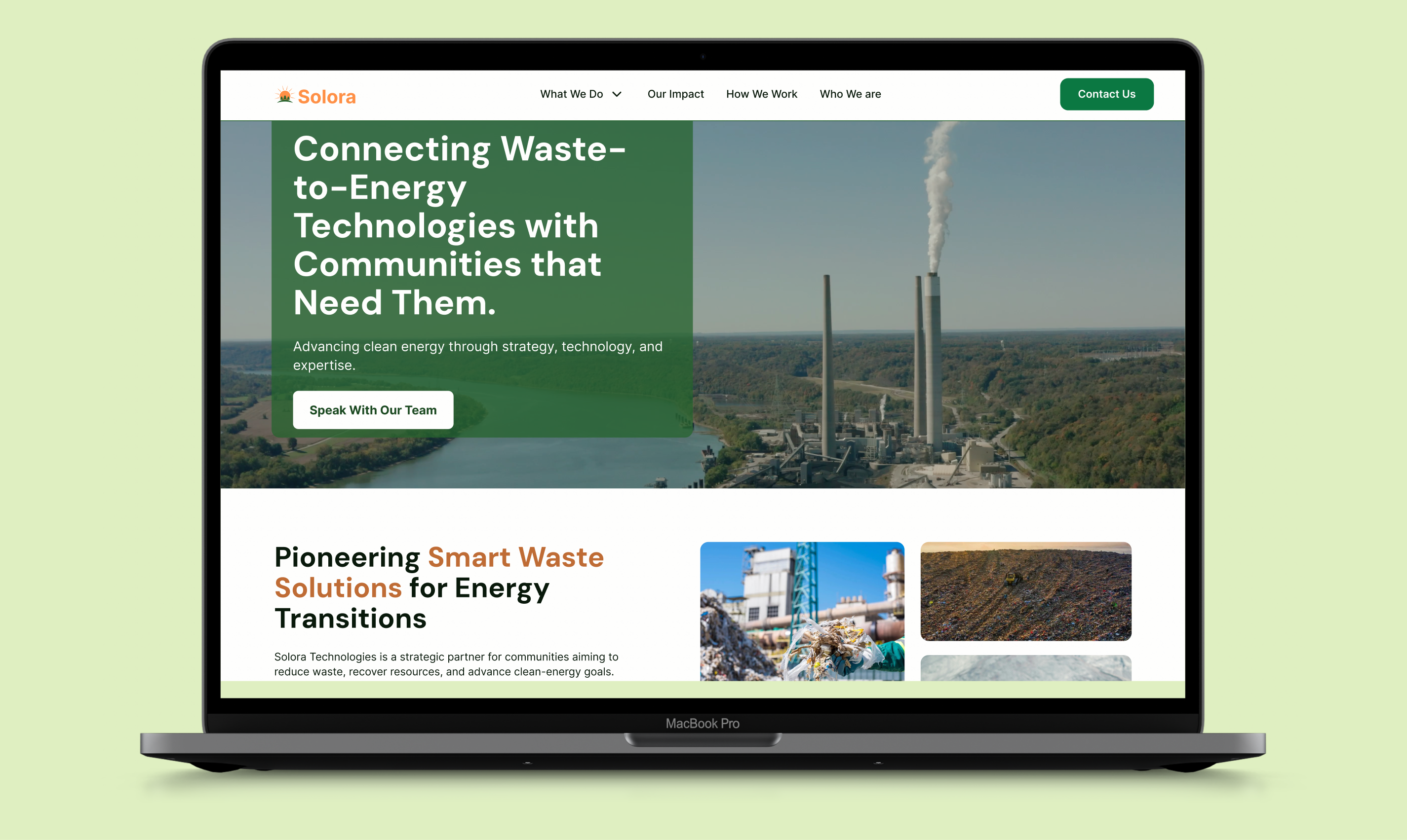
Solora Technologies is a data-driven environmental and waste-to-energy advisory company. The redesigned site brings environmental data, policy insight, and technology evaluation into one clear, approachable experience. It makes it easier to understand options, align stakeholders, and move projects forward responsibly.
UX Designer, UI Designer, UX Researcher, Presenter, Co-Project Manager
Novemeber - December 2025 (4 weeks)
Figma, Adobe Illustrator
Torrie Real, Laura Lopez
The redesign of the Solora Technologies website was undertaken to help an early-stage but highly specialized firm clearly communicate who they are, what they do, and how they support complex environmental decisions. Operating at the intersection of waste management, clean energy, environmental analytics, and regulatory strategy, Solora needed a digital presence that reflected both the rigor of its work and the advisory nature of its role.
The core challenge was not visibility alone, but credibility. Solora works with municipalities, investors, Indigenous and community leaders, and policy stakeholders—audiences that are conservative, risk-aware, and operating within highly regulated environments. The website needed to establish trust quickly, clarify service differentiation, and support first conversations, while also providing a scalable foundation for future growth.
I served as a co-project lead on this engagement, contributing across information architecture, content strategy and writing, vector and diagram design, and interactive components. My primary focus was clarifying Solora’s positioning and reinforcing credibility with municipal and investor audiences through clear structure, precise language, and systems-oriented visuals.
Solora Technologies is an environmental strategy and advisory firm that works upstream—helping clients understand waste flows, evaluate viable pathways, interpret environmental data, and navigate regulatory and market complexity before major capital commitments are made. Unlike many firms in the waste-to-energy space, Solora does not operate facilities or promote a single technology. Instead, it competes on clarity, coordination, and evidence, combining environmental analytics, regulatory fluency, and systems-level strategy to support defensible decision-making.
The redesign was completed within a four-week timeline for a company that was less than a year into its public-facing presence. Solora did not yet have a complete website, and much of the foundational information had to be gathered through internal interviews, investor presentations, and working documents. At the same time, Solora’s service offerings and positioning were still evolving, which required the design process to accommodate refinement without locking the company into rigid structures.
Success was defined qualitatively. The Solora team wanted a site that clearly explains what they do, how their services fit together, and why they are different from technology vendors and large global operators. The site needed to give each audience enough confidence to schedule an initial call, while remaining flexible enough to support future services, reports, partnerships, and proprietary innovations.
The goal of the Solora Technologies website redesign was to clearly position the company as a credible, science-driven environmental strategy partner. The project focused on clarifying services, building trust with municipalities and investors, and creating a scalable structure that supports informed decision-making in a complex, regulated space.
Research methods included persona refinement, internal interviews with Solora’s CFO and IT Director, competitive audits of established operators and emerging technology firms, and early sitemap walkthroughs with the client. This discovery focused on understanding how Solora’s work is evaluated, trusted, and acted upon in real decision environments. Rather than treating the website as a marketing artifact, we framed it as a decision-support tool. Municipal leaders, investors, regulators, and technology partners all interact with Solora at different points in the same ecosystem, and the site needed to reflect that interconnected reality.
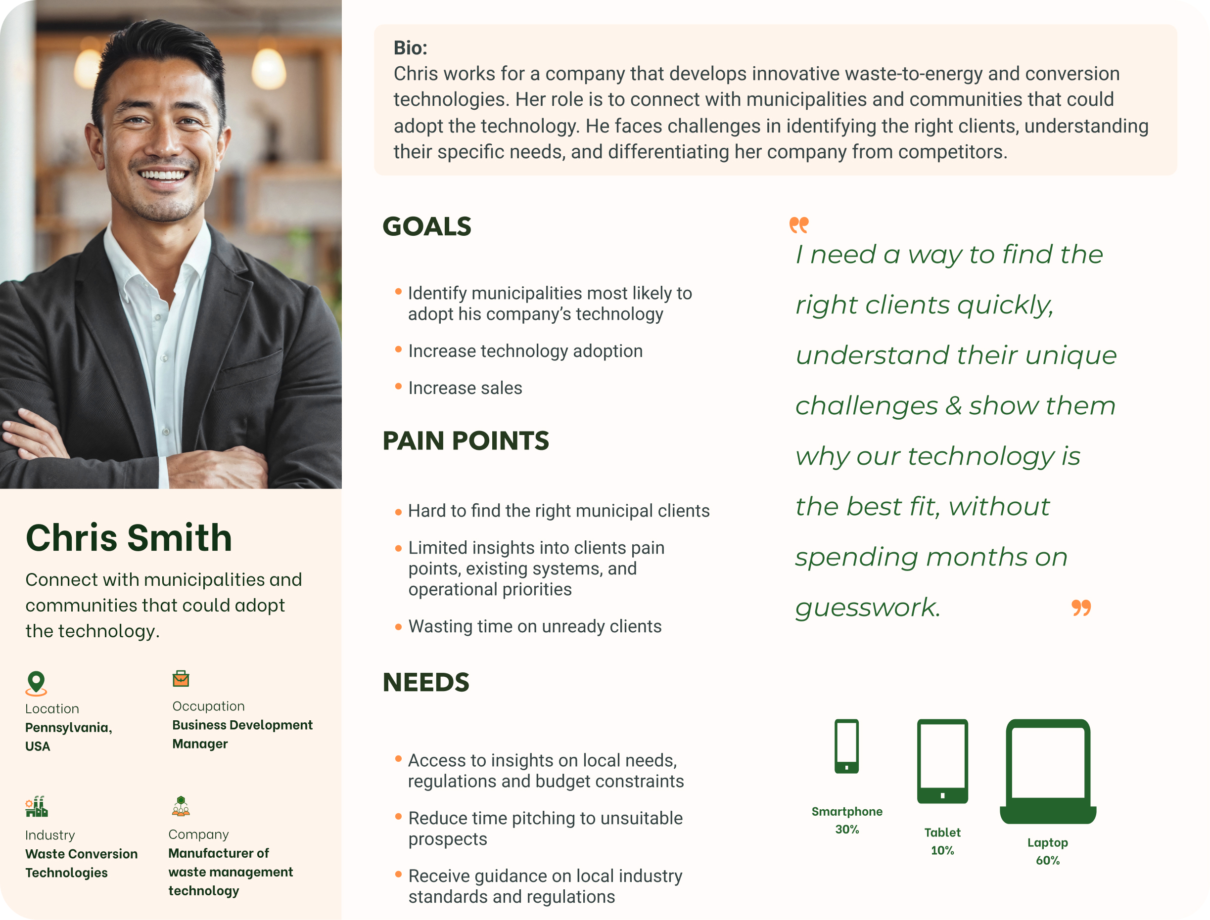
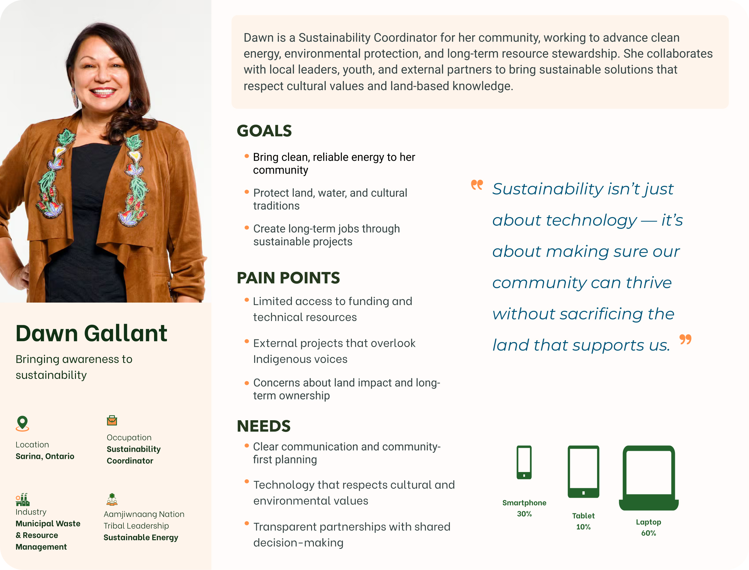
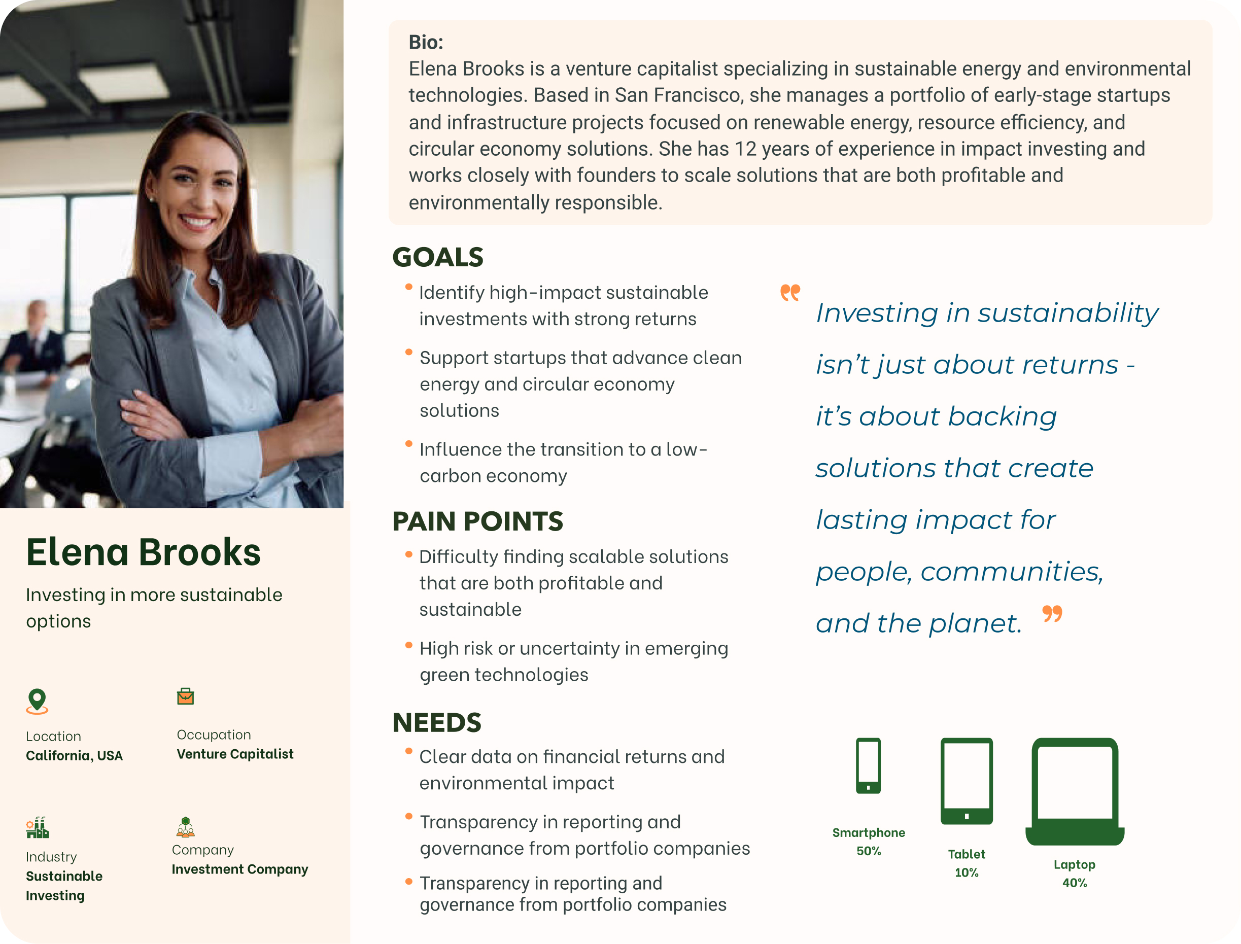
During the first week of the project, my team and I focused on understanding the company’s needs, services, and desired audience/customer segment. Discussions and informational interviews with the Director of Information Technology and the Chief Financial Officer were crucial in establishing a foundational understanding of Solora. There were many “re-framing moments” for our team that changed the directory of the project. For instance, our initial personas focused on a municipal waste manager and a technology business development lead, but client conversations revealed a broader audience ecosystem that also included environmental technology vendors, Indigenous community leaders evaluating land-based solutions, and investors navigating clean-energy opportunities and regulatory exposure in Canada.
Another critical re-framing moment occurred when early assumptions that Solora directly operated waste-to-energy facilities were corrected through interviews. This clarification became a cornerstone of the redesign: waste-to-energy needed to be framed as a potential outcome of informed planning, not the starting point.
Initial personas focused on a municipal waste manager and a technology business development lead, but client conversations revealed a broader audience ecosystem that also included environmental technology vendors, Indigenous community leaders evaluating land-based solutions, and investors navigating clean-energy opportunities and regulatory exposure in Canada.


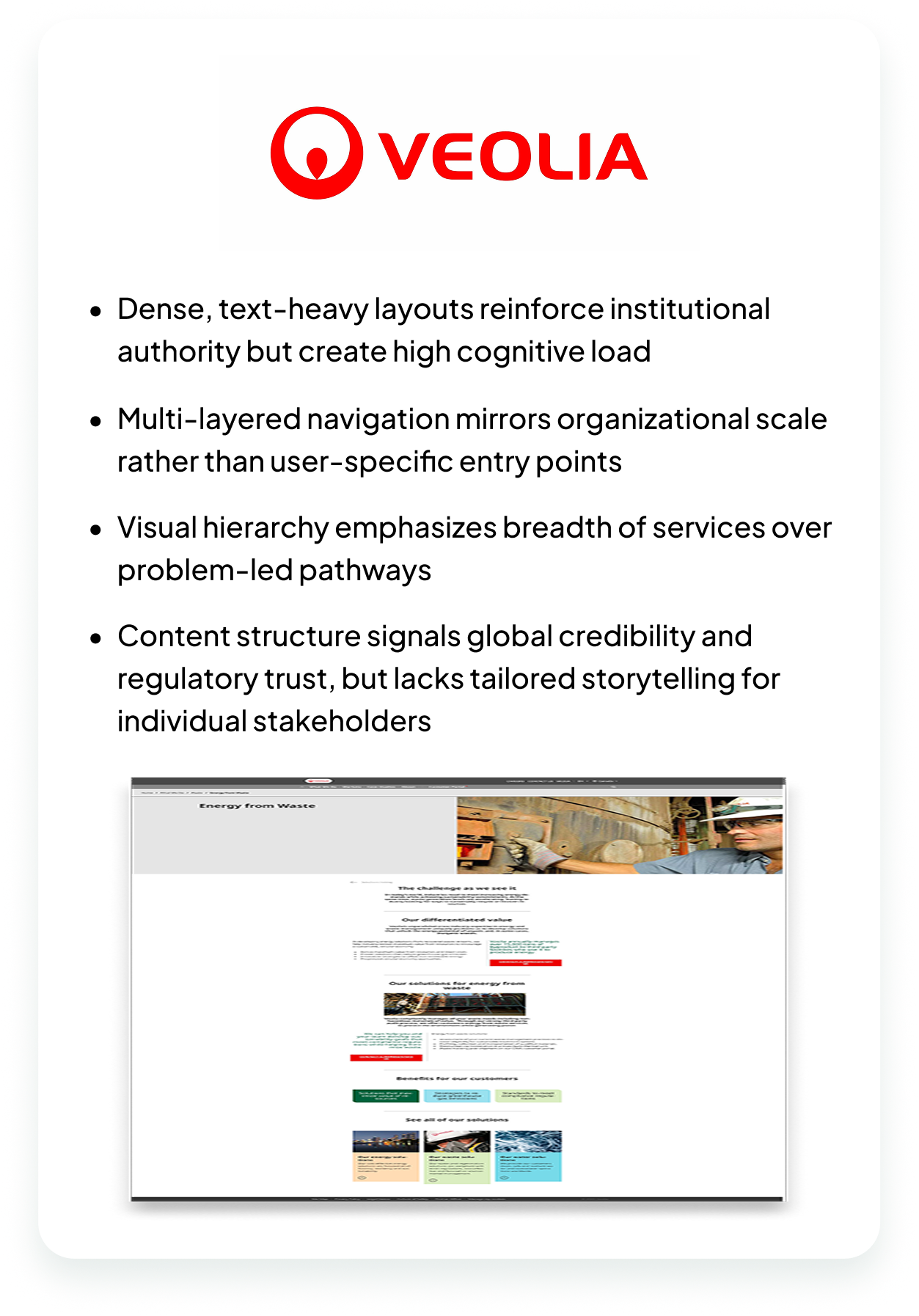
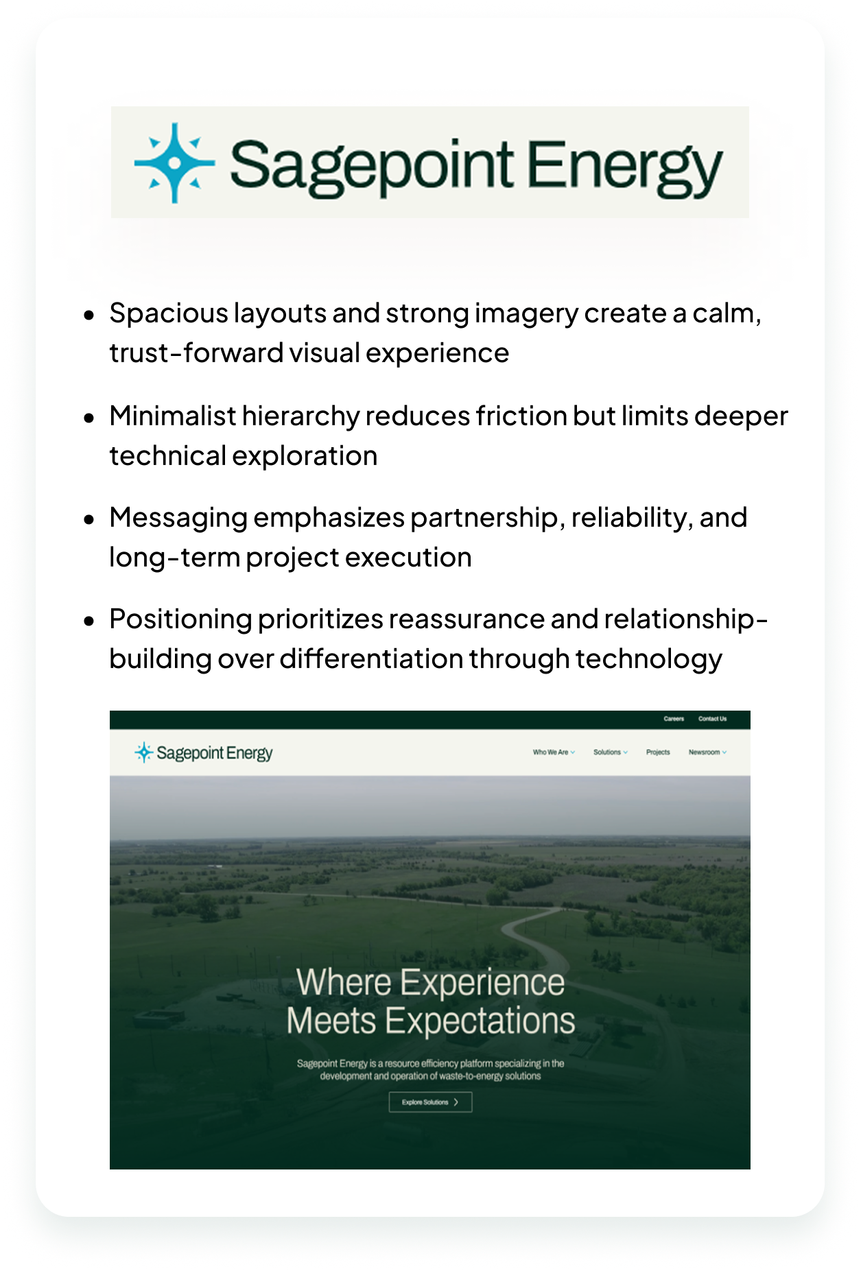
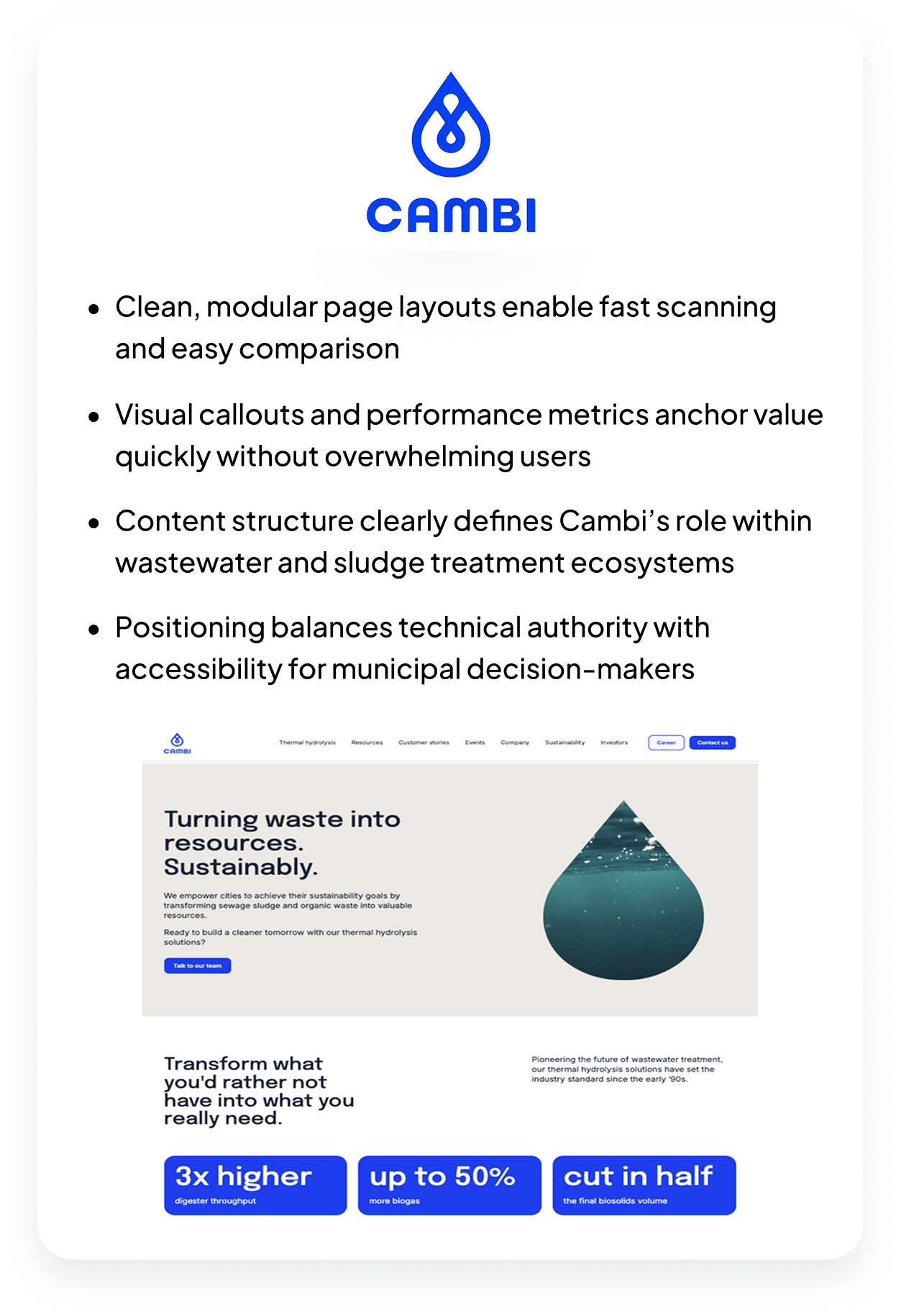
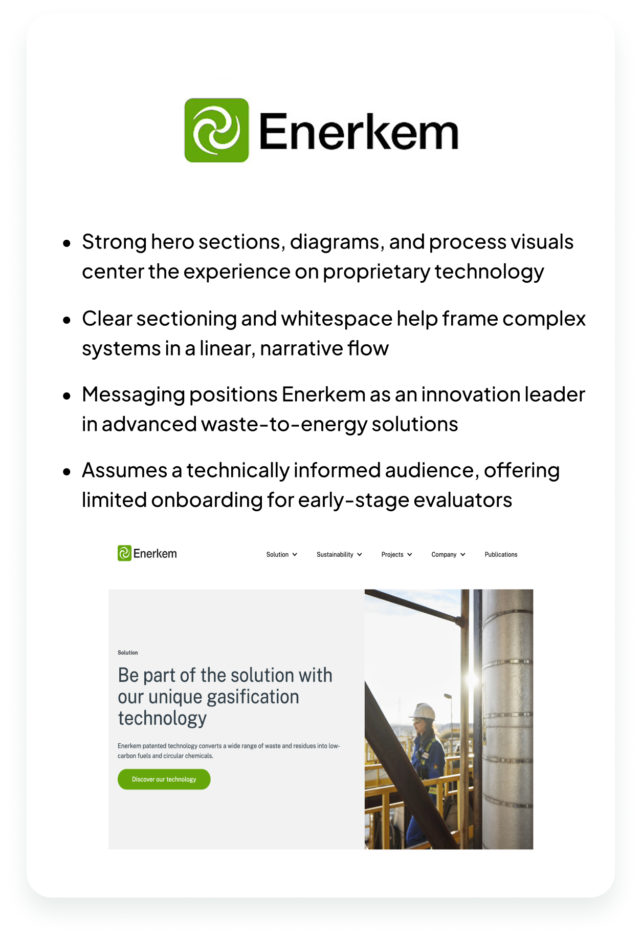
Competitive analysis revealed a clear positioning gap. Large global firms emphasize scale and execution but often under-serve early-stage feasibility analysis and decision support. Smaller execution-focused companies communicate clearly but narrowly, with limited strategic or regulatory depth. Design-forward technology sites convey innovation but often lack audience clarity and real-world regulatory grounding. Few competitors clearly articulated how environmental analytics and regulatory intelligence guide decisions before technology selection.
Several insights ultimately guided the site’s structure and content strategy:
A critical reframing moment occurred when early assumptions that Solora directly operated waste-to-energy facilities were corrected through interviews. This clarification became a cornerstone of the redesign strategy.
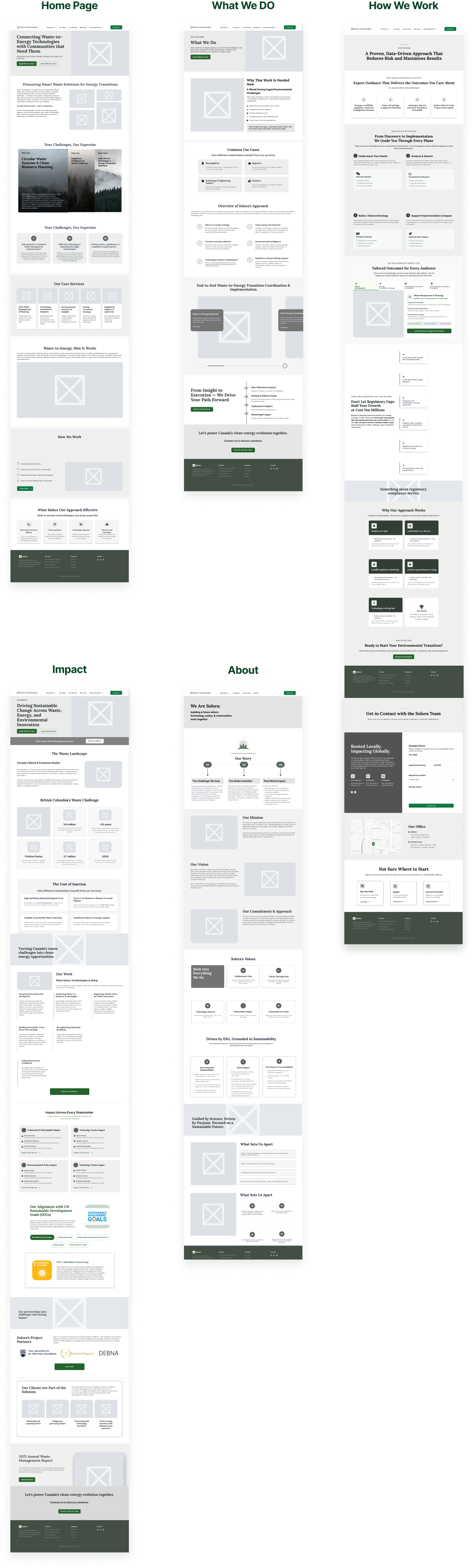
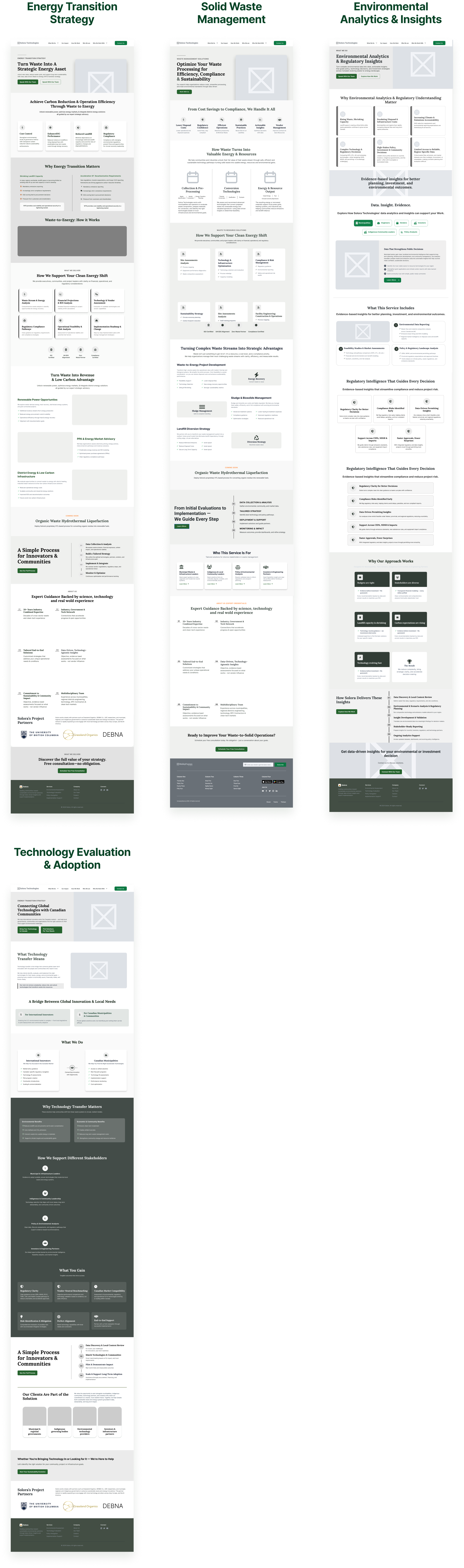
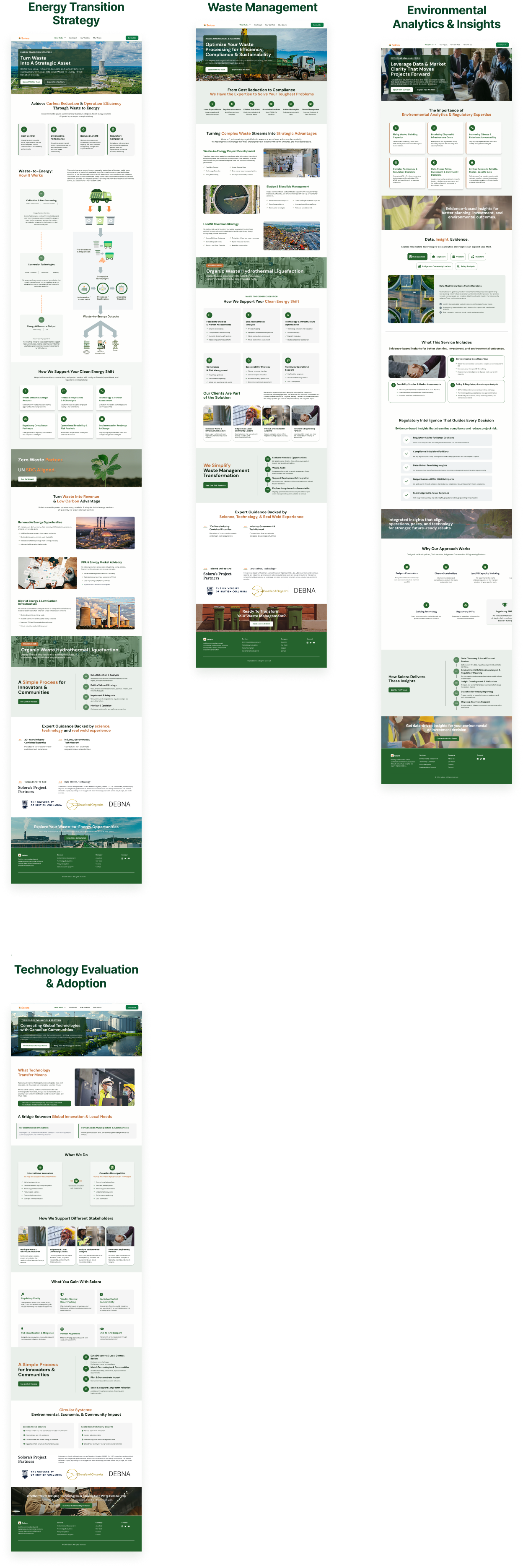
The homepage establishes context and trust, while service pages guide users into more detailed explanations. Each service page follows a consistent internal structure—problem context, Solora’s strategic approach, regulatory considerations, and anticipated outcomes—mirroring how environmental projects are evaluated in practice. Regulatory support and environmental analytics are embedded across all services, reflecting their role as universal decision drivers rather than standalone offerings.
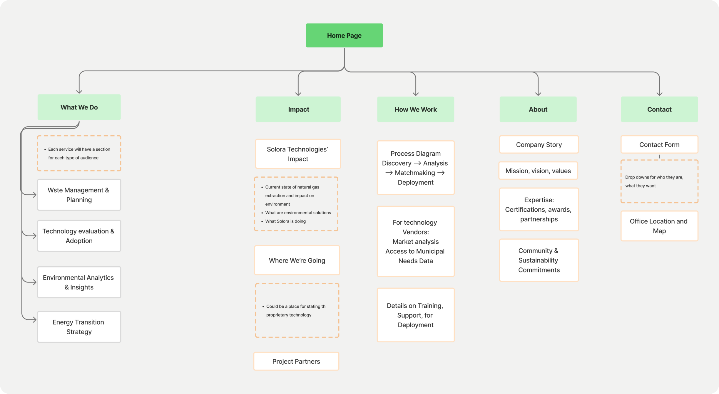
Service naming and grouping were intentionally framed to distinguish Solora as a strategic advisor rather than a technology vendor. Waste Management Consulting anchors the framework, reflecting how engagements typically begin. Technology Evaluation & Adoption emphasizes Solora’s technology-agnostic role. Environmental Analytics & Insights and Energy Transition Strategy anchor Solora’s differentiation by pairing data-driven justification with long-term transition planning.
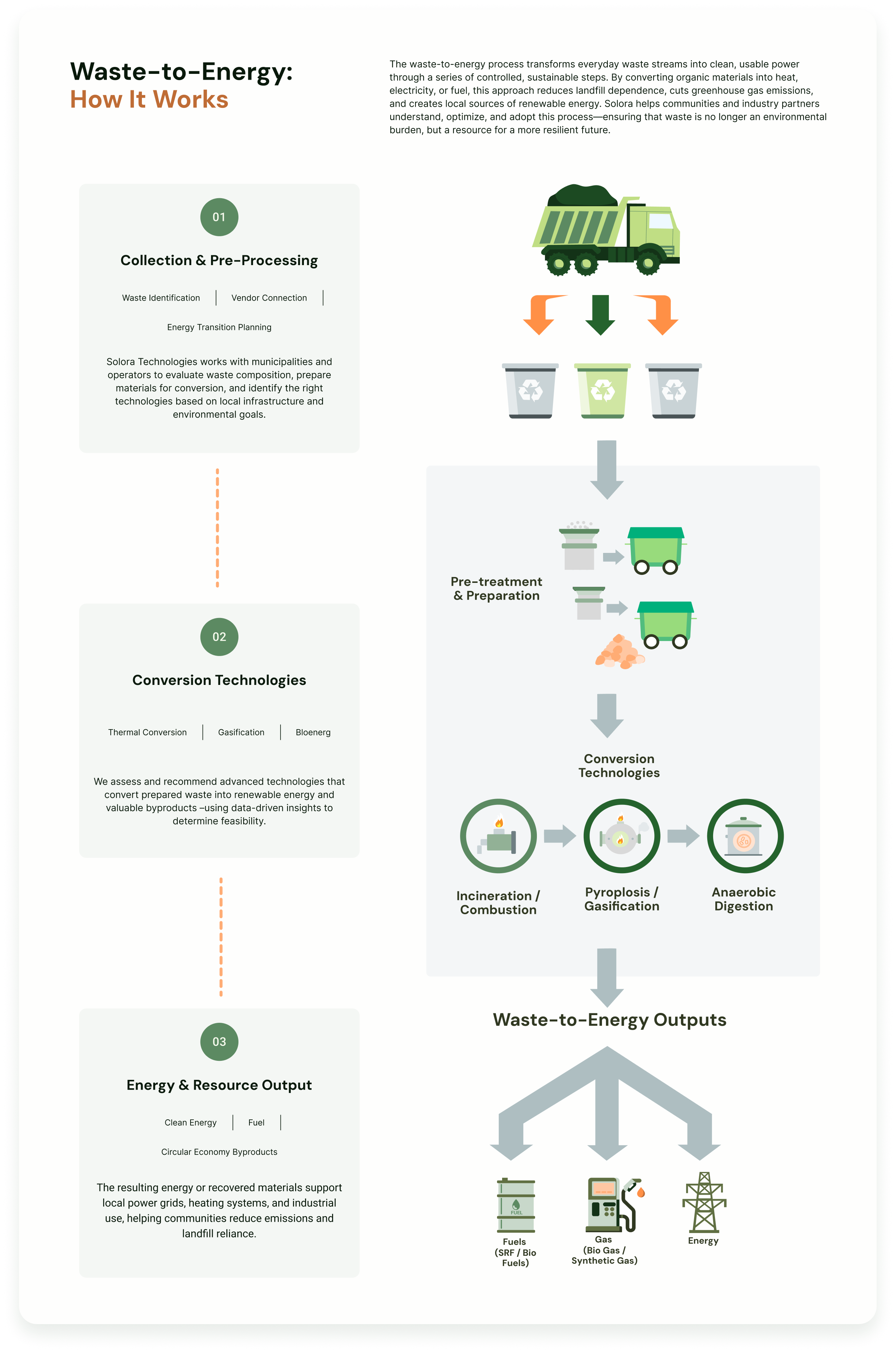
Balancing technical accuracy with accessibility was a central design challenge. Rather than oversimplifying, complexity was structured through progressive disclosure, clear hierarchy, and visual explanation. Step-by-step diagrams translated complex waste-to-energy systems into shared reference points for mixed technical and non-technical audiences. Supporting copy used plain language and outcome-focused framing, preserving rigor through logic and sequencing rather than jargon.
Client collaboration was structured around weekly check-ins, with feedback intentionally focused on structural accuracy and content clarity. As feedback evolved, I was deliberate about preserving the coherence of the information architecture so that new inputs strengthened clarity without introducing fragmentation.
Given the compressed timeline, our team developed mid-fidelity wireframes to balance speed with clarity. We intentionally included page-level language to help the client react to both structure and messaging, allowing us to gather more actionable feedback early in the process. Laura and I authored the copy across all pages to ensure consistency and alignment with the project goals.
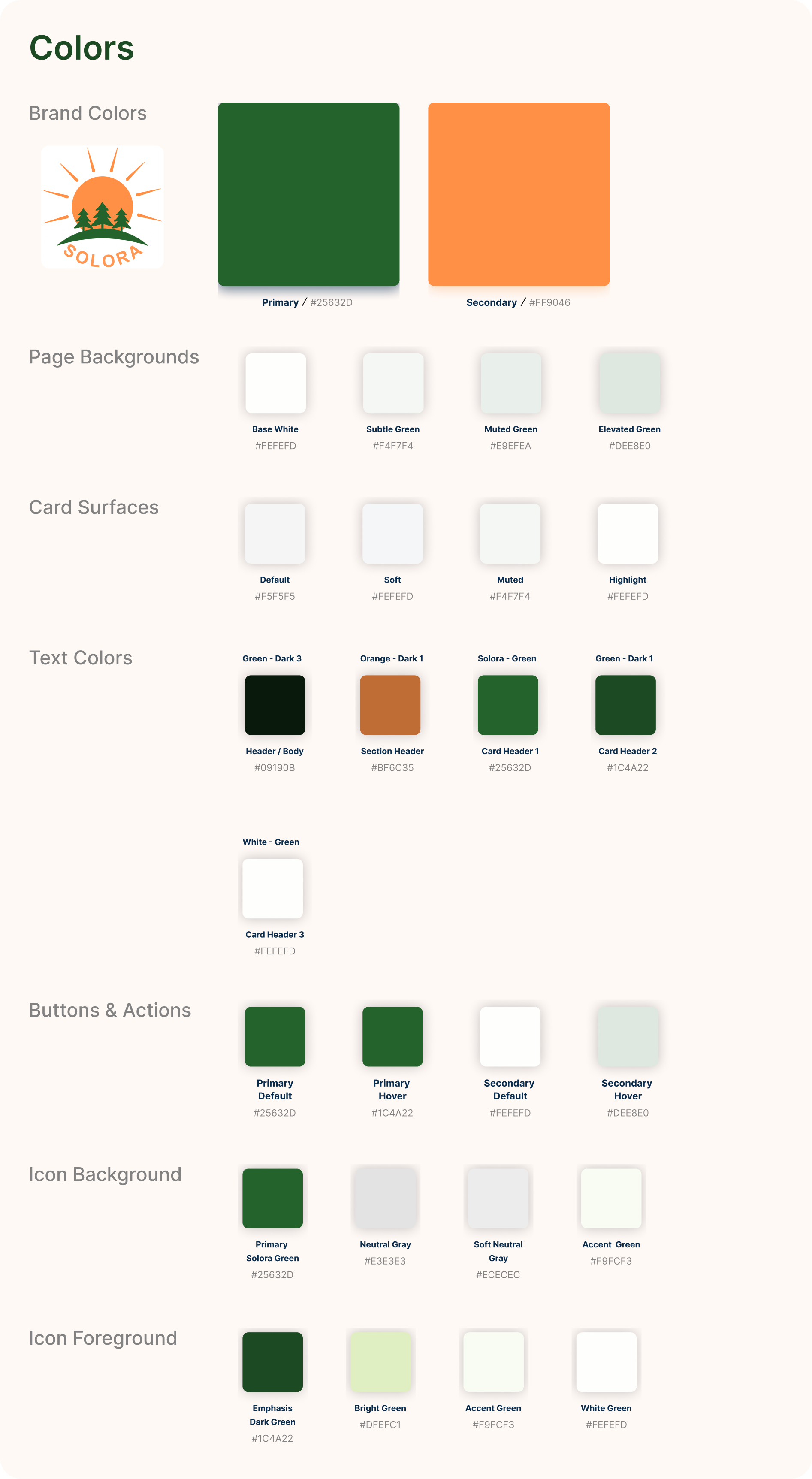
A style guide was developed to convey trust, rigor, and modern environmental leadership. Key principles included:
The system balances innovation with seriousness, aligning with Solora’s role as both strategist and technical partner.
To support understanding and establish credibility, I designed a custom waste-to-energy process diagram that clearly outlines each stage of the system. I created the vectors from scratch and structured the flow to make a complex process approachable for visitors who may be unfamiliar with waste-to-energy concepts. While the client valued having a diagram, they had not yet seen one that felt right, so I focused on a visual style that aligned with Solora’s updated brand colors and positioning. The result was an engaging, informative diagram that reinforces Solora’s expertise without feeling overly clinical or “cartoony”.
As feedback was incorporated, I was intentional about preserving the simplicity and coherence of the site architecture. Updates were evaluated against user flows and audience needs to ensure that new inputs strengthened clarity without introducing fragmentation or scope confusion. This approach allowed the design to evolve alongside client understanding while maintaining a consistent, decision-oriented experience across the site.
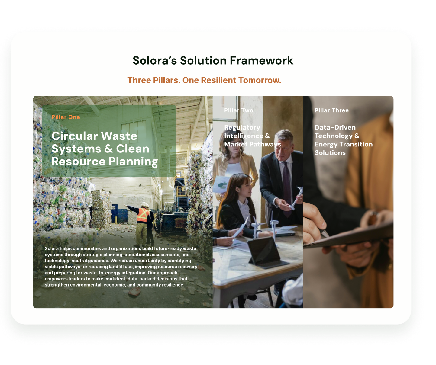
I designed this section as an accordion to make Solora’s multifaceted approach easier to absorb without oversimplifying it. Each pillar represents a distinct but interconnected area of expertise, and the expandable format allows users to explore them at their own pace based on their role, familiarity, or immediate needs. This interaction supports clarity and focus while reinforcing how Solora Technologies integrates systems planning, regulatory intelligence, and data-driven solutions into a cohesive strategy rather than standalone services.
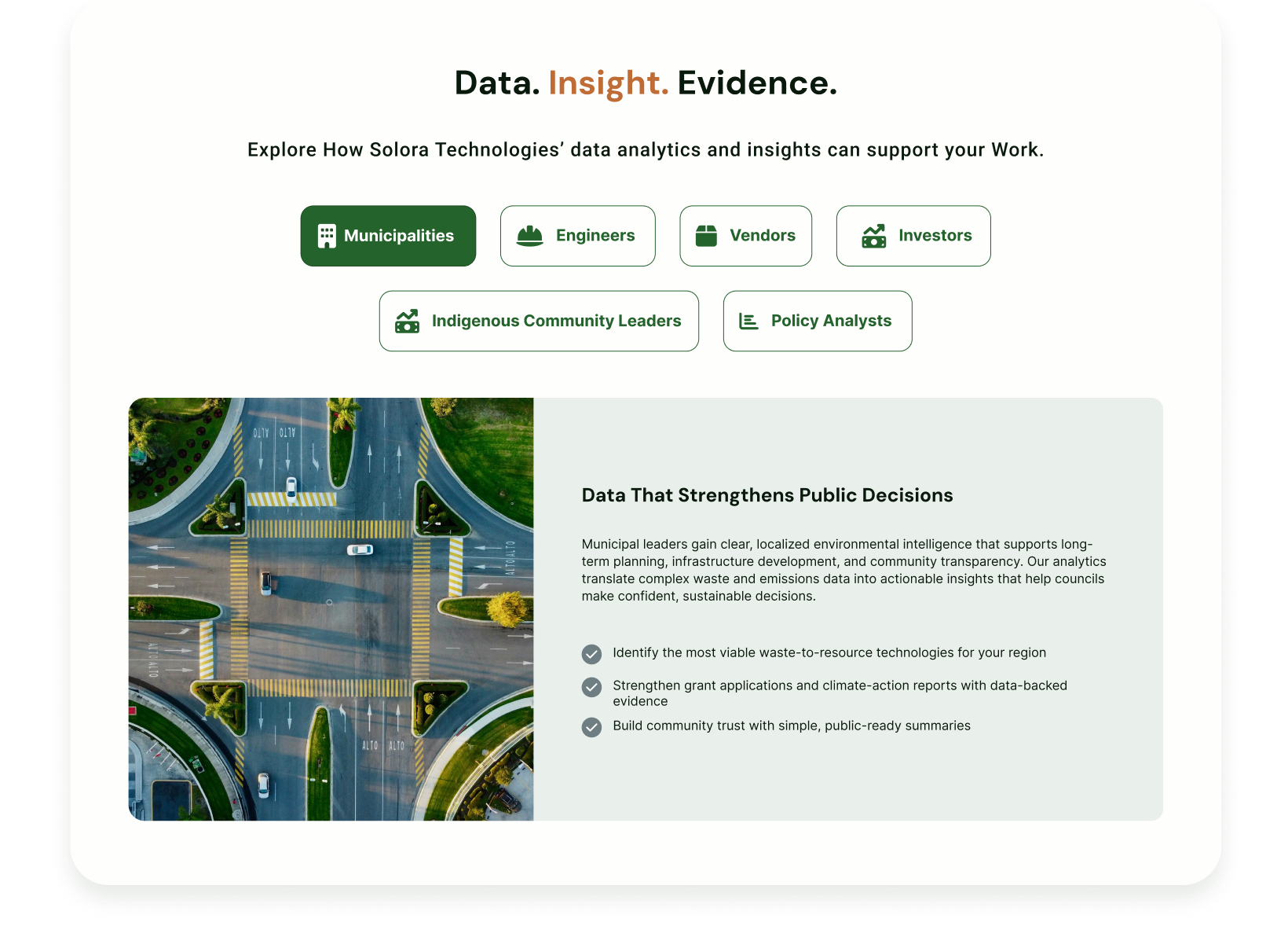
I designed this section with clickable, audience-specific buttons so each group can quickly see what is relevant within Solora’s Data Analysis and Insights service. Instead of interpreting broad technical language, the interaction presents tailored value based on role and decision context. This helps stakeholders understand how Solora Technologies supports their needs without sorting through unnecessary information.
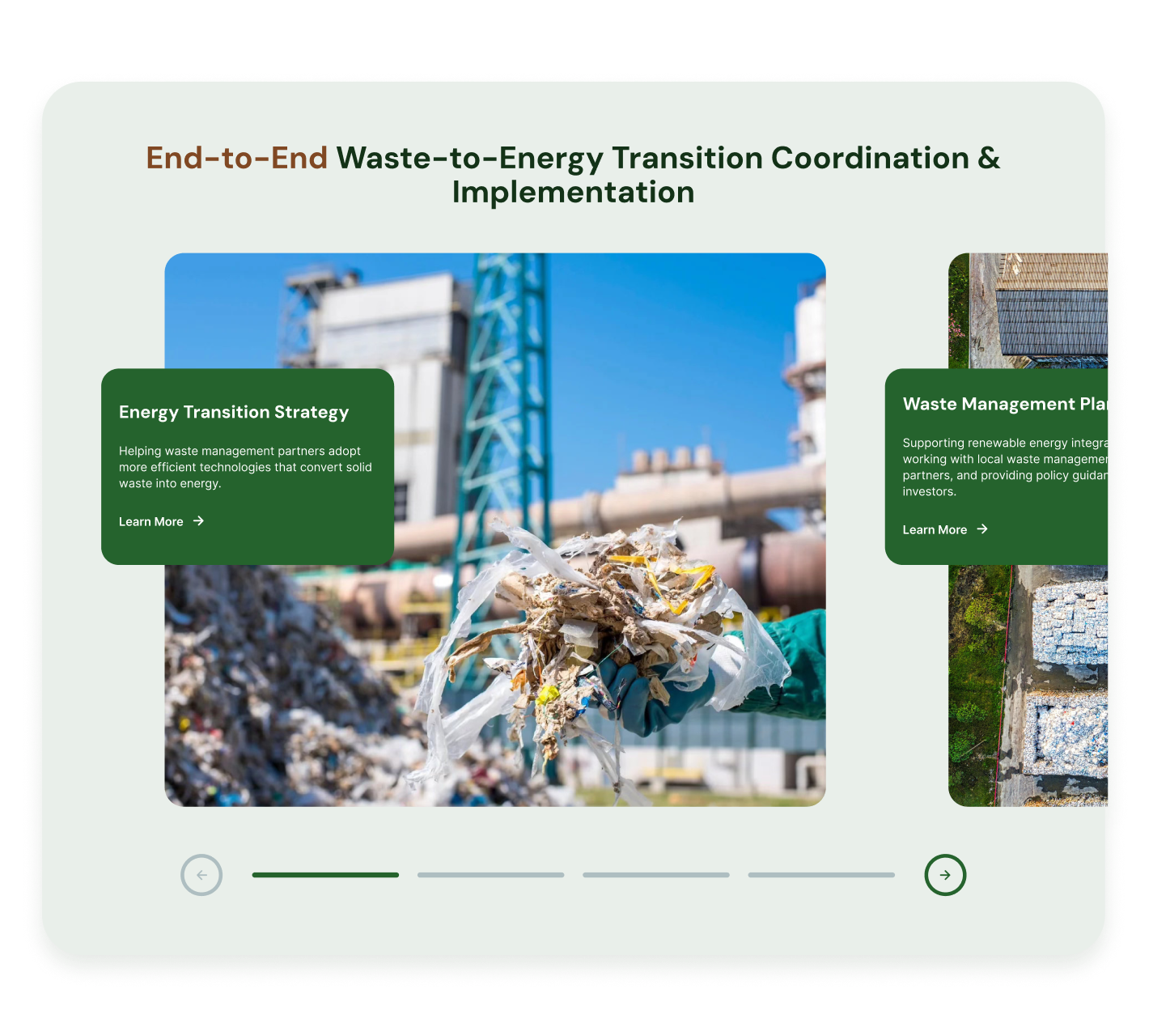
I designed the modern services carousel to give users a clear, scannable overview of what Solora Technologies offers without overwhelming the homepage. Each card pairs a service title with a concise one-sentence overview, allowing visitors to quickly assess relevance before committing to more detail. The “Learn More” interaction supports efficient exploration while preserving vertical space and maintaining a clean, focused homepage layout.
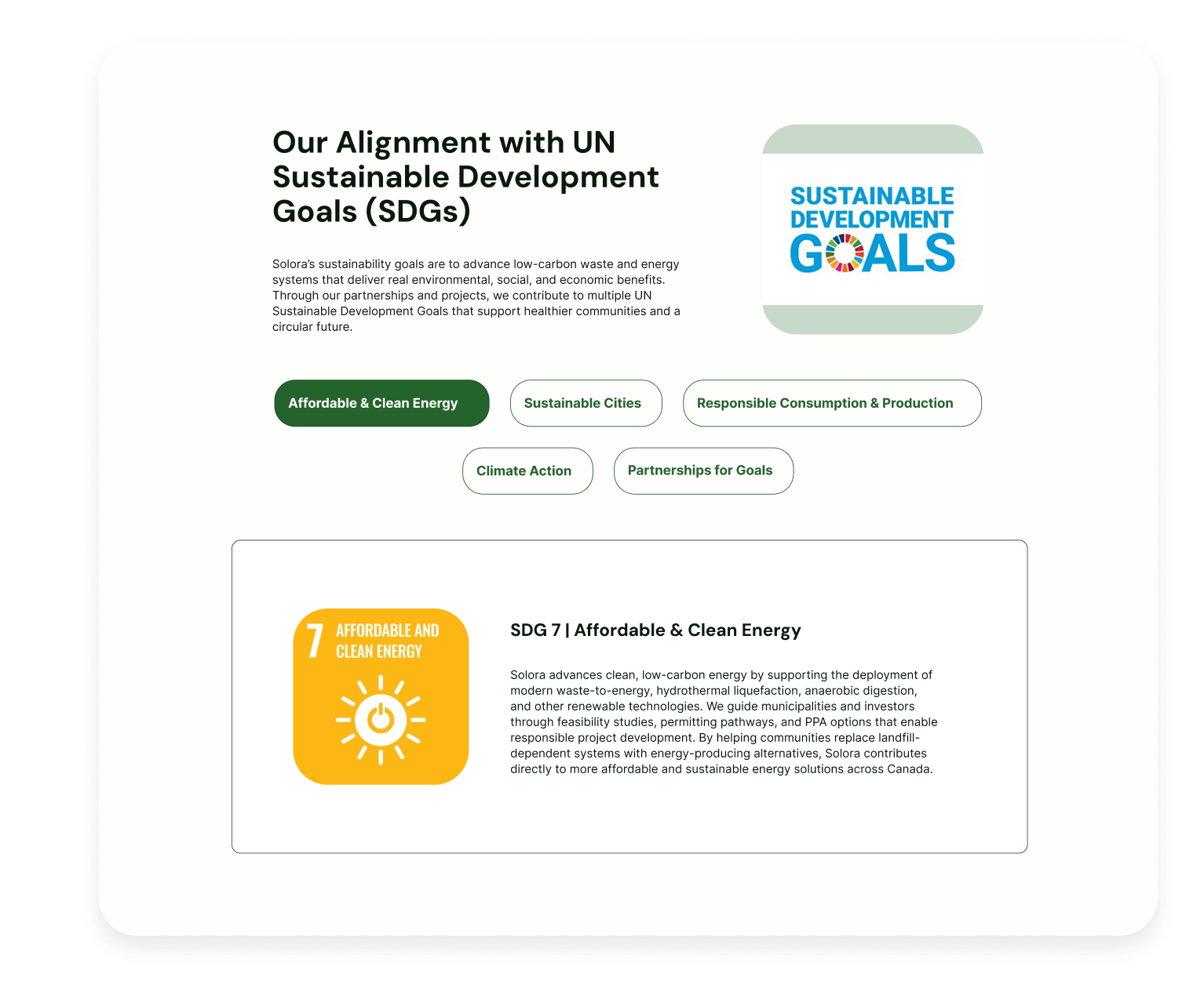
I designed the Sustainability Showcase with clickable buttons tied to the UN Sustainable Development Goals to make Solora’s sustainability commitments clear and tangible. This interaction allows users to explore how Solora Technologies aligns its work with globally recognized goals while maintaining a strong focus on sustainability outcomes in Canada. The component reinforces Solora’s role as a values-driven partner operating at both national and global scales.
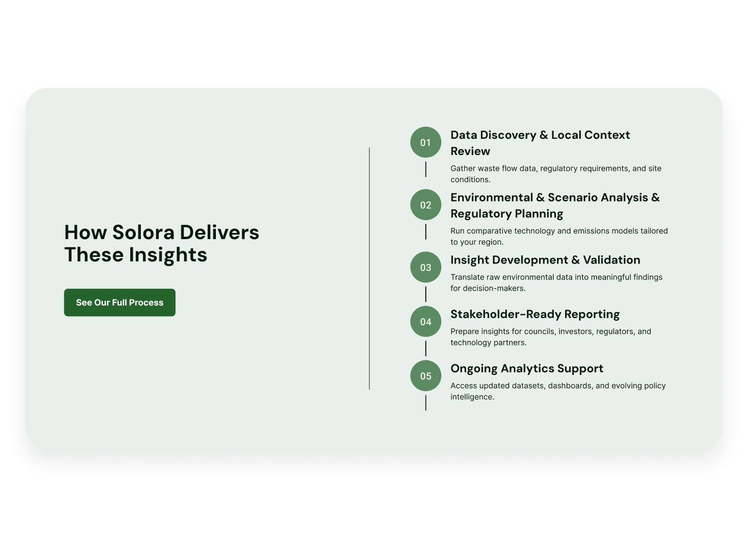
I designed the intake-to-outcome step outline to clearly show clients what to expect from the moment they engage with Solora Technologies through final delivery. By visualizing each step, the component sets expectations, reduces uncertainty, and helps clients understand how their inputs translate into actionable outcomes. Tailoring this outline to each service reinforces consistency while positioning Solora as a mature, highly organized partner with a clear and repeatable engagement standard.
Client collaboration was structured around weekly check-ins at the beginning of each week. During these sessions, the team shared progress, outlined what had been completed, and clearly identified the type of feedback needed. Most client feedback focused on structural accuracy and content clarity—ensuring services were described correctly and reflected how Solora works in practice. Visual feedback was gathered more directionally, informed by competitor sites the client found compelling, while the design team translated those preferences into Solora-specific visuals.
As feedback was incorporated, I was intentional about preserving the simplicity and coherence of the site architecture. Updates were evaluated against user flows and audience needs to ensure that new inputs strengthened clarity without introducing fragmentation or scope confusion. This approach allowed the design to evolve alongside client understanding while maintaining a consistent, decision-oriented experience across the site.
The final design communicates Solora’s positioning as a strategic, science-driven partner through a deliberate combination of structure, language, and visual hierarchy. Rather than leading with specific waste-to-energy technologies or proprietary systems, the site foregrounds Solora’s role in helping clients understand, evaluate, and navigate complex environmental decisions. Services are framed around strategy, analytics, and transition planning, making it clear that technology is an outcome of informed decision-making—not the starting point.
Scientific rigor is reinforced by how information is presented throughout the site. Environmental analytics, market intelligence, and regulatory considerations are embedded across pages rather than isolated in a single section. Diagrams and visual process flows explain complex systems in a clear, logical sequence, demonstrating that Solora’s recommendations are grounded in analysis and systems thinking rather than marketing claims. Precise language and restrained use of jargon allow both technical and non-technical audiences to engage confidently with the content.
The site’s overall narrative mirrors how real-world projects unfold—from early discovery and feasibility through coordination and implementation readiness. Navigation and copy consistently position Solora as a hands-on advisor and project partner who works alongside municipalities, investors, and technology providers to reduce risk and guide decisions across the project lifecycle.
Trust and credibility were central design considerations, particularly given Solora’s conservative, high-stakes audiences. Content is presented in clean, data-forward layouts that emphasize clarity and scannability. Short sections, clear headings, and intentional spacing reflect how municipal leaders and investors review reports and proposals, helping the site feel familiar and decision-oriented rather than promotional.
Regulatory awareness is woven throughout the experience rather than treated as a standalone topic. Permitting, compliance, and stakeholder engagement considerations appear alongside strategy and analytics, signaling that Solora anticipates real-world constraints early in the process. This structural choice reinforces procedural competence and risk awareness—critical trust signals for public-sector and investment audiences.
Tone and visual restraint further support credibility. The design avoids exaggerated claims, flashy effects, or overly aspirational imagery. Instead, visuals are used to explain systems and workflows, and language remains measured and outcome-focused. These choices position Solora as a reliable, science-driven partner that supports informed, long-term decision-making.
The site guides users through Solora’s process by aligning content structure with how environmental and waste-to-energy projects are evaluated in practice. The homepage establishes context by acknowledging common challenges such as landfill capacity constraints, regulatory complexity, and uncertainty around viable pathways. This framing demonstrates problem understanding before proposing solutions.
From there, users are introduced to Solora’s services as an integrated framework rather than isolated offerings. Each service page follows a consistent narrative arc—defining the problem, explaining Solora’s approach, and outlining how analytics, evaluation, and coordination lead to outcomes. Visual diagrams support this flow by breaking complex systems into understandable steps, allowing users to build confidence as they move through the content.
As users progress deeper, the site emphasizes feasibility, data, and regulatory alignment as the bridge between exploration and action. Rather than prescribing a single technology, the design allows users to explore solution pathways that are tailored to context and guided by Solora’s expertise. This structured progression positions Solora as a steady partner who leads users from initial understanding to implementable decisions.
Scalability was built into the design through a modular, system-based structure. Services are organized around durable capability categories—consulting, analytics, evaluation, and strategy—rather than narrow technologies or one-off offerings. This allows Solora to introduce new services, sub-services, or specialized programs without disrupting the core site architecture.
Pages are composed of repeatable components such as section headers, process diagrams, data callouts, and outcome blocks. These components can be reused across future service pages, reports, and case studies, ensuring consistency as the site grows. Placeholder components were intentionally included to accommodate Solora’s stated goals of releasing reports and announcing proprietary technology.

The final design positions Solora as a strategic, science-driven partner through structure, language, and visual restraint. Services are framed around guidance and decision support rather than technology promotion. Environmental analytics, regulatory awareness, and market context are embedded throughout the site, reinforcing evidence-based decision-making.
Content is presented in clean, data-forward layouts that reflect how municipalities and investors review reports and proposals. Regulatory considerations are woven into service narratives rather than isolated, signaling procedural competence and risk awareness. The tone avoids exaggerated claims in favor of measured, outcome-focused language that resonates with conservative, high-stakes audiences.
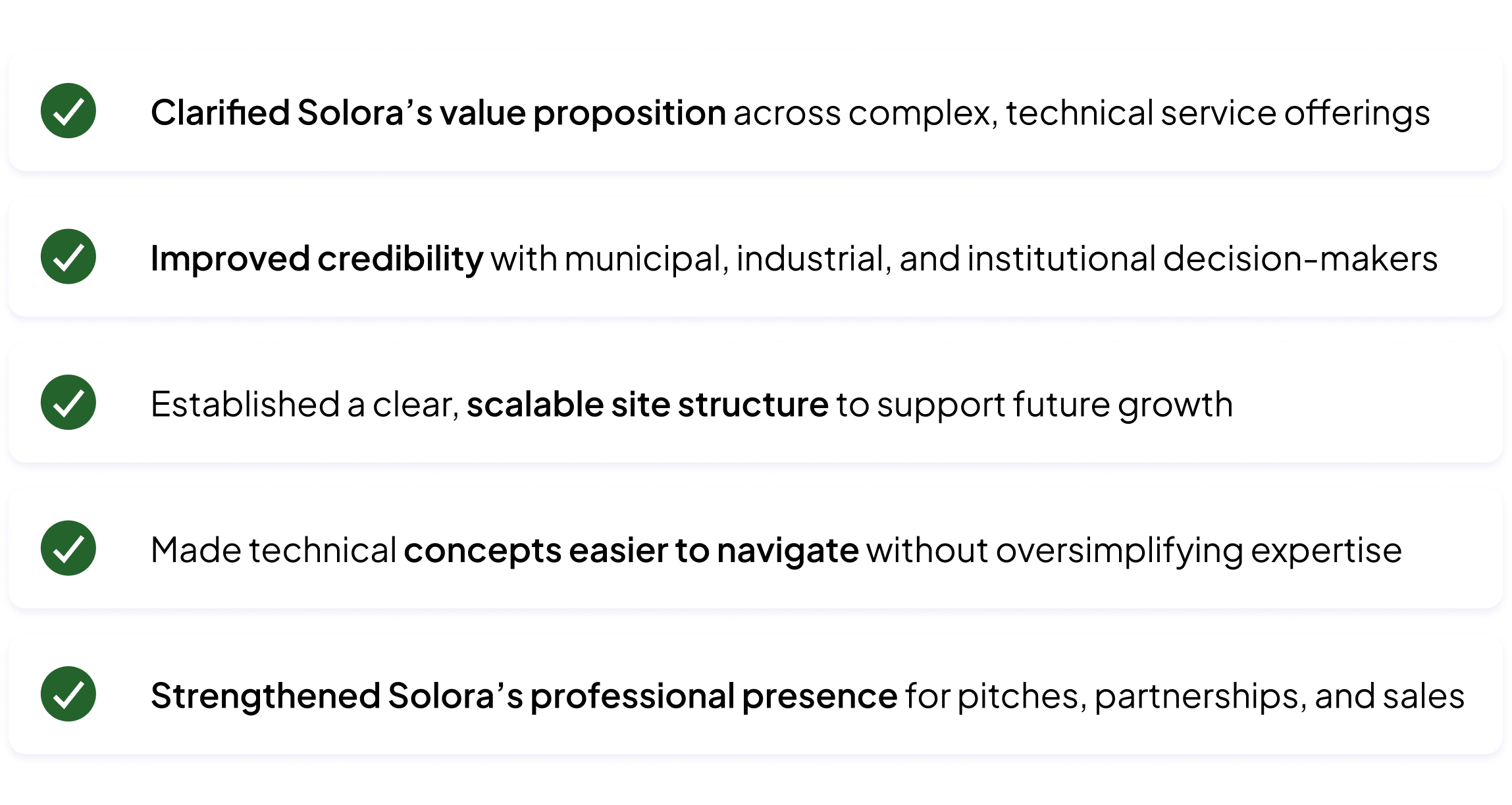
Qualitatively, the redesign aligned the Solora team around a shared narrative and language for their services. Externally, the site is now ready to be used confidently in investor outreach, municipal discussions, and partnership conversations—serving as both a credibility signal and an educational tool. The modular structure supports scalability as Solora releases reports, expands partnerships, or introduces proprietary technology.
This project reinforced that designing for technical and policy-heavy domains is fundamentally about decision support. Stakeholders do not want complexity removed; they want it structured, justified, and navigable. Credibility comes from acknowledging constraints and trade-offs as much as opportunities.
The work also marked a shift in my practice from designing interfaces to designing decision systems. Rather than optimizing for engagement alone, I focused on trust, feasibility, and long-term outcomes—designing an experience that supports alignment across municipalities, investors, regulators, and technology partners. This case study reflects my growth as a strategic, research-led designer who can operate confidently in high-stakes, real-world environments.

Copyright © Torrie Real